Operation Room Service
Travel checkout strategy
Context:Hopper is a travel booking service where users can search for and book flights, hotels, rental cars, and other trip related products.
Hopper has a broader travel ecosystem that includes flights, hotels, rental cars, and other trip-related products, but those products can still feel like separate booking funnels. I wanted to work out a way to better connect flights and hotels by increasing hotel attach during Hopper’s core flight checkout flow, without getting in the way of the primary task: booking the flight.
The idea was to find a moment where lodging could be introduced in a way that felt timely, useful, and connected to the trip the user was already building.
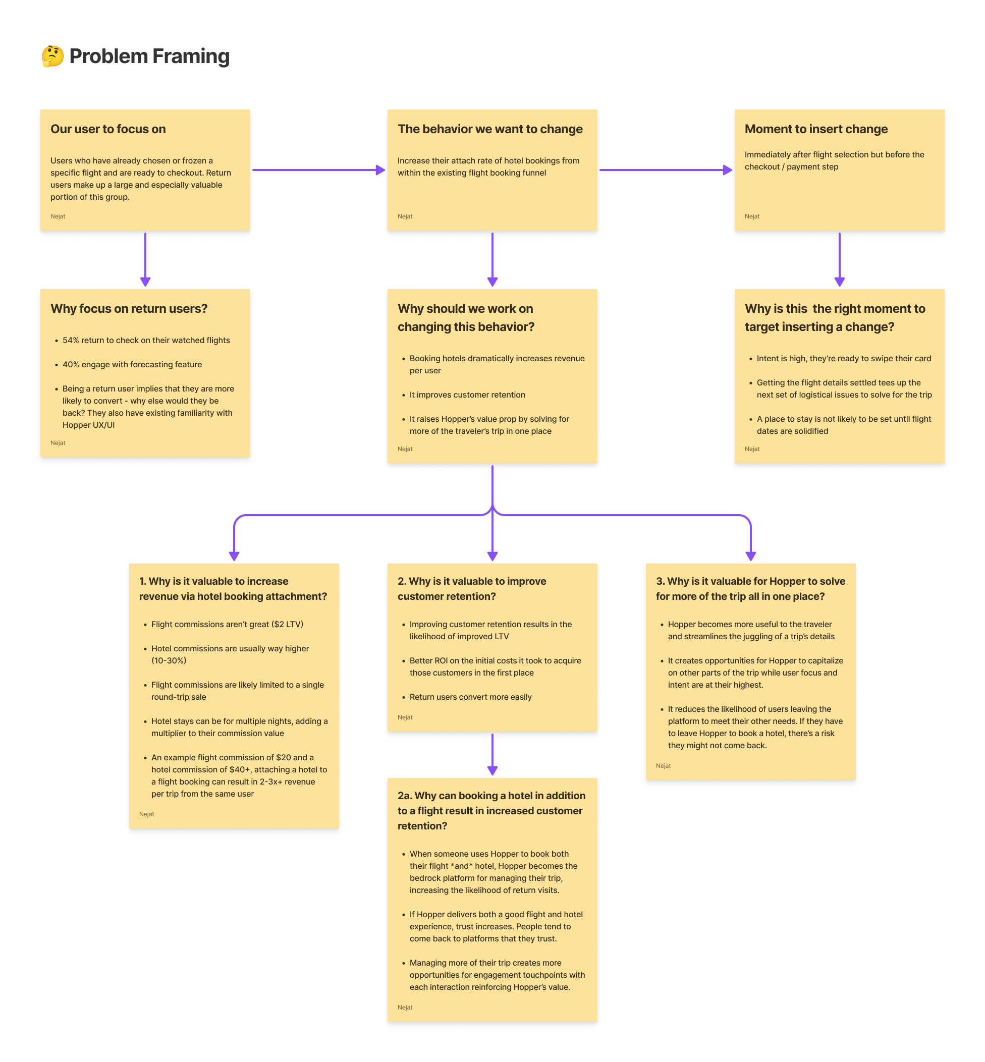
To do that, I zeroed-in on the moment after a user had chosen a specific flight, locked in their travel dates, and is moving toward payment. At that point in time, the trip feels real, their intent is high, and Hopper already has enough context around their travel to make genuinely relevant hotel recommendations.
This felt like a natural opportunity to help users with the next major hurdle of planning their trip, where they’re staying, without pushing them out of the booking flow or asking them to start from scratch somewhere else, like a competitor’s website.
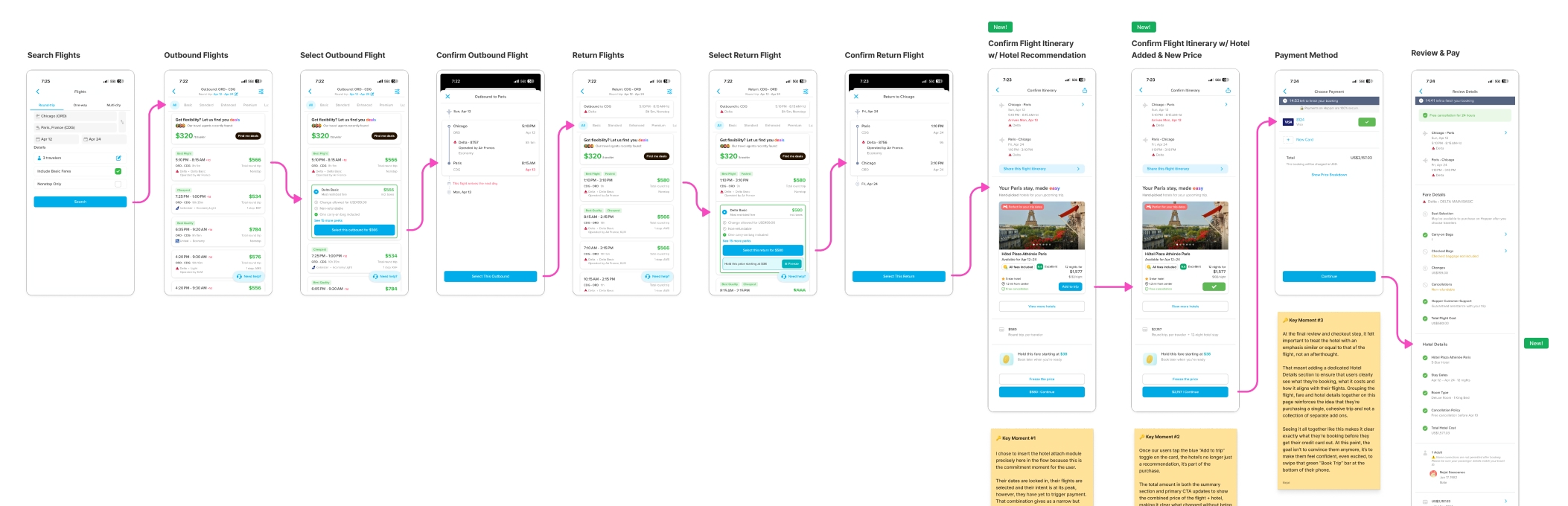
To make the scenario concrete, I grounded the work in an actual family trip we took from Chicago to Paris. Looking at the experience through the lens of a real trip made the opportunity clearer: once the flight is selected, lodging becomes the next major decision. That helped me evaluate the flow with practical constraints like destination, dates, trip length, budget, hotel availability, and how the checkout experience changes once a hotel enters the picture.
The Opportunity:
Users come to Hopper looking to book flights, but there’s more to a trip than just getting there.
Once you’ve selected a flight and are moving through checkout, where you’ll be staying stops being some abstract, far-off concept and becomes one of the next logical parts of your trip to figure out.
The issue isn’t that users don’t need a hotel or want to be sold one. It’s that hotel recommendations can feel disconnected when they show up too early, late, or without enough context to feel legitimately useful.
That creates an opportunity to make hotel discovery feel less like a separate task and more like just the right piece of the puzzle to fit in next.
By showing a relevant hotel recommendation in the right way and at the right moment, Hopper has an opening to increase hotel bookings attached to flights without risking too much disruption to the core purchase funnel.
Framing the user, behavior change, and moment to introduce hotel attach
The full proposal walkthrough includes the problem framing, flow logic, design explorations, and final hotel attach concept in more detail. You can explore it in full, here.
Why This Moment:I placed the hotel attach moment after itinerary confirmation and before final payment because that is where several important things become true at once.
The user has committed to a specific flight, the travel dates are locked in, intent is high, and payment has not happened yet. That makes it a stronger moment than earlier flight browsing, where hotel recommendations can feel premature or disconnected from the final trip details.
It also fits naturally into the part of the flow where Hopper already introduces adjacent attach products. The goal was not to bolt on another upsell, but to introduce lodging consideration in a way that felt connected to the trip the user was already building.
The Concept:
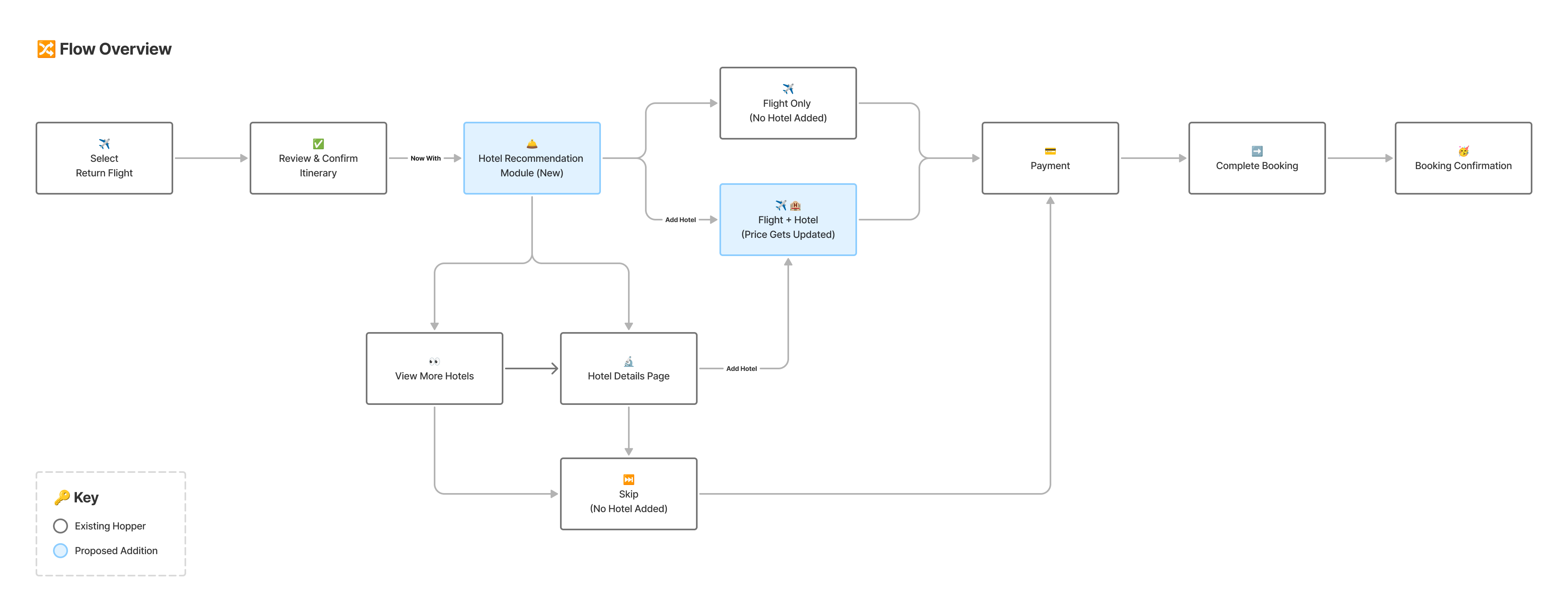
I added a hotel recommendation module to Hopper’s existing Confirm Itinerary page, after flights have been selected but before the payment step.
The module surfaces one hotel option that fits the trip context, then gives users three clear paths: keep checking out with the flight only, view hotel details, or add the hotel to their trip.
Nothing about the default path changes. If the user doesn’t proactively add the hotel, they simply continue through the flow as they normally would.
Proposed Flow:The proposed flow introduces a curated hotel recommendation on the Confirm Itinerary screen.
From there, users can continue with flight-only checkout, view hotel details, add the hotel to their trip, or review the updated flight and hotel total before payment.
Proposed flow depicting the optional hotel attach without changing the default checkout path
If the hotel is added, the pricing updates in context. The total does not just jump without explanation. Flight and hotel costs are itemized so users can understand exactly what changed and why.
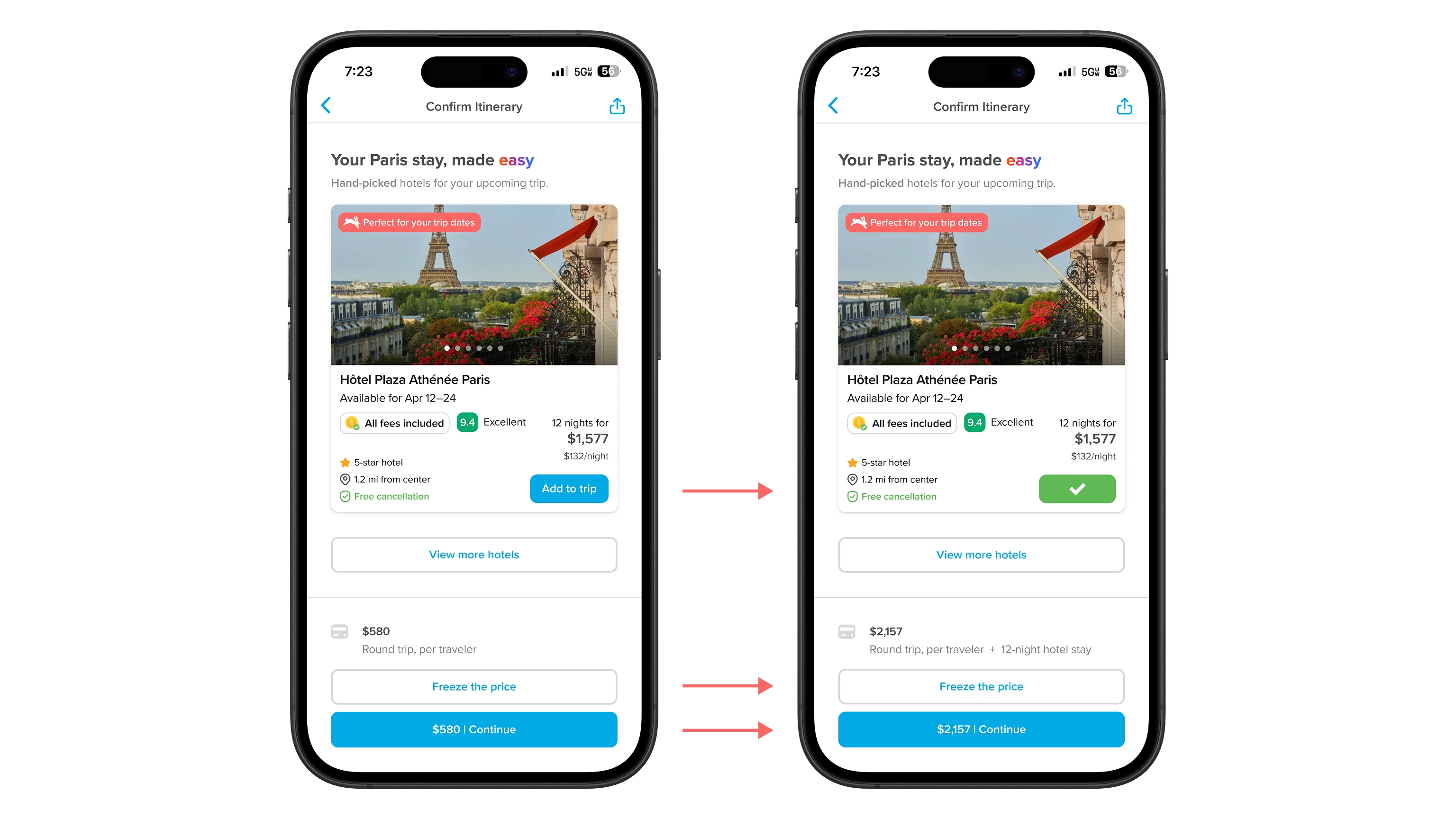
Adding a hotel updates the itinerary, pricing summary, and checkout CTA in context
Risk:The biggest risk was adding friction at a high-stakes point in the checkout flow.
Flight checkout is not the place to get cute or overload the user. If the recommendation feels too aggressive, too generic, or too disruptive, it could hurt the core behavior that matters most: completing the flight booking.
To reduce that risk, the recommendation stays optional. Unless users actively add the hotel to their trip, the default path remains unchanged. They can still move forward with flight-only checkout without being forced into a hotel decision.
How I’d Validate:The core question is whether hotel attach can increase without damaging the flight booking flow.
I would validate this through an A/B test against the existing flight-only checkout experience, looking at hotel attach rate, flight purchase completion, abandonment at the itinerary confirmation step, time spent on the page, and whether users who view hotel details are more likely to add lodging or abandon checkout.
If hotel attach increases while flight conversion stays stable, the concept is worth iterating on. If flight conversion drops, the recommendation is either showing up at the wrong time, taking up too much attention, or not feeling relevant enough to justify its placement.
Final Thoughts:This work was less about adding another upsell and more about finding a moment where Hopper could help users complete more of their trip in one place.
By using context datapoints that the user already provided and confirmed earlier in the funnel, the experience supports the business goal of higher hotel attach rates while still feeling targeted, timely, and useful, while protecting the primary job of the page: getting the user successfully checked out with confidence.