Archive for the Uncategorized Category

Operation Room Service – Travel checkout strategy

Saturday, May 2nd, 2026

Operation Room Service

Travel checkout strategy

Context:
Hopper is a travel booking service where users can search for and book flights, hotels, rental cars, and other trip related products.

Hopper has a broader travel ecosystem that includes flights, hotels, rental cars, and other trip-related products, but those products can still feel like separate booking funnels. I wanted to work out a way to better connect flights and hotels by increasing hotel attach during Hopper’s core flight checkout flow, without getting in the way of the primary task: booking the flight.

The idea was to find a moment where lodging could be introduced in a way that felt timely, useful, and connected to the trip the user was already building.

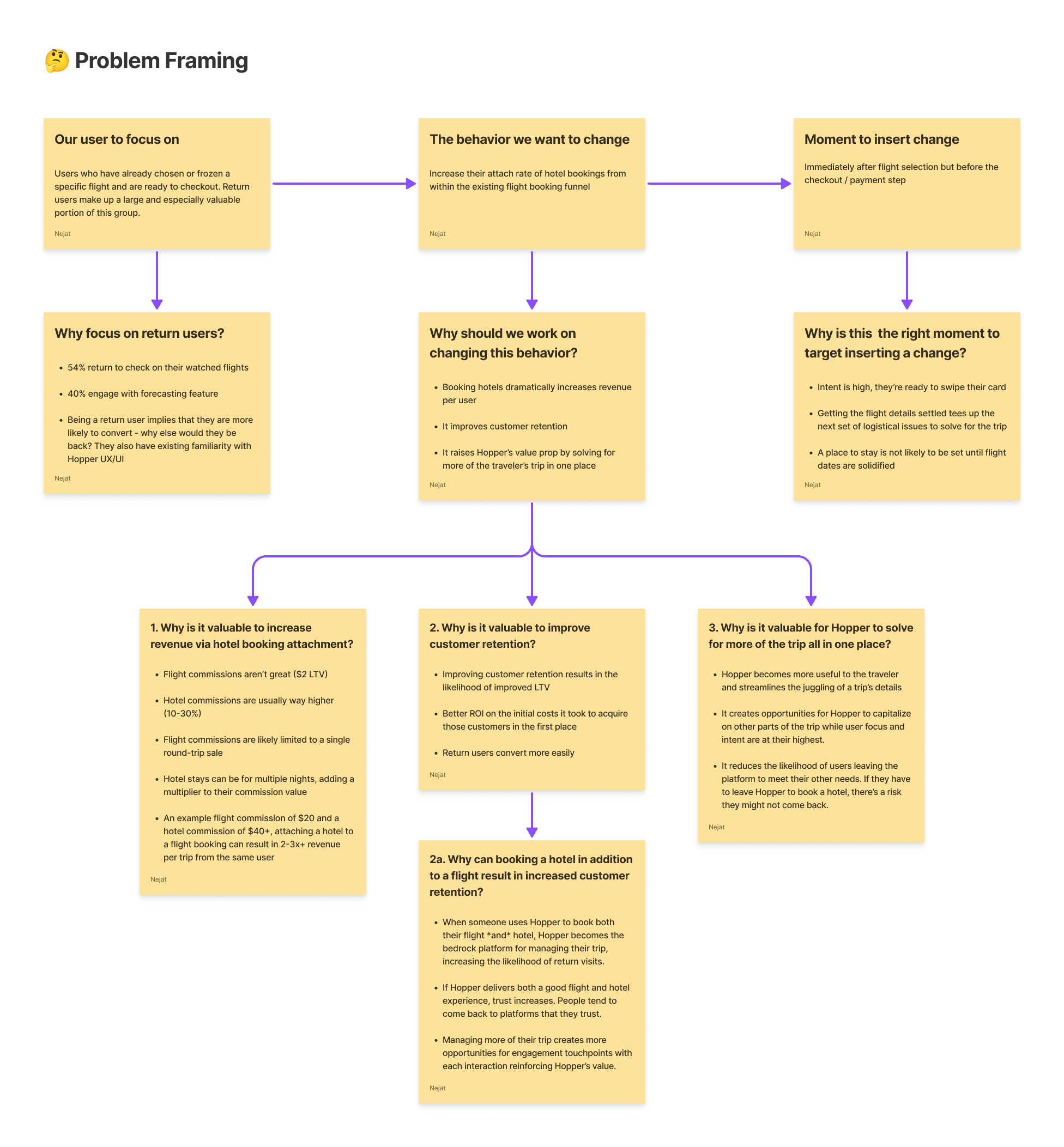
To do that, I zeroed-in on the moment after a user had chosen a specific flight, locked in their travel dates, and is moving toward payment. At that point in time, the trip feels real, their intent is high, and Hopper already has enough context around their travel to make genuinely relevant hotel recommendations.

This felt like a natural opportunity to help users with the next major hurdle of planning their trip, where they’re staying, without pushing them out of the booking flow or asking them to start from scratch somewhere else, like a competitor’s website.

To make the scenario concrete, I grounded the work in an actual family trip we took from Chicago to Paris. Looking at the experience through the lens of a real trip made the opportunity clearer: once the flight is selected, lodging becomes the next major decision. That helped me evaluate the flow with practical constraints like destination, dates, trip length, budget, hotel availability, and how the checkout experience changes once a hotel enters the picture.

The Opportunity:
Users come to Hopper looking to book flights, but there’s more to a trip than just getting there.

Once you’ve selected a flight and are moving through checkout, where you’ll be staying stops being some abstract, far-off concept and becomes one of the next logical parts of your trip to figure out.

The issue isn’t that users don’t need a hotel or want to be sold one. It’s that hotel recommendations can feel disconnected when they show up too early, late, or without enough context to feel legitimately useful.

That creates an opportunity to make hotel discovery feel less like a separate task and more like just the right piece of the puzzle to fit in next.

By showing a relevant hotel recommendation in the right way and at the right moment, Hopper has an opening to increase hotel bookings attached to flights without risking too much disruption to the core purchase funnel.

Framing the user, behavior change, and moment to introduce hotel attach

The full proposal walkthrough includes the problem framing, flow logic, design explorations, and final hotel attach concept in more detail. You can explore it in full, here.

Why This Moment:
I placed the hotel attach moment after itinerary confirmation and before final payment because that is where several important things become true at once.

The user has committed to a specific flight, the travel dates are locked in, intent is high, and payment has not happened yet. That makes it a stronger moment than earlier flight browsing, where hotel recommendations can feel premature or disconnected from the final trip details.

It also fits naturally into the part of the flow where Hopper already introduces adjacent attach products. The goal was not to bolt on another upsell, but to introduce lodging consideration in a way that felt connected to the trip the user was already building.

The Concept:
I added a hotel recommendation module to Hopper’s existing Confirm Itinerary page, after flights have been selected but before the payment step.

The module surfaces one hotel option that fits the trip context, then gives users three clear paths: keep checking out with the flight only, view hotel details, or add the hotel to their trip.

Nothing about the default path changes. If the user doesn’t proactively add the hotel, they simply continue through the flow as they normally would.

Proposed Flow:
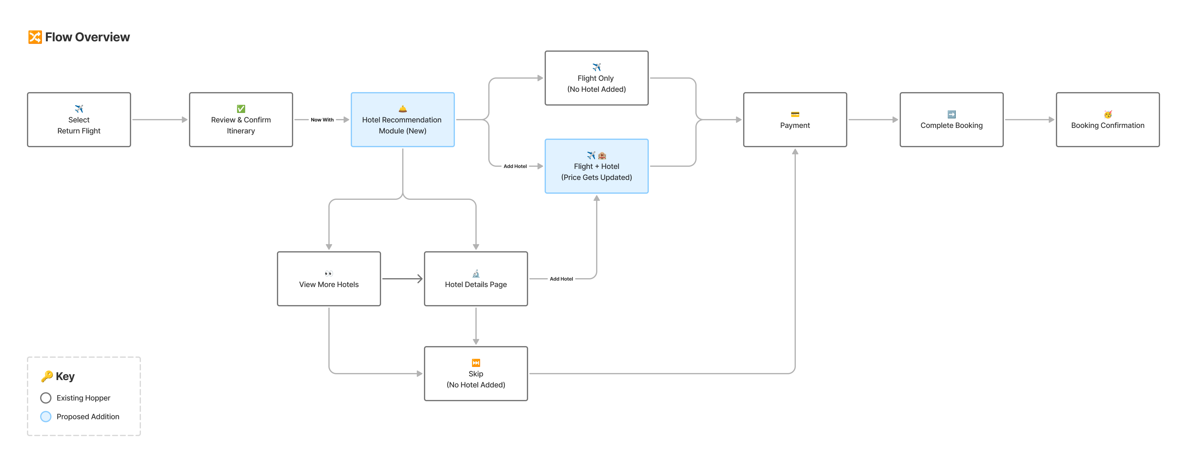
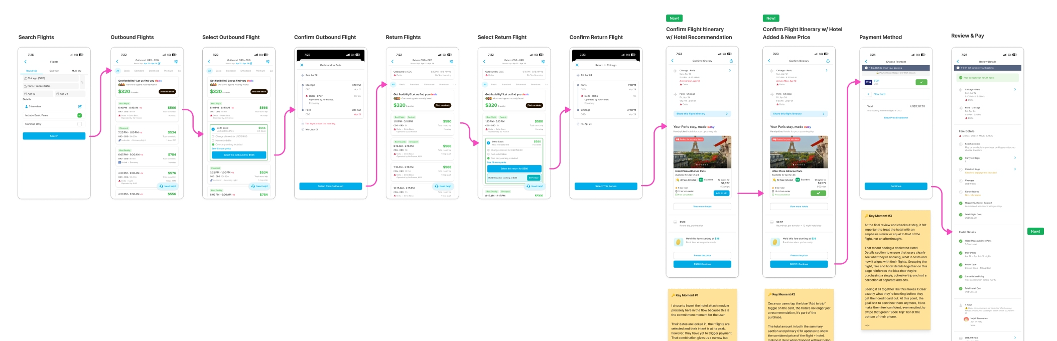
The proposed flow introduces a curated hotel recommendation on the Confirm Itinerary screen.

From there, users can continue with flight-only checkout, view hotel details, add the hotel to their trip, or review the updated flight and hotel total before payment.

Proposed flow depicting the optional hotel attach without changing the default checkout path

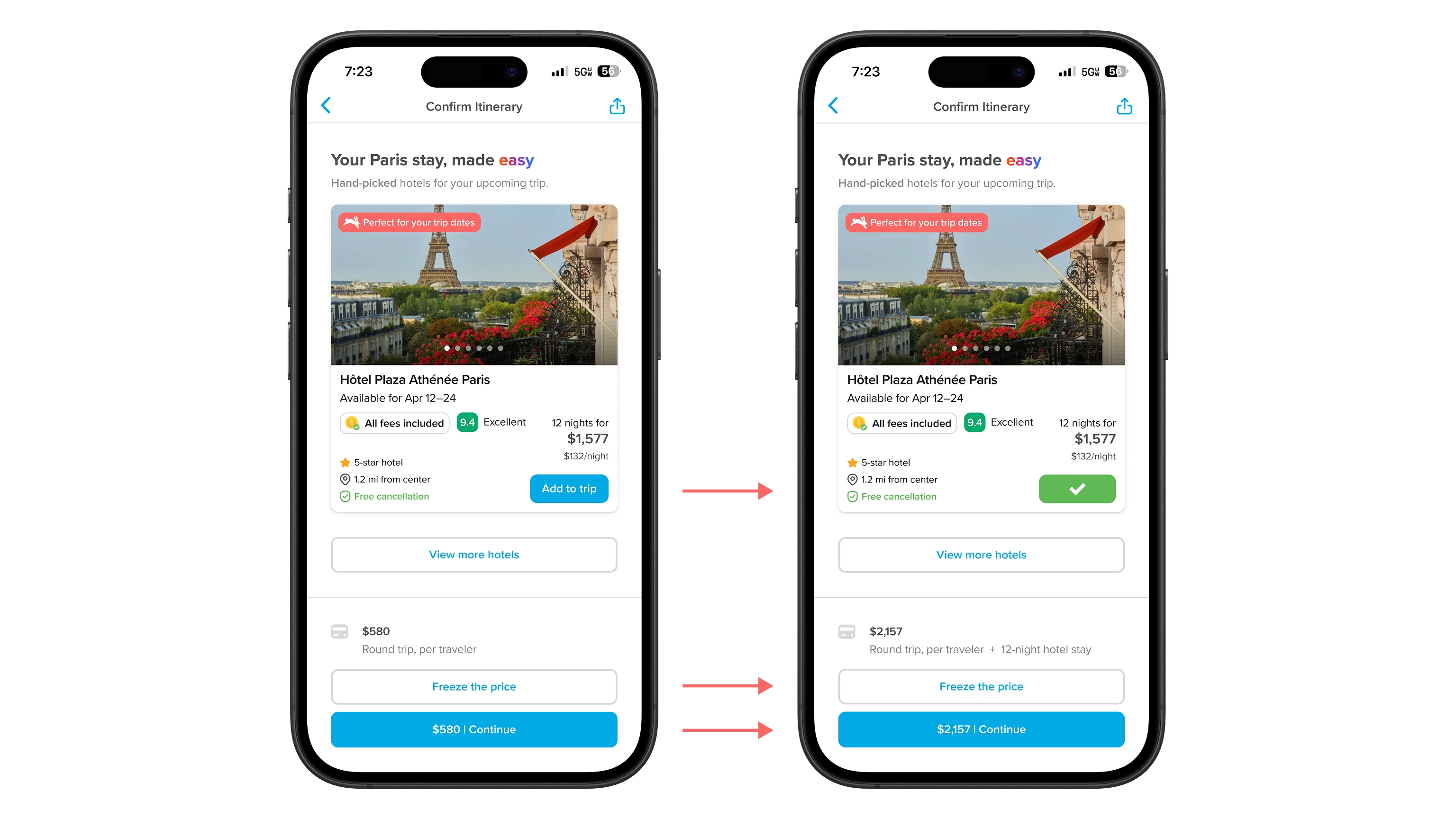
If the hotel is added, the pricing updates in context. The total does not just jump without explanation. Flight and hotel costs are itemized so users can understand exactly what changed and why.

Adding a hotel updates the itinerary, pricing summary, and checkout CTA in context

Risk:
The biggest risk was adding friction at a high-stakes point in the checkout flow.

Flight checkout is not the place to get cute or overload the user. If the recommendation feels too aggressive, too generic, or too disruptive, it could hurt the core behavior that matters most: completing the flight booking.

To reduce that risk, the recommendation stays optional. Unless users actively add the hotel to their trip, the default path remains unchanged. They can still move forward with flight-only checkout without being forced into a hotel decision.

How I’d Validate:
The core question is whether hotel attach can increase without damaging the flight booking flow.

I would validate this through an A/B test against the existing flight-only checkout experience, looking at hotel attach rate, flight purchase completion, abandonment at the itinerary confirmation step, time spent on the page, and whether users who view hotel details are more likely to add lodging or abandon checkout.

If hotel attach increases while flight conversion stays stable, the concept is worth iterating on. If flight conversion drops, the recommendation is either showing up at the wrong time, taking up too much attention, or not feeling relevant enough to justify its placement.

Final Thoughts:
This work was less about adding another upsell and more about finding a moment where Hopper could help users complete more of their trip in one place.

By using context datapoints that the user already provided and confirmed earlier in the funnel, the experience supports the business goal of higher hotel attach rates while still feeling targeted, timely, and useful, while protecting the primary job of the page: getting the user successfully checked out with confidence.

Super LO – Old Writeup

Sunday, April 26th, 2026

Super LO – Old 2023 Writeup

Background:
Mortgages are one of the most complex lending products in the world. That means Loan Officers have complicated jobs with many responsibilities that scatter their focus across different parties and tasks from within and outside their organizations.

This leaves Loan Officers, also known as LOs, constantly shifting gears and being largely reactive rather than proactive, far from ideal for making the most efficient use of their time.

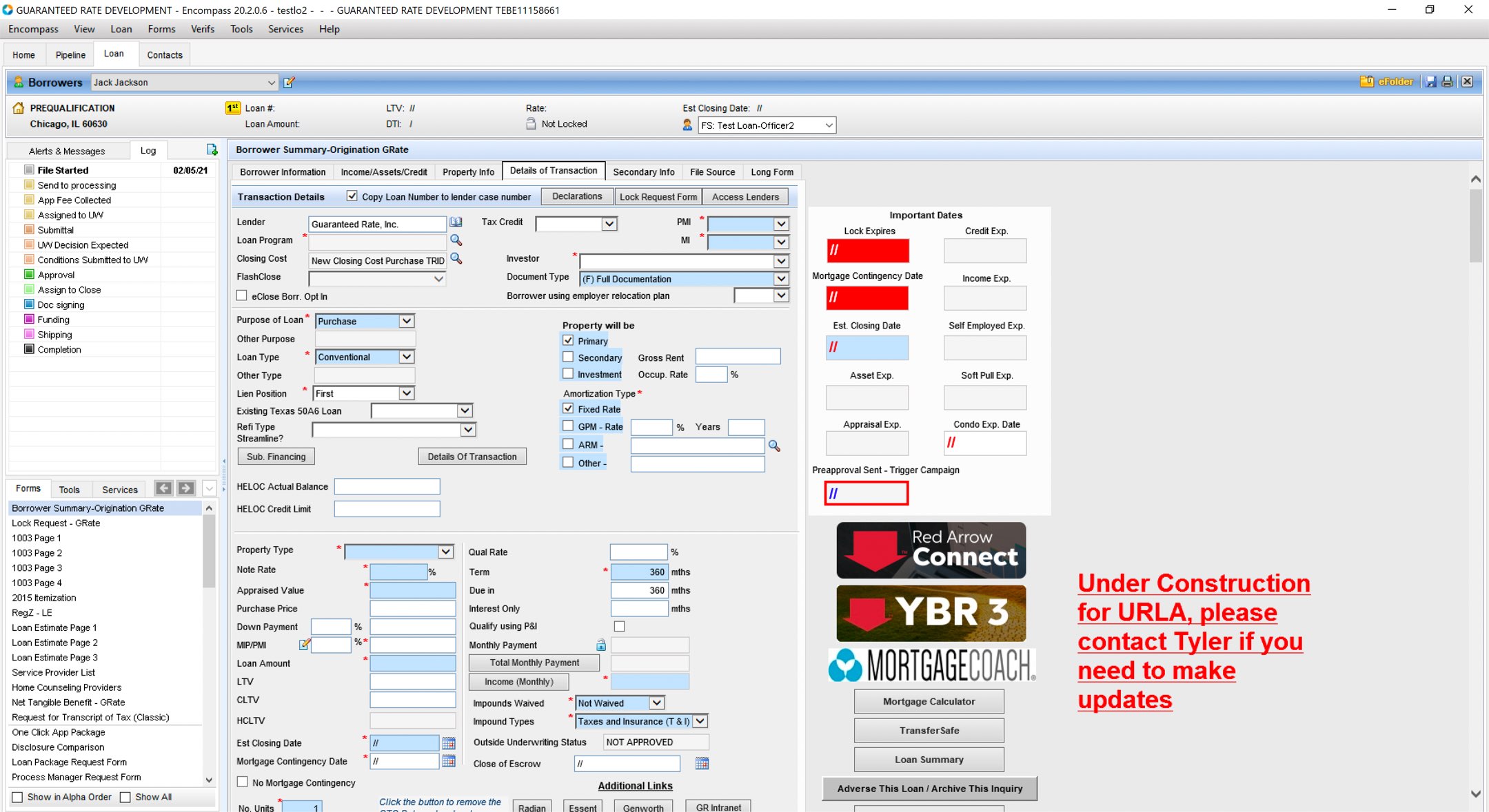
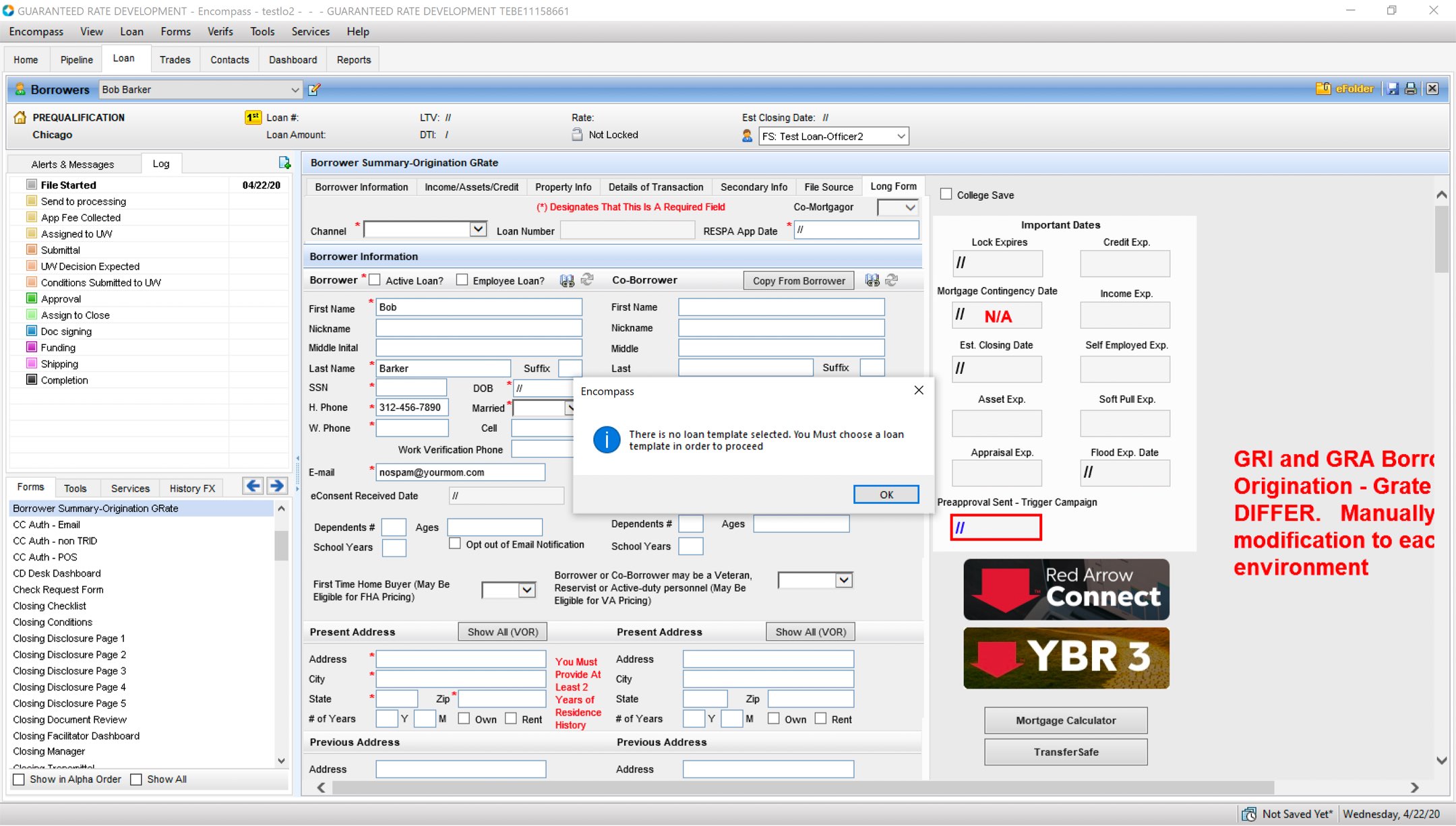
For LOs to be effective in their role at Guaranteed Rate they must shuffle through a half-dozen or more disparate systems each day. To make matters worse, many of these experiences are dated, slow and mobile-hostile.

Objective:
Super LO came about in an effort to streamline our Loan Officers’ key workflows and optimize them for multiple breakpoints in completely responsive, mobile-first UI.

The primary goal was to ensure LOs could easily service and efficiently grow their pipelines from anywhere. Our secondary goal was to limit our organization’s reliance on third party, one size fits all software solutions and the annually recurring financial burdens that accompany them.

We wanted to control our own destiny and custom tailor our LOs experience to best fit the Guaranteed Rate way of doing things, known as The Proactive POD Model.


Process:
I loved working on this project. It required massive collaboration and big systems thinking while solving countless smaller problems simultaneously for multiple different viewports.

Hanging in the balance were huge productivity gains for high-octane users LOs who were already generating hundreds of millions in loan origination volume and doing it with software that might as well be from the stone age. This was a prime opportunity to free them from a series awful, antiquated, inefficient tools that they were dependent upon to earn a living.

To start, I conducted user interviews with over a dozen LOs and their entire support staffs. I learned about their process, the order in which they operated, how they communicated and kept track of everything amongst themselves, their customers and what the biggest pain points were.

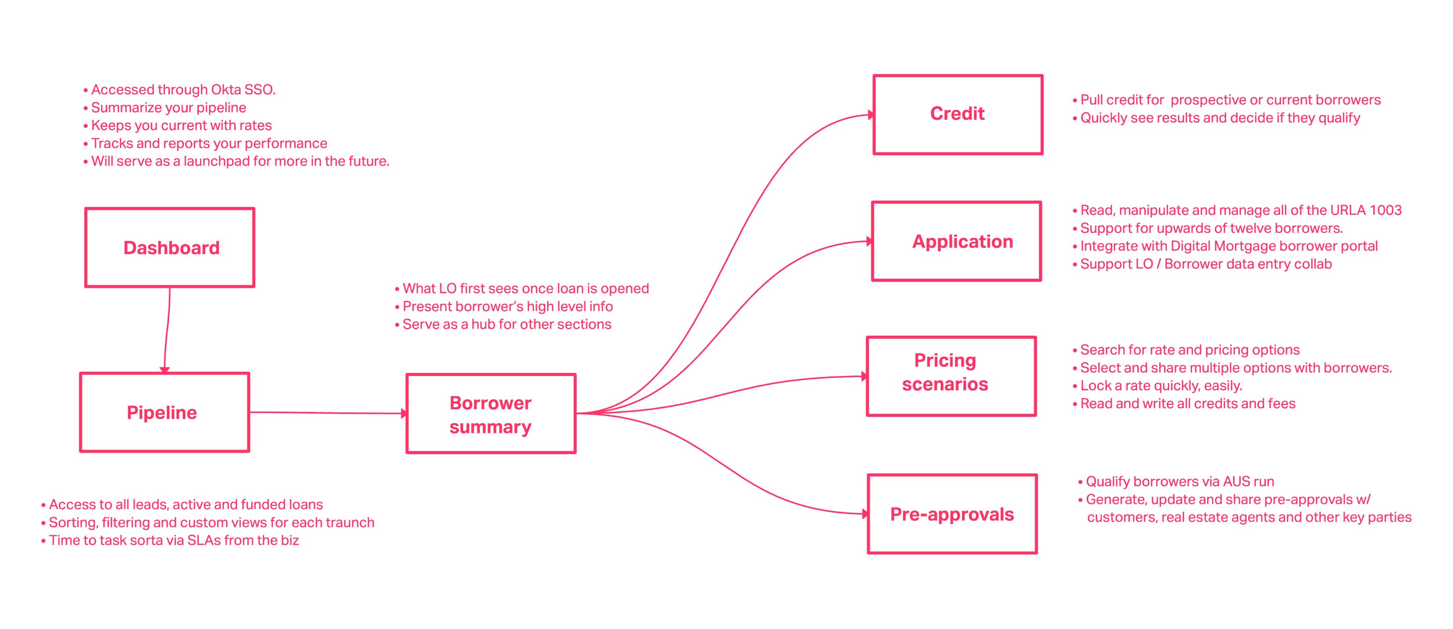
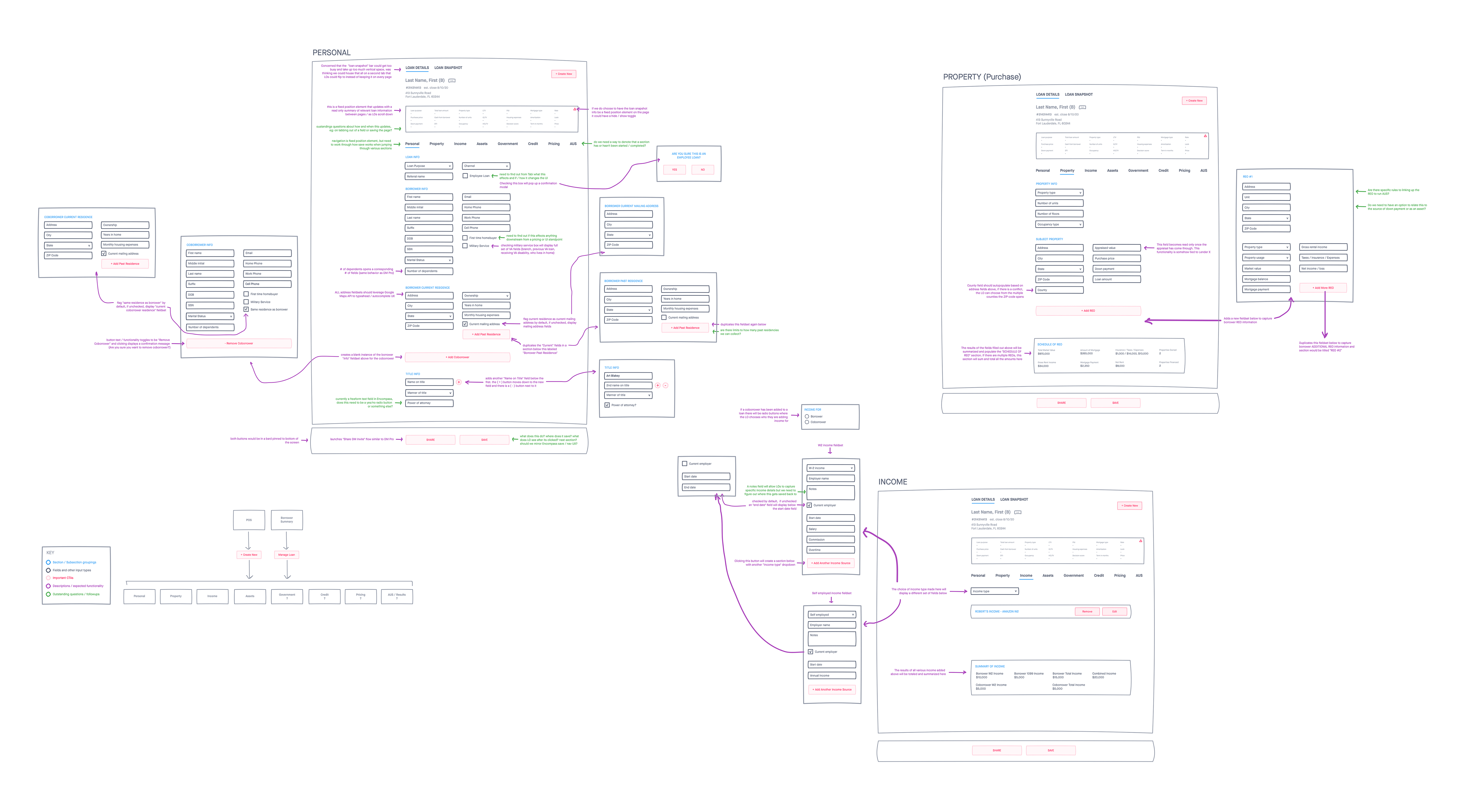
From those conversations, I sorted the findings and worked with my product leads to outline a core feature set and put together this early journey map below. It wound up serving as our cross-functional team’s northstar while we kicked off the sizable task of piecing this exciting new experience together from scratch.


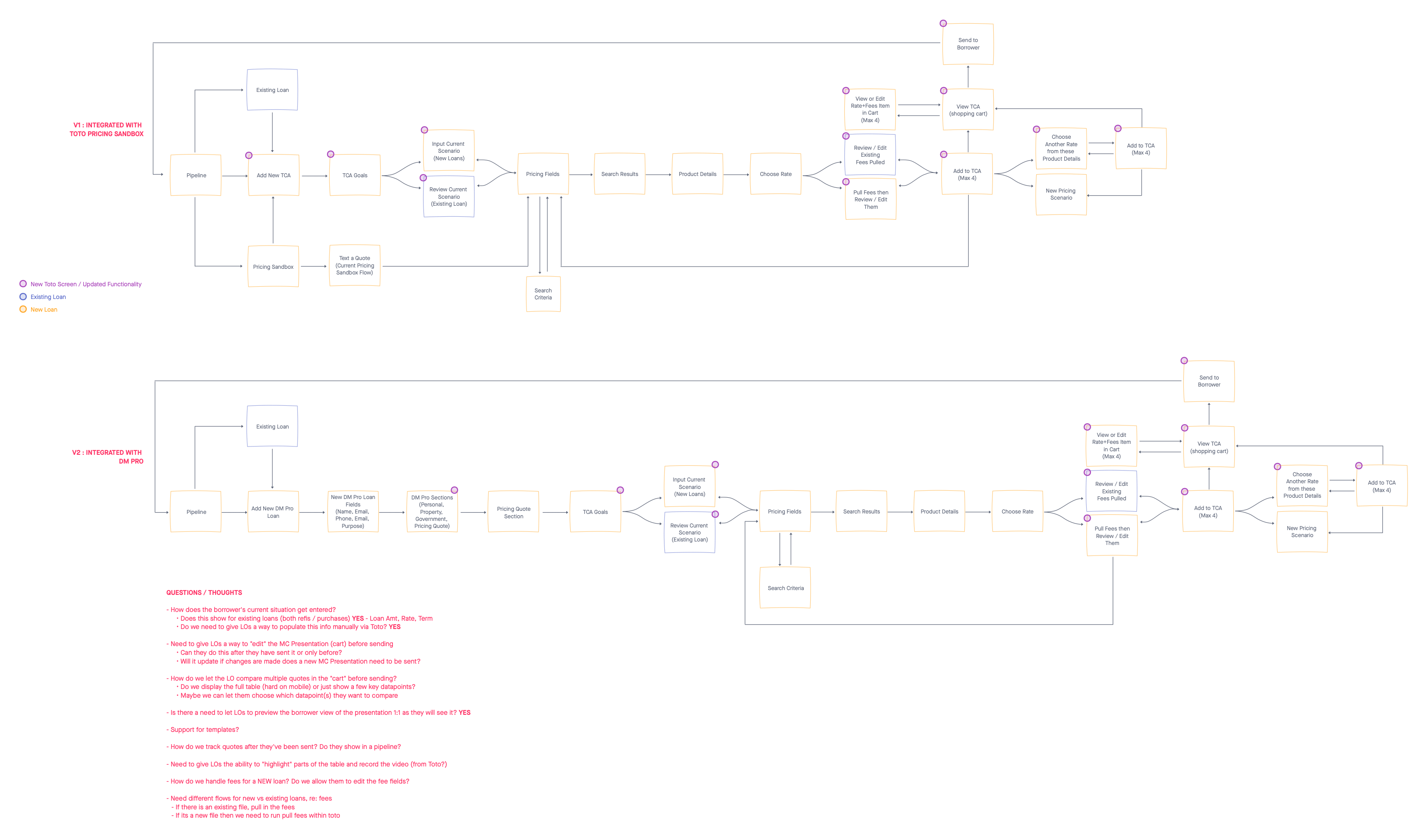
I used this simple flowchart as a basis for a far more elaborate interactive framework overview that documented much of Super LO’s core features, functionality and UI with just the right level of detail. It wound up evolving as we built out the app and served as a key reference point for my product and engineering partners, alike.

It was also incredibly useful in shopping the concept around for initial feedback from both LOs and business stakeholders while building a genuine buzz for it that would ultimately help us gain traction and user-adoption once we were ready to launch the beta.

I proceeded to wire out a myriad of different workflows, pages and interactions across the entire app, always looking to solve for simplicity, speed and fully-responsive UIs.


Super LO wound up with well over 150 screens and each had to be designed for 3 individual breakpoints. I was more thankful than ever that we’d worked as a team to stand up a rock-solid design system to rely on.

I built an end-to-end, clickable prototype and used it to conduct user testing with our LOs, looking to ensure that we were still on the right track after miring myself in all the gritty details.

Pairing closely with my product and engineering leads, we used the results of these feedback sessions to establish scope, prioritize features, set requirements and build a timeline for delivery that we tightly adhered to.

Hurdles:
This project had no shortage of challenges from the outset. First was the fact that my stakeholders insisted on complete feature parity between the mobile and desktop experiences rather than delivering a stripped down version for a phone. Talk about fitting an elephant through a keyhole, but hey, I do this job for the love of solving problems like this.

Next, was the fact that we were required to build upon and integrate with many existing, fragmented systems and service design patterns despite the fact that almost all of them came with plenty of their own baggage to account for.

Another was the fact that our goal was to take the LOs daily operations, which are largely unique to each user, and attempt to homogenize and organize them into a system that prioritizes the most important work at all times and points across the loan manufacturing process.

This resulted in a balancing act between the needs of our users (“Let me work how I want to work!”) and the operations vision of the business (“We know what’s best and we’re trying to run a well-oiled machine, here!”) It proved to be quite challenging at times, but nothing that wasn’t surmountable through transparency, pragmatism and communication.

Results:
Upon release, the response was overwhelmingly positive. We nailed the foundational features and the overall structure of the app was really well received. The LOs were genuinely excited. Not only at the prospect having a single point of sale experience for all their loan origination needs, but that it was built to suit their needs and that it was a completely fully-featured experience on mobile, as well.


We opened to a small beta group of about fifty LOs and the word spread. The folks in the GR product group had created something truly focused on helping our Loan Officers sell more effectively and earn more money. It didn’t long to eclipse 400 unique daily logins, with our beta group eventually ballooning to over 700 users with a company-wide launch planned for Q2 2023.

If the success of the beta is any indication for how successful the full launch to be, Super LO will allow us to stop licensing Ellie Mae Encompass, resulting in upwards of $7 million dollars of savings per year all while providing a vastly improved, more nimble experience.

Additional Artifacts:

Super LO Interactive Framework Document


Money Movement Platform – End-to-end payment orchestration

Monday, April 20th, 2026

Money Movement Platform

End-to-end payment orchestration
Context:
After standing up Paylocity’s Modern Tax System, which gave us a structured approach to managing our clients’ varying tax obligations, it became clear that how we’d historically been handling the underlying movement and reconciliation of funds left a lot to be desired.

As a Payroll and HCM company operating under a TPA / POA model with our clients, moving funds between Paylocity-held accounts, client accounts, employee accounts, tax authorities, and other entities is the linchpin of our business.

Unfortunately, our system for doing so became unruly after it had grown ad-hoc over the years. The resulting system and workflows were fragmented, difficult to manage, and relied far too heavily on manual intervention and tribal knowledge. That’s not a sustainable way to operate or scale an enterprise system.

Our different teams like Payroll, Tax, Banking Operations, Engineering, and Support all interacted with transactions in different ways, often relying on a mix of internal tools, database reports, and manual processes to request, execute, track, and verify the movement of money.

This resulted in a murky view and minimal shared understanding of how transactions actually moved through the system from end to end.

The Problem:
This lack of a unified model and standardized processes resulted in real operational challenges across the company.

At its core, our org’s workflow for moving money was still highly manual. ACH files had to be generated multiple times per day by Banking Ops users in order to be transmitted on time to meet bank processing deadlines. Missing a deadline could push payments out another business day, creating real downstream risk for time-sensitive obligations like payroll deposits or tax payments.

Aside from executing payments, there was no consistent way to manage or clearly understand transactions triggered from the many, various parts of our HCM platform. Different services implemented their own methods for requesting, funding, and tracking payments, which led to fragmentation across the system. Similar types of transactions were being handled in different ways depending on the product or team.

Our Banking Ops Teams had to rely heavily on spreadsheets, raw ACH and BAI2 files, and internal reports to piece together what was happening. This made even basic questions – internally or for clients – difficult to answer without manual investigation, which in turn was also a challenging process.

There was no shared platform responsible for performing money movement in a consistent, reliable way. Our services like Tax, Payroll, Rewards and others each owned parts of the process themselves, instead of being able to rely on a centralized system that could handle requests, execution, and status updates.

Combined, this all made the verification and reconciliation of funds (one of the most important jobs in the entire organization) far more complex than it needed to be. Banking Ops users were responsible for ensuring funds were successfully moved and accounted for, both at the payment level and at the client level, but they didn’t have a unified system to support those key, daily workflows in a structured way.

While spinning up our in-house full-service tax product put a spotlight on many of these issues, the underlying problem extended beyond any single domain. We had a platform-wide gap in how money movement was structured, carried out, and supported.

System Mapping:
The first step I had to take was making the entire system understandable.

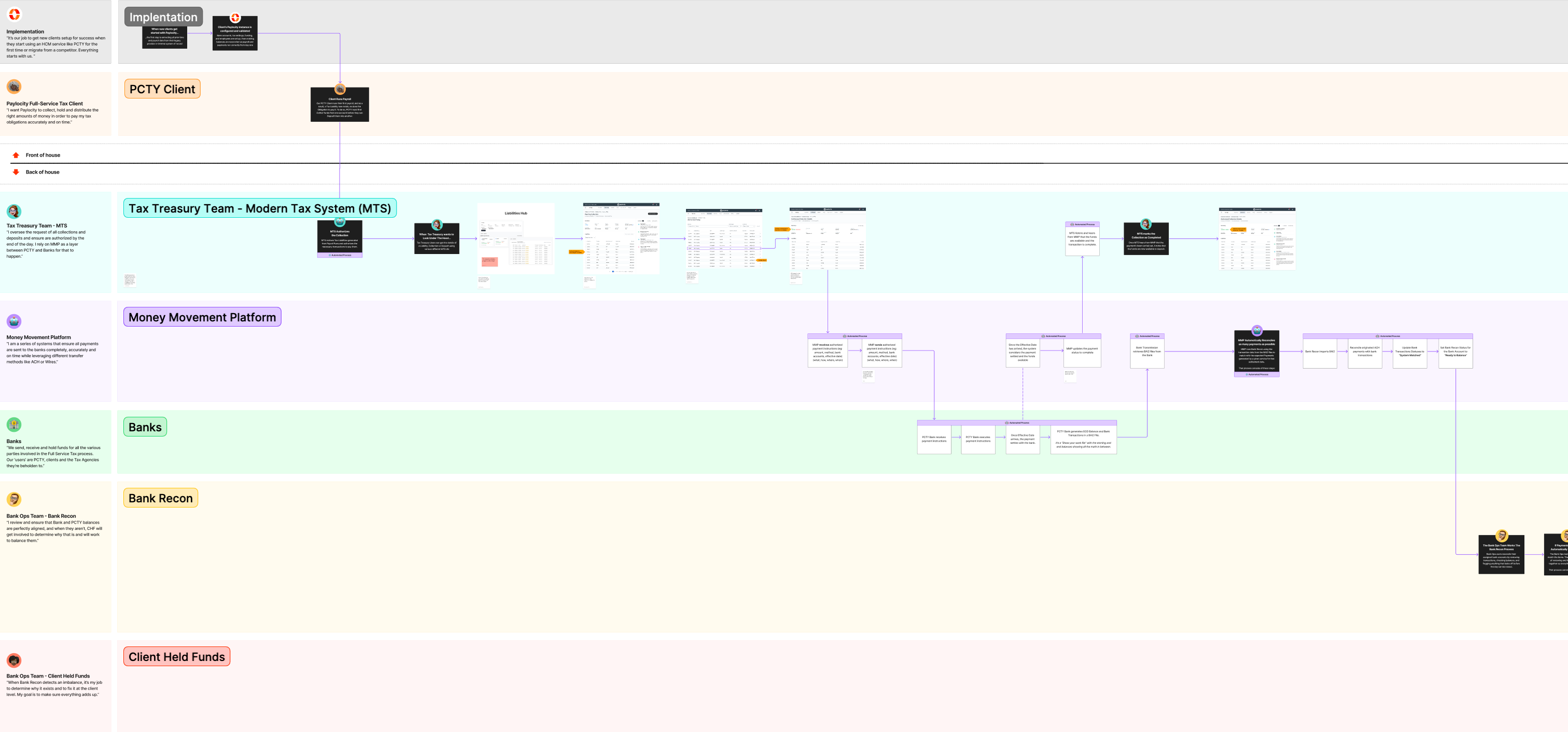
In order to do so, I built a service blueprint that mapped the full lifecycle of a payment, starting with Client Onboarding, followed by a Payroll run through to Tax and Money Movement, into and out of the Banks and back into Paylocity for Reconciliation.

It clearly depicted the journey of how funds were requested, processed, and ultimately verified and told the story across multiple swimlanes to show how transactions should actually move through the system from end to end.

It also made inputs, outputs, and dependencies between systems explicit, helping us identify gaps, overlaps, and failure points as we evolved the document into its final form below:

Rather than focusing on a single product or workflow, my goal was to capture the system as a whole and define a clear model for how it should operate. This made it possible to see how different services initiated requests, how funds were moved between accounts, what could be automated, where human intervention was still required, and how reconciliation was handled after the fact.

This became a shared artifact used across the triad to align both teams and stakeholders on how money movement worked and how it should evolve moving forward. It was built through close collaboration with product and business partners to uncover how these processes functioned in practice, where they were breaking down, and how they could be improved through a more unified system.

Most importantly, it established a common language and mental model that let Product, Design, Engineering, and Ops all discuss the system in the same way. It fast became something we frequently referenced in stakeholder discussions, was regularly pulled up in working sessions, and also wound up being really useful when onboarding new team members.

Designing for Multiple Roles:
One of the most important parts of this work was accounting for the different teams, roles and systems involved across the lifecycle of a transaction.

This wasn’t a platform built for a single type of user. It had to support a range of areas, each with its own goals and responsibilities. From clients running payroll, to Tax teams managing obligations, to Banking Ops reconciling funds, everyone interacts with money movement in a different way. They all have different priorities.

To accurately capture this, I partnered closely with my product and business partners to understand how each role actually operated, what they needed from the system, and where things overlapped.
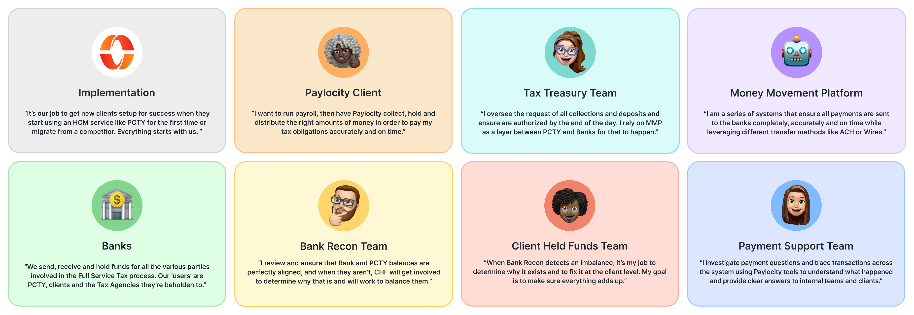
Key Money Movement Participants

This resulted in a set of clearly defined participants that were baked directly into the blueprint, ensuring the system reflected the full range of users and workflows involved in moving money end to end.

The Platform:
Visually mapping the system cemented the notion that we needed to treat money movement as a shared platform underlying our different HCM services rather than something that each one implemented bits and pieces of on its own.

Instead of embedding portions of payment logic within Tax, Payroll, and other products, we built a model where they’d just hook into a centralized platform and make a request. Any service could now simply ask that a specific amount be collected from one account and delivered to another by a defined date. This gave us a consistent, systematic way for services to move money and laid the groundwork for greater automation, speed, and accuracy across the organization.

From there, the Money Movement Platform would take over and automatically carry out the transaction, from funding, executing, tracking, and updating the status of each payment as it moves through the system. This ensured requests were handled quickly, accurately, all while reducing the need for human intervention.

This created a clear separation of labor with services defining what needed to happen and the Money Movement Platform handling how it happened, positioning it as a service enablement layer across the organization. This allowed products like Tax, Payroll, Rewards and more to rely on a shared, consistent foundation rather than implementing their own fragmented solutions.

Transaction Visibility:
Outside of fast, accurate and automated money movement, the most immediate gap the platform addressed was visibility into transactions. By centralizing all transaction activity into a single source of truth, users could track the complete lifecycle of any payment from start to finish.

Before, answering even basic questions about a payment often required digging through multiple systems, reports, and raw data files. There was no one place to see how a transaction was initiated, where it was in the process, or whether it had successfully completed.

Payment visibility needed to be treated as a first-class part of the platform, not some sort of afterthought. That meant building a centralized, searchable record of all transaction activity to help users understand what happened, why it happened, and how to respond.
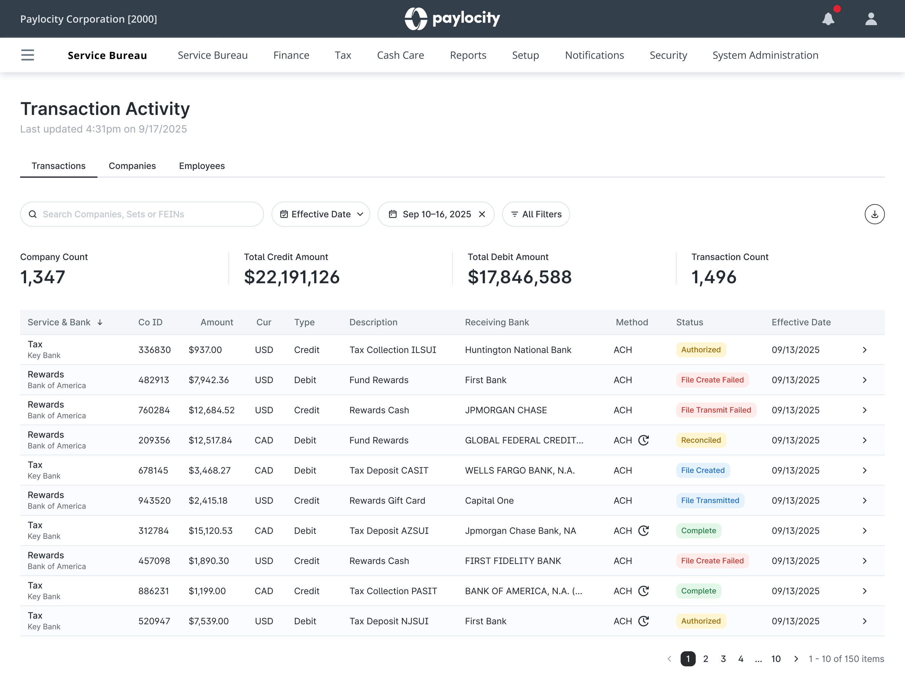
Default view shows recent transactions across companies Users can search by company ID, Set ID, or FEIN Users can switch between different milestone date types Plenty of filter options to narrow down transaction results Detailed transaction view supports both client and internal inquiries
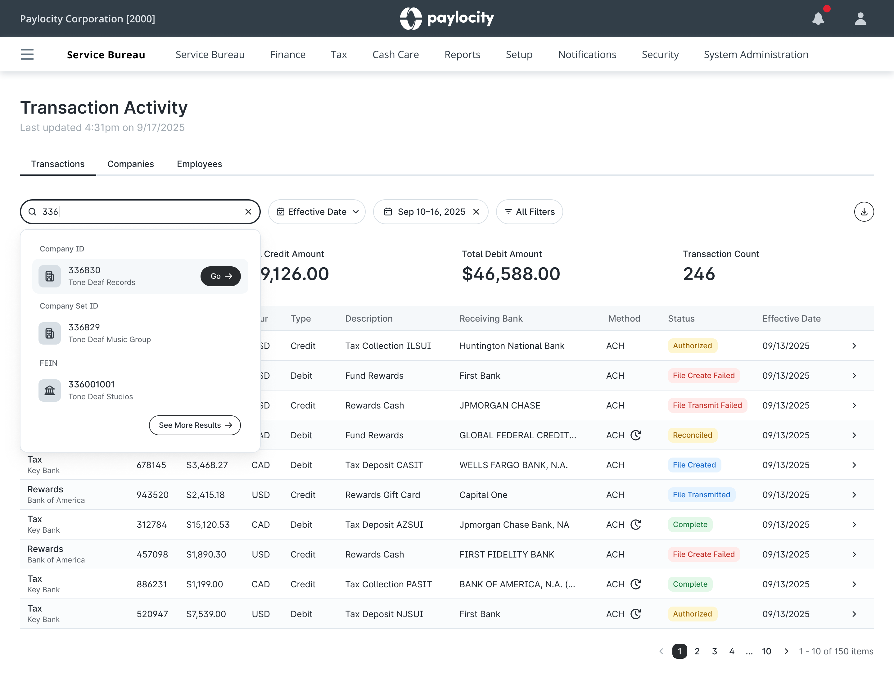
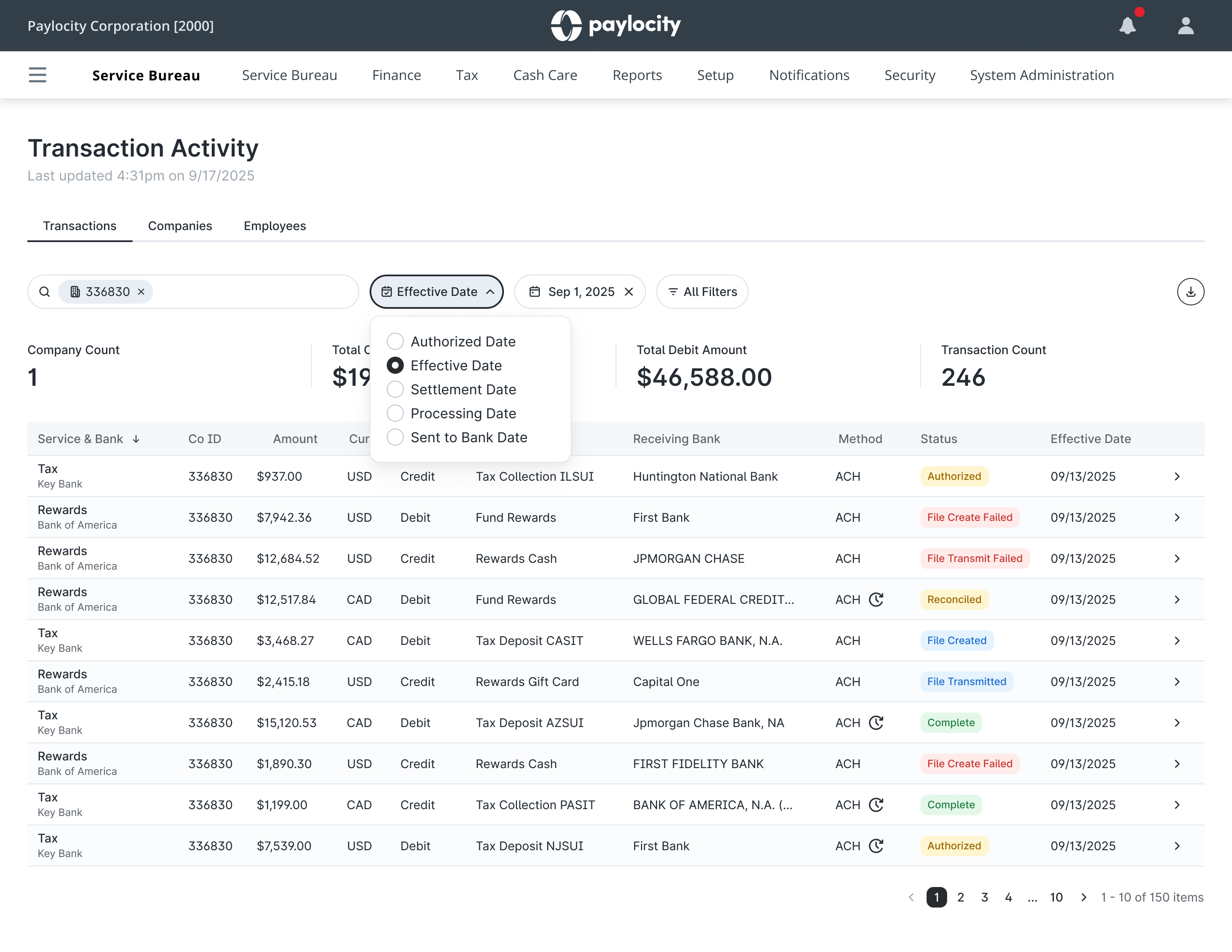
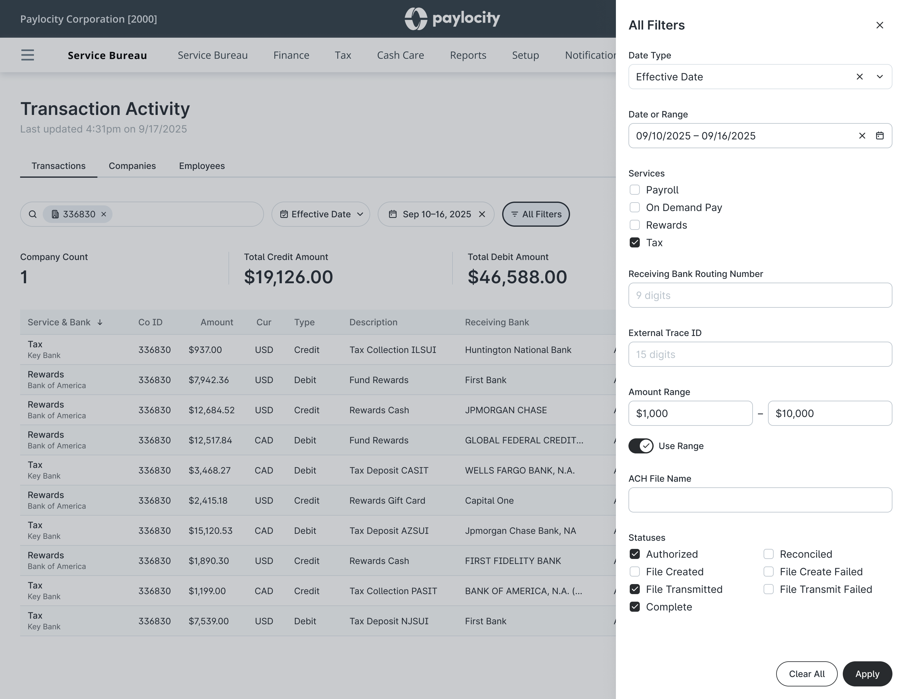
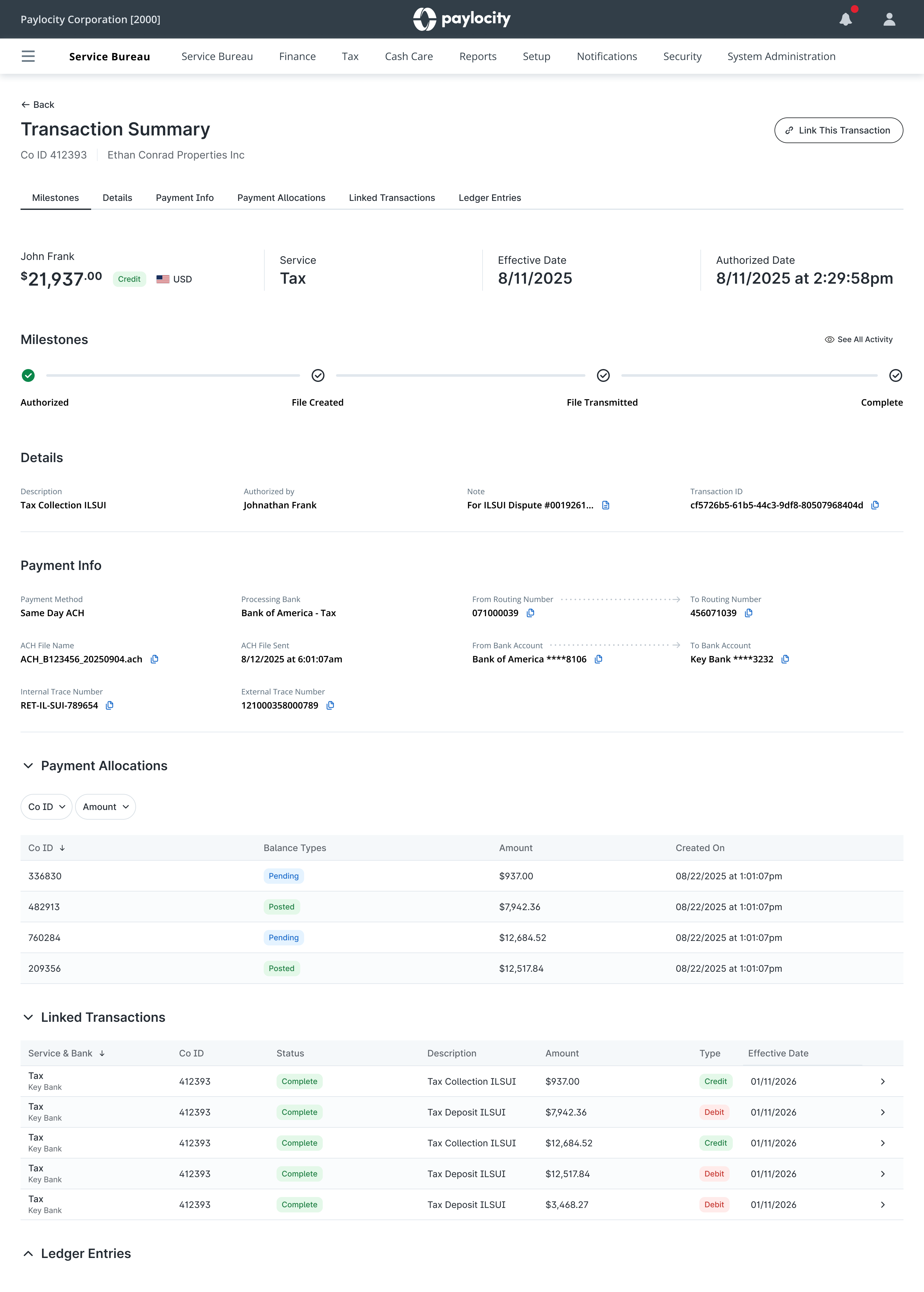
Rather than relying on spreadsheets, ACH files, or engineering support to run database queries, Bank Ops users could now search a unified record of transactions, including key details like amount, source and destination accounts, and status.

Their jobs became significantly easier. They could trace transactions, quickly ID issues, and reduce the amount of manual investigation needed to understand what was happening or answer urgent questions from clients.

At the time, this visibility was only available internally. Clients themselves had no direct way to see or understand their payment activity, which meant these questions always had to be routed through support.

While Transaction Activity immediately improved how our internal teams handled these requests, it also served as a proving ground for something larger. By centralizing transaction data and validating it through internal workflows first, we were laying the foundation for eventually delivering that same level of visibility directly to clients as a self-service experience.

The Impact:
Creating a unified Money Movement Platform gave Paylocity a consistent and reliable foundation for how funds were handled across its ecosystem.

By centralizing payment functionality, we reduced duplication across services and enabled far more scalable workflows, all while improving accuracy, speed, visibility, and automation at the core of our business.

This also helped position Paylocity to scale its payment infrastructure and support new financial products without requiring each service to build its own money movement logic.
Modern Tax System – Tax operations platform

Tuesday, April 7th, 2026

Modern Tax System

Tax operations platform

Context:
Payroll taxes are one of those things that nobody really cares or thinks about until something goes wrong.
At Paylocity, we process payroll for 40,000+ companies, each responsible for paying and filing taxes across ~13,000 jurisdictions on different schedules. These include both employer and employee taxes, so the stakes are high.

Each payroll run kicks off a chain reaction. Tax liabilities are generated based on the amount, funds are collected, deposits are made, and returns are ultimately filed as a record.

And because we operate under a TPA / POA model with our clients, we don’t just play a supporting role in this process – we own it. If something fails, it’s not just a Product or UX issue, it impacts our business, the client, and the relationship. Things like missed payments, penalties or interest all carry real financial risk.

The Problem:
The legacy system we’d been licensing for years wasn’t built to handle that level of responsibility. it was an expensive, fragmented third-party platform heavily reliant on manual coordination. Different teams owned different stages of the tax lifecycle, but nothing clearly connected them.

In theory, the workflow should:

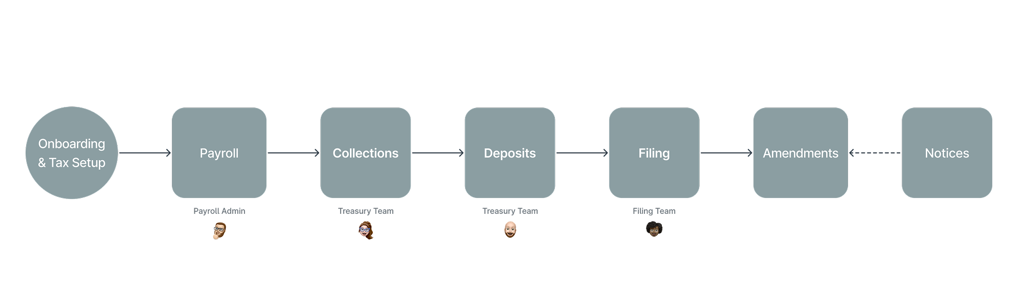
Tax Liability > Collect Amount > Deposit Amount > File Return

In reality, however, things broke quietly, and we found out too late. A missing EIN. An expired TPA. A company or branch opening in a new jurisdiction that wasn’t fully set up with that tax agency. Small issues were allowed to proceed until they failed, when the cost of fixing them was already high.

Our teams weren’t just doing the work, they were also constantly stopping to investigate, rewind, and recover from failures that could have been avoided in the first place.

Insight:
It became clear we weren’t dealing with downstream problems, we were dealing with upstream issues going undetected.

It turned out that paying and filing payroll taxes aren’t just a series of steps, it’s an interconnected system, and if something is wrong early, it has a domino effect that worsens as it moves forward. So instead of improving individual steps, I asked “What if we could validate tax jobs as they move through the process in realtime and put the brakes on the one with issues the moment they’re detected?”

Approach:
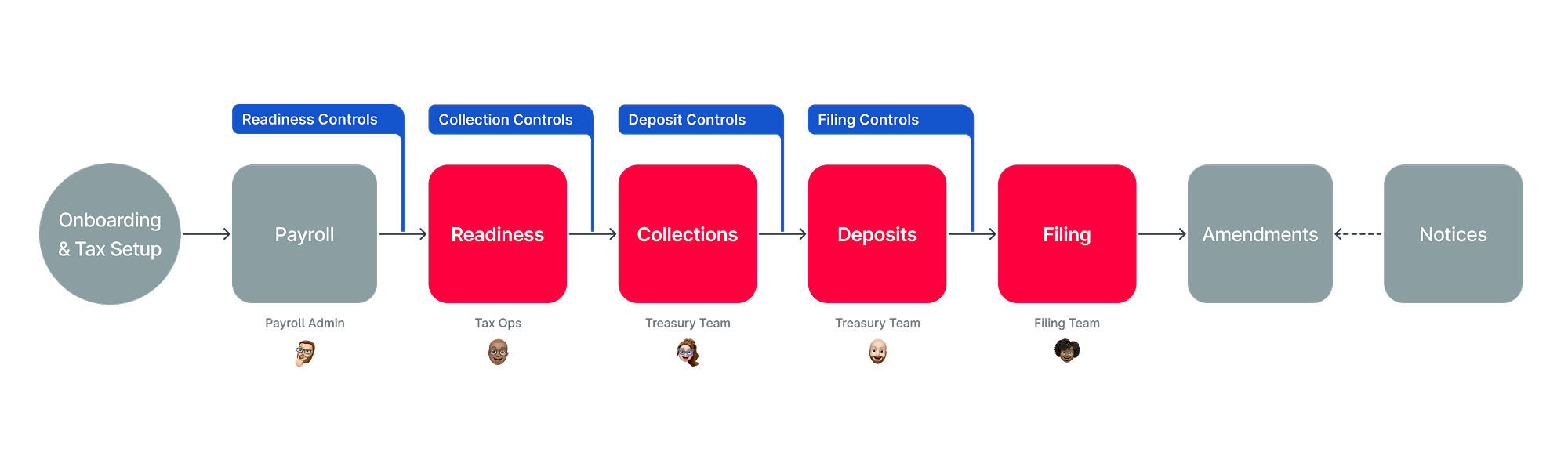
I worked with my PM and Tax Ops partners to map the lifecycle end-to-end and together we identified where failures originated and how they propagated. From there, we introduced controls.

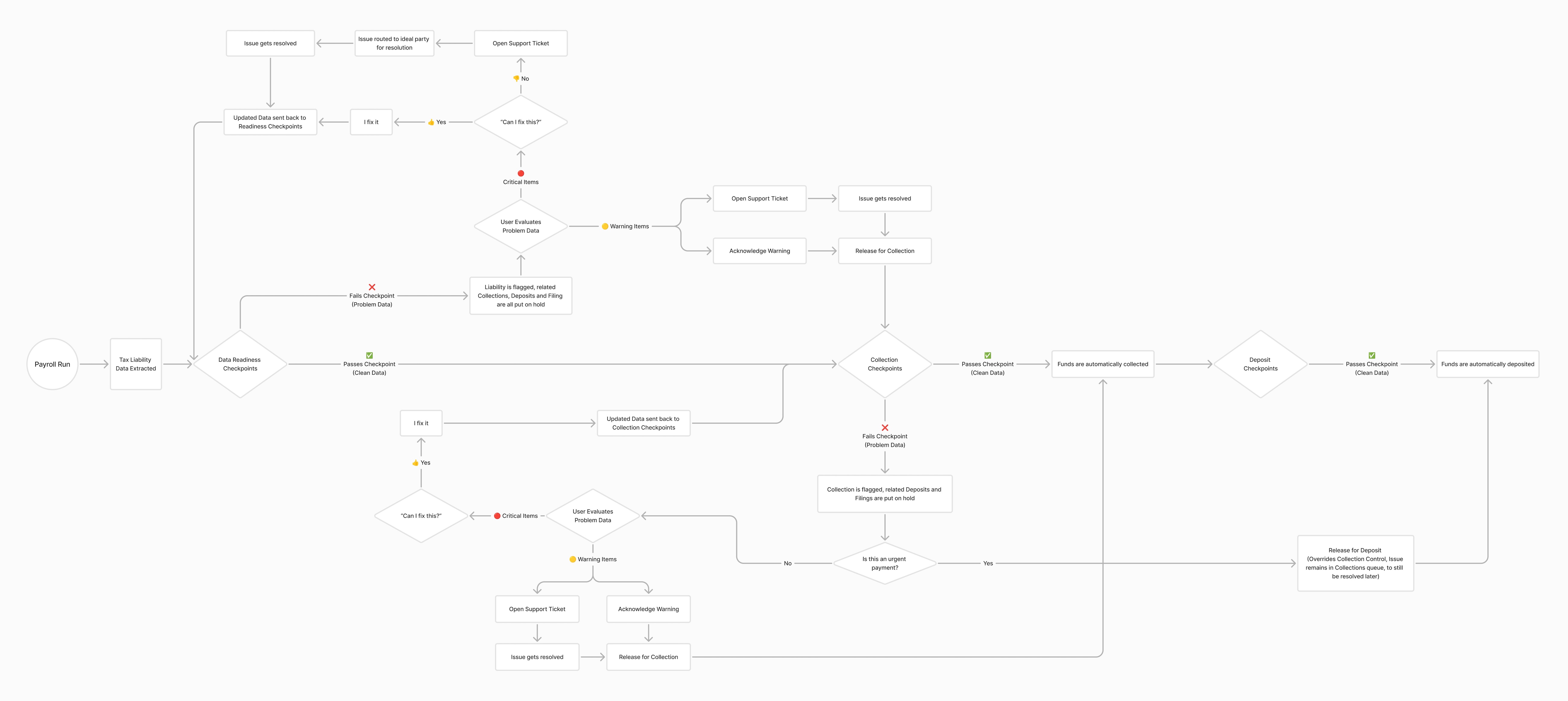
Tax Treasury Flow With Control Checkpoints Old Workflow

What are controls? They’re systematic, validation checkpoints that exist across the entire payroll tax process. At each phase, MTS would evaluate whether all the right conditions are met before allowing any given tax job to proceed. If something is wrong, the controls system detects it, flags it and doesn’t let it pass.

New Workflow

We wound up with over 90 different controls after our first pass, which meant that there had been dozens upon dozens of things that were historically mucking up the works of a smooth and successful tax processing operation. Yikes.

You. Shall. Not. Pass! …with a control violation

Designing Readiness:
We absolutely wanted to break our reliance on legacy software, but it wasn’t enough to simply replace it with a new version of the same thing. As such, I was adamant about interjecting a new piece into the end-to-end process we named “Readiness”.

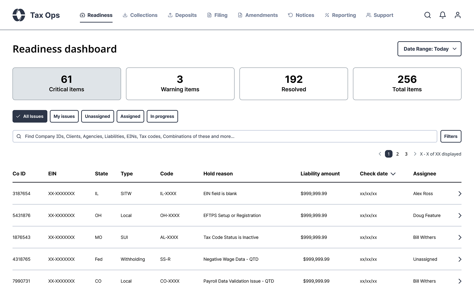
Instead of problems appearing to pop up randomly across different tools and portions of the process, everything rolls up into one, centralized place. Paylocity could now operate the payroll tax process holistically instead of piecemeal.

Readiness Dashboard

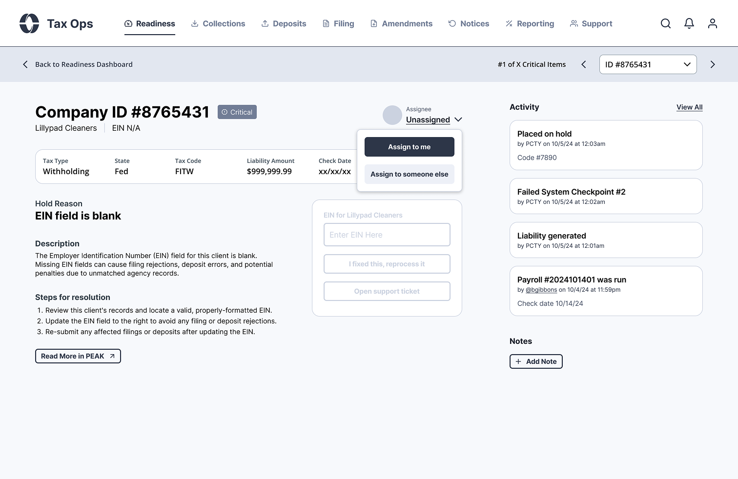
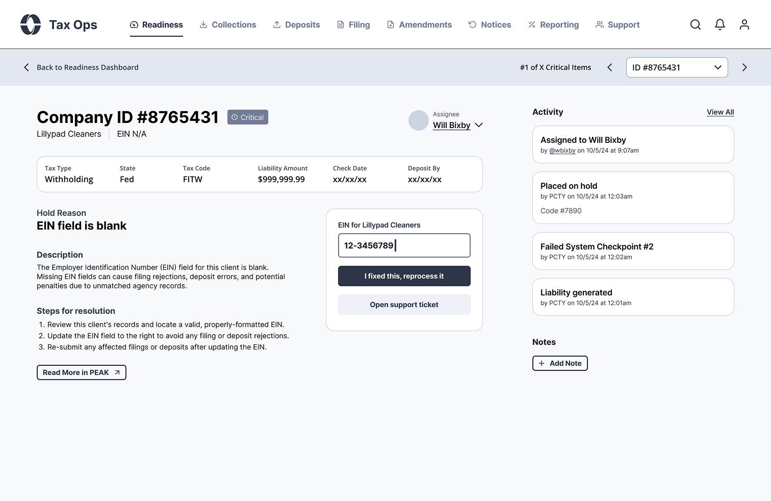
Teams can immediately see what’s broken, how severe it is, and where to focus. Opening an issue shows exactly what triggered it.

Issue Detail View

An incorrect or missing EIN might not seem like a huge deal, but in this scenario here, it will block filing later, which, in turn, makes collecting the funds from the client and depositing them into agency coffers a moot point.

Instead of finding that out downstream once a filing fails, the system detects and surfaces it immediately. Surfacing the problem isn’t enough, the system needs to help resolve it.

Guided Resolution

MTS clearly explains what needs to be fixed and prompts users take action directly from within the same UI. No digging, switching tools, or guesswork needed.

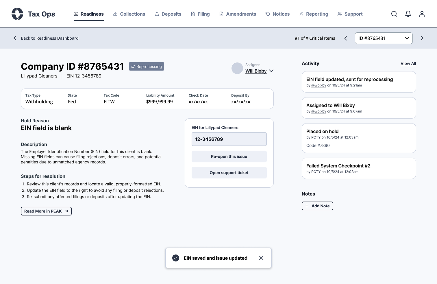
Reprocessing the Issue

Once a fix is submitted, the system re-validates the tax job against the control that caught it in order to ensure that there won’t be any additional blockers as it moves along.

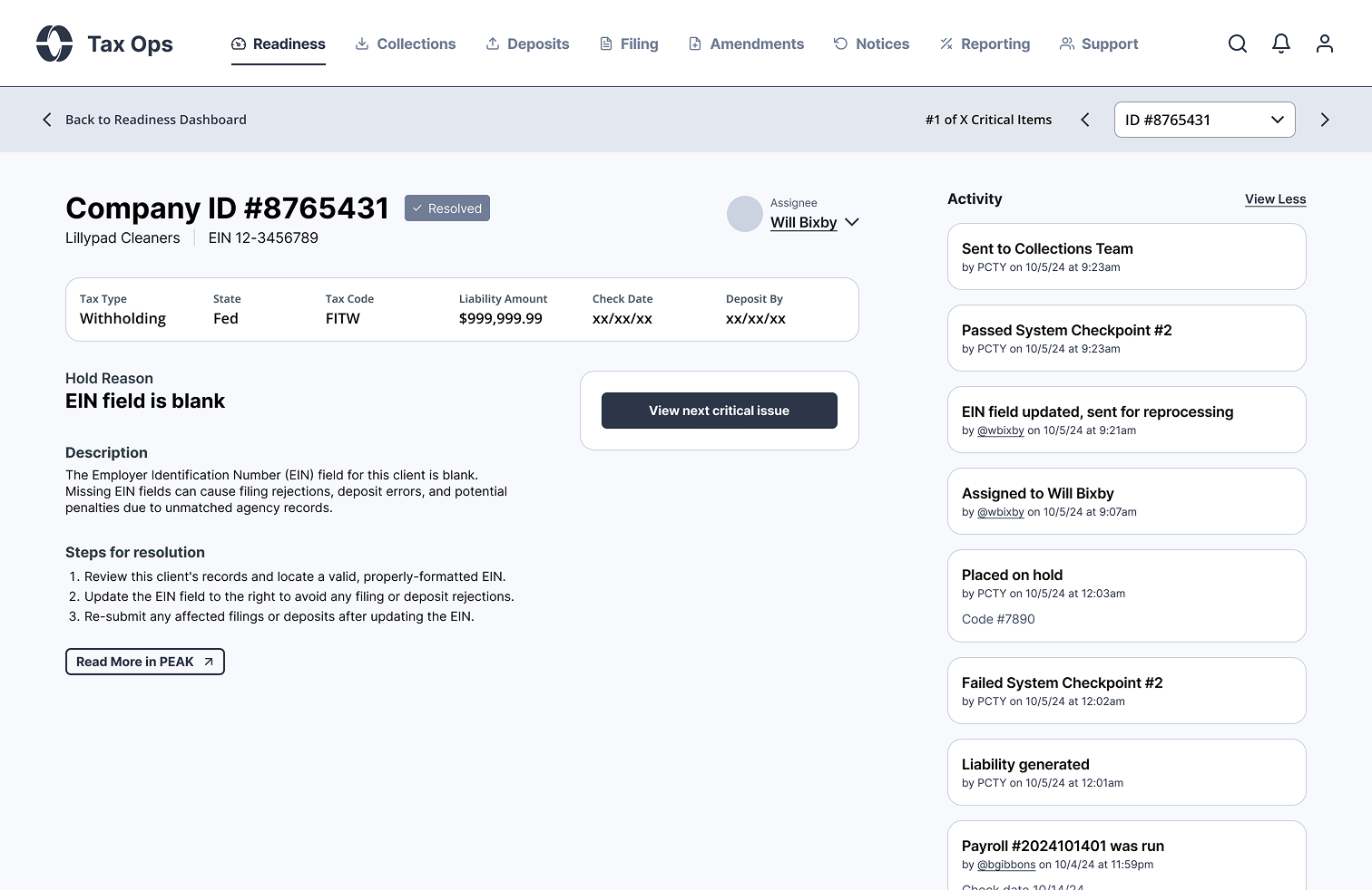
Resolving the Issue

If the tax job passes without being caught by any controls, the workflow resumes automatically, the user is prompted to work the next issue, and a complete history is captured for troubleshooting and auditing purposes.

This wasn’t just for validation, it was about providing our users with visibility, too. Every issue includes a timeline of what happened, who touched it, what changed and all of that context is carried downstream as the tax job moves onto the next phase in its lifecycle.

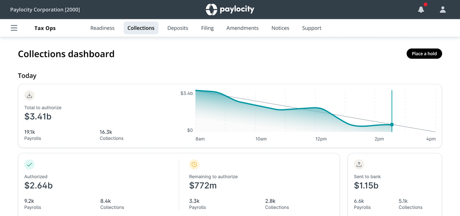
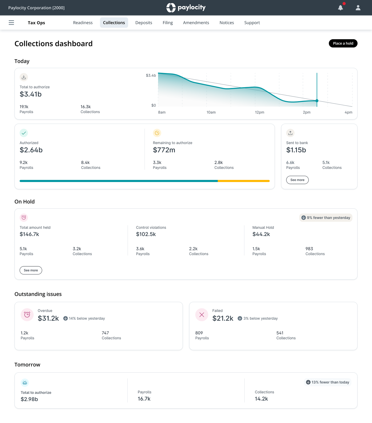
Treasury Team Collections Dashboard

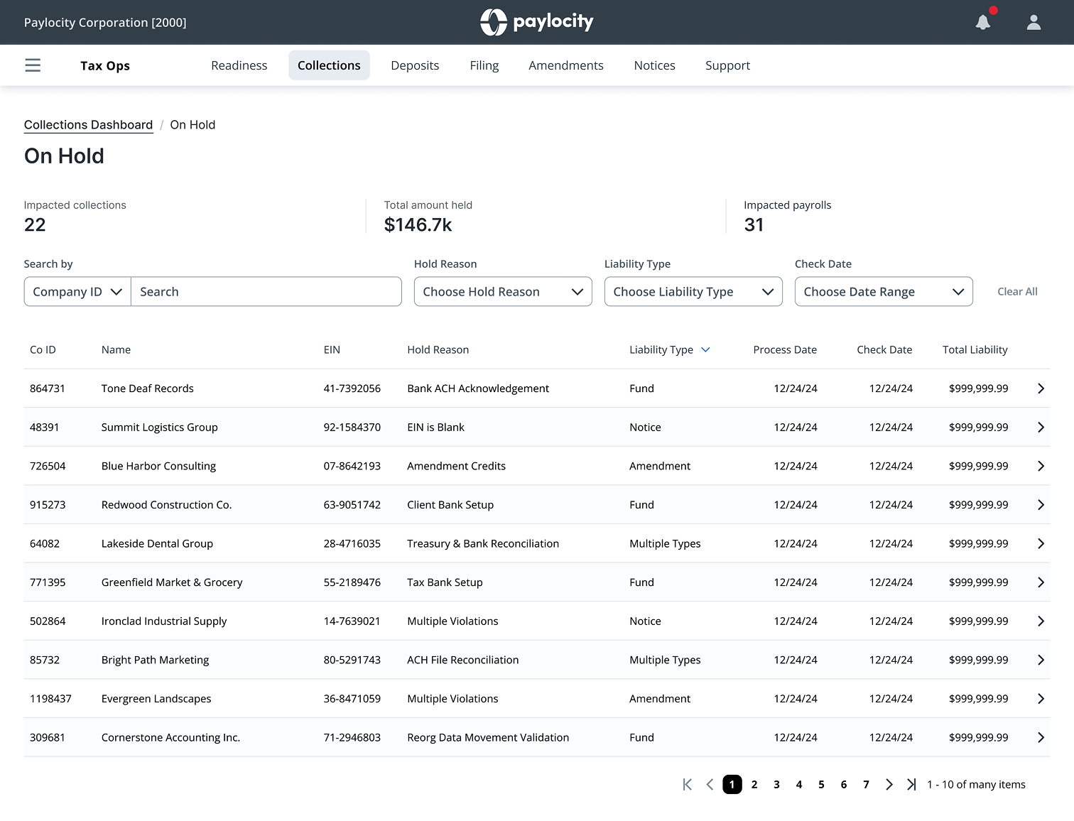
When a tax job fails a control, it doesn’t just show up in Readiness, it’s also surfaced to the Treasury Team in their workflow. This allows them to keep tabs on all of their tax-related work, regardless of whether or not it’s blocked by a control violation or proceeding along as intended.

Collections On Hold

Within Collections and Deposits, users can drill into any transaction, but the On Hold view ties directly back to Readiness. It shows exactly what’s blocked, why it’s blocked, and what needs to happen next. This makes it easy to keep clients informed and support Tax Ops without asking around or digging through reports.

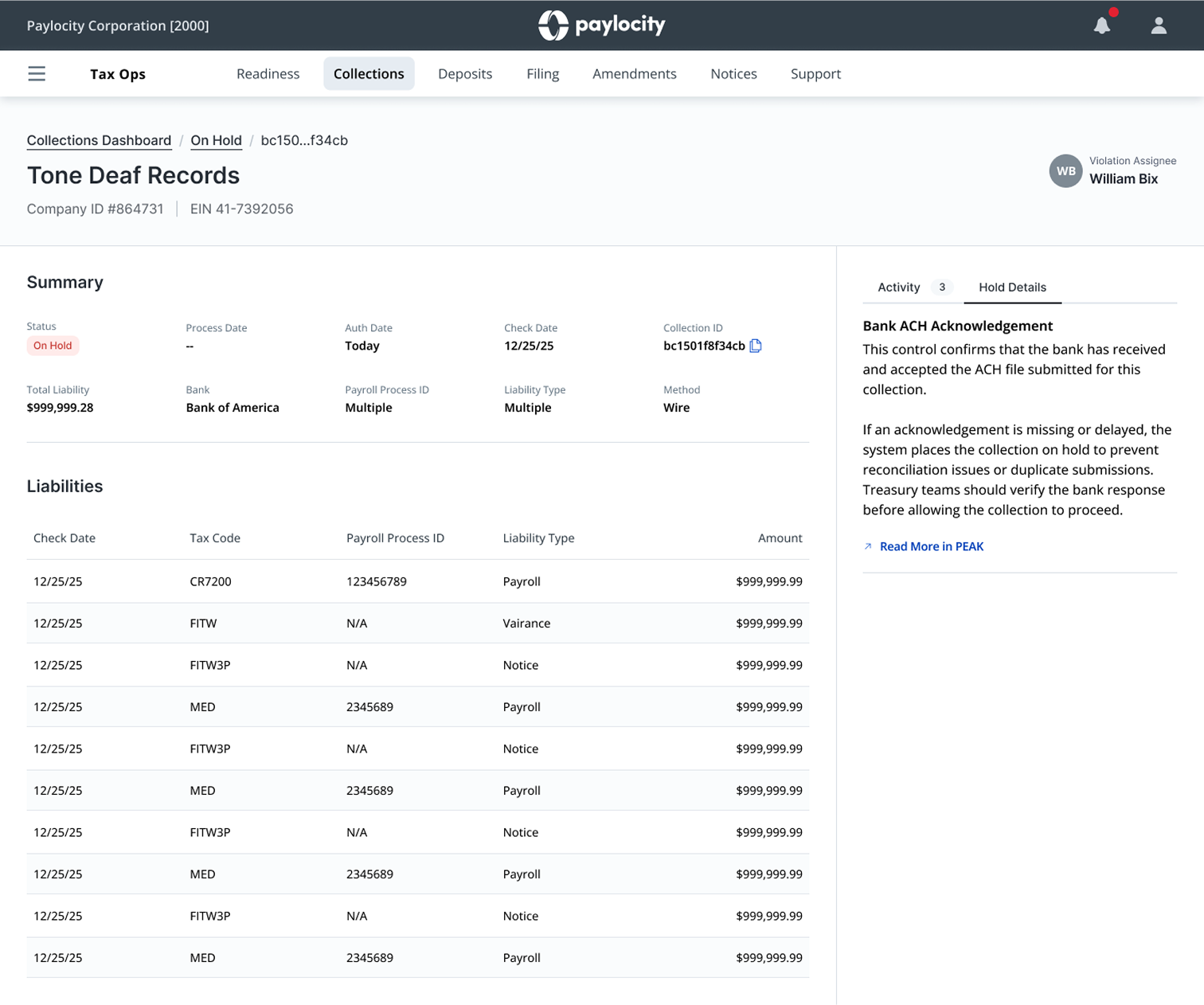
Details Page – On Hold Collection

The details page is the final piece of the puzzle. After drilling in, Tax Treasury users can see the full picture, presented in a way that aligns with their mental model. Things like the transaction details, hold reason, audit trail and a breakdown of the individual liabilities within the overall payment are all readily available to them.

Outcome:
This wasn’t just some series of UI and workflow improvements, nor was it simply sunsetting an awful, third-party legacy tool. It was a fundamental shift in how Paylocity was able to process and file payroll taxes.

Work no longer marched blindly forward. Instead, tax jobs were now continuously validated, and issues were caught at the point of introduction rather than at the point of failure.

As a result, our slew of different Tax Ops Teams could work in a far more optimal manner. They spent less time reacting and more time doing performing their duties: collecting funds, making payments and filing returns.

This methodology also enabled us to offload the detection and resolution of issues to a dedicated Tax Ops support team rather than using the valuable time of our more specialized Tax Treasury and Filing users to do so.

Business Impact:
We were able to eliminate a $12M+ annual dependency on a third-party platform from a direct competitor in the HCM space. Moreover, owning the entirety of both the system and operational workflows allowed us to have complete control over how our payroll tax processes were executed and how they could evolve. It built a foundation to optimize and grow upon moving forward, letting us control our fate and turn on a dime should future events dictate the need.

Operational Impact:
Issues are now detected and resolved faster, instead of surfacing at the worst possible points in the lifecycle. By introducing controls upstream, we significantly reduced downstream failures in collections, deposits, and filing.

Teams are no longer spending time piecing together what went wrong across multiple systems. Readiness provides all the necessary context in a single, centralized space making the problem clear and resolution straightforward.

Its framework allows us to layer in additional controls as we continue to operate and grow. The 90 or so we launched with was just the beginning.

Strategic Impact:
Now that we’ve got a system that we actually own and can evolve, one that exists as a single, unified platform, we’re able to adapt workflows quickly, layer in automation where it makes sense, and start building toward more intelligent, data-driven operations.

Instead of being constrained by external tooling, we can now move faster and shape the system based on how our teams actually work and improve how they work over time.

My Role:
I led design across the project, from discovery through system design and delivery. This required aligning Tax Ops, Treasury, and Filing around a shared model of how the system should work. I suggested the need for a controls system and worked closely to help define it’s framework, advocated heavily for and designed the Readiness layer, connecting upstream validation to downstream execution. I helped turn a fragmented, high-risk system into something structured, visible, repeatable, and usable.

Final Thoughts:
This initiative wasn’t just about replacing a legacy system with one we could own or making tax workflows easier. Sure, we did all that, but it was really about making things harder to break.

By introducing tax job validation and connecting our teams through a single, shared system, we shifted from reactive problem-solving to proactive control over one of the most important aspects of our entire business.

Headshot

Thursday, July 13th, 2023

Hey! I’m Nejat!

I love making sense of messes and building impactful things.

I’ve spent years working with great people, products and orgs and I cant imagine doing anything else with my life. Get to know me by checking out my work or just feel free to hit me up.

Super LO Point of sale experience
Loan Finder Rate recommendation engine
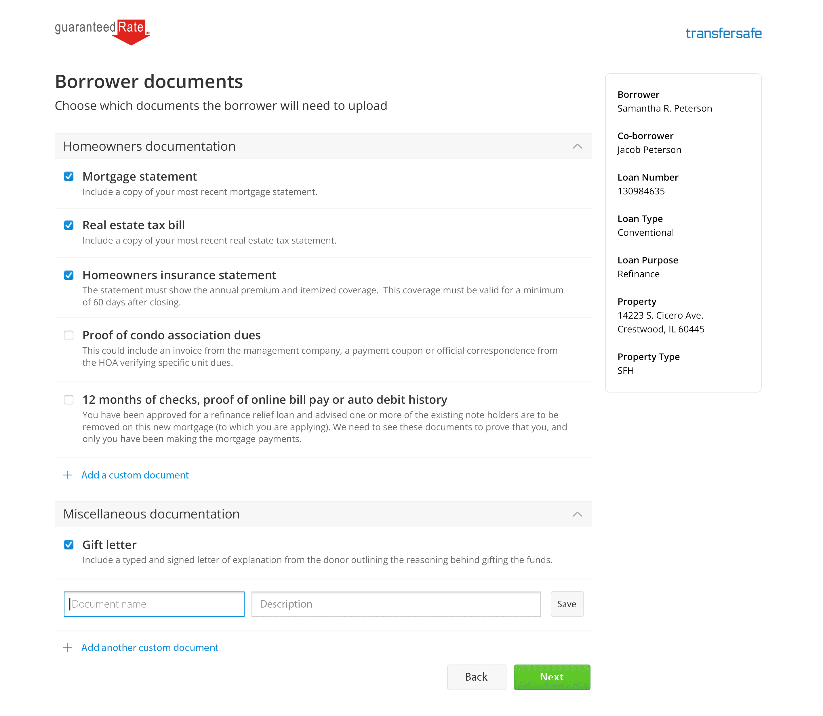
TransferSafe Secure document portal
Agent Advantage More loans, faster closings

Agent Advantage

Tuesday, July 11th, 2023

Agent Advantage

Background:
In the retail mortgage space, the relationship between Real Estate Agents and Loan Officers is the engine that drives the bulk of the business. Word of mouth is a powerful thing and trust is essential when it comes to making one of the biggest financial transactions of your life. The majority of loans that GR originates come from Agent referrals who bring us more Borrowers than all other intake channels combined.

As a result, Loan Officers spend a significant portion of their day in a reactive state, maintaining these essential relationships by responding to questions like “where’s the loan at?” and “is everything still on track to meet our estimated closing date?”

Guaranteed Rate had built individual apps to support both Agents and Loan Officers, but these two pillars of our loan manufacturing platform were completely siloed from one another and lacking any cross-system visibility or functionality, despite the importance of the Agent + LO relationship.

Objective:
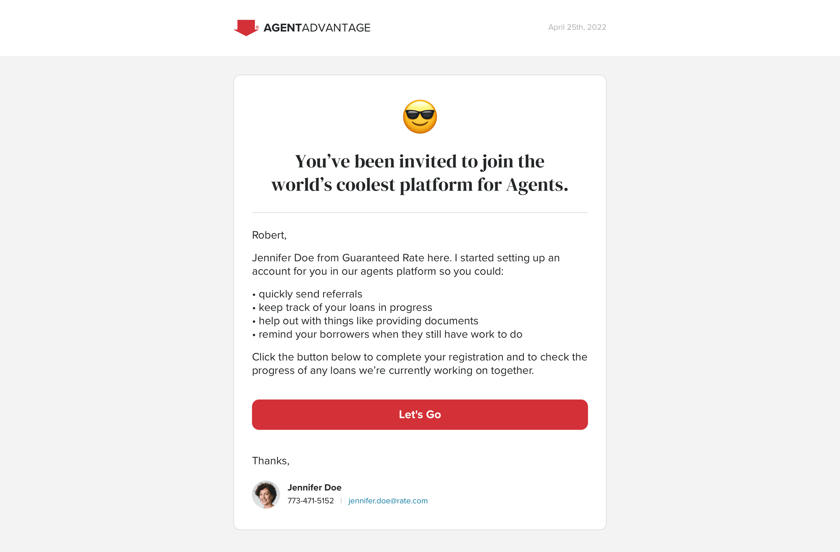
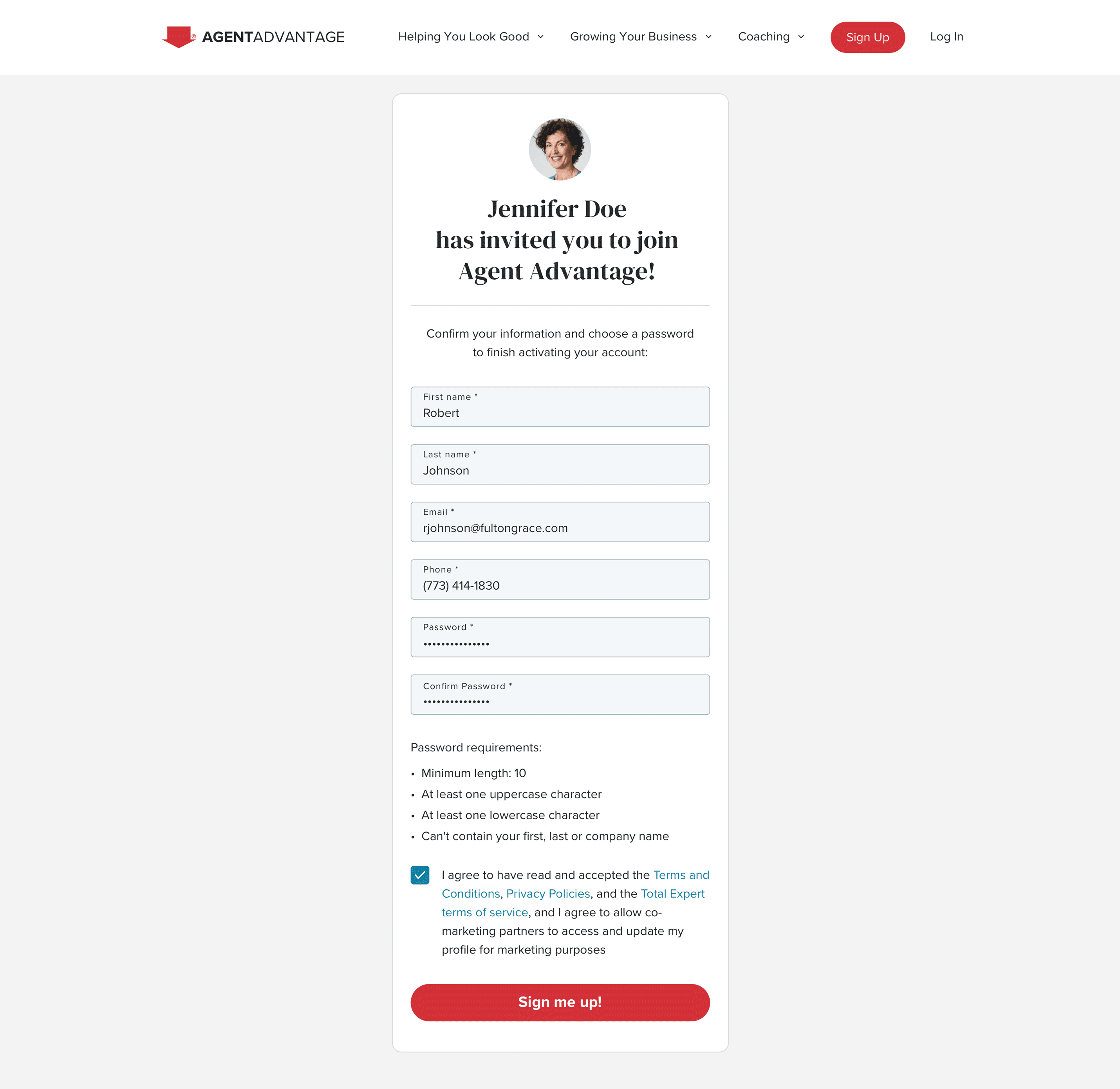
My goal was to design a workflow that would string these disparate systems together and enable our LOs to easily invite their referral partners to use our Agent Advantage platform or connect with existing Agents who were already on it.

Loan Officers would then be able to link Agents to their Borrowers that had loans in progress with the aim of getting all key parties on the transaction connected, collaborating and synced up on important milestone updates and critical loan-related tasks.

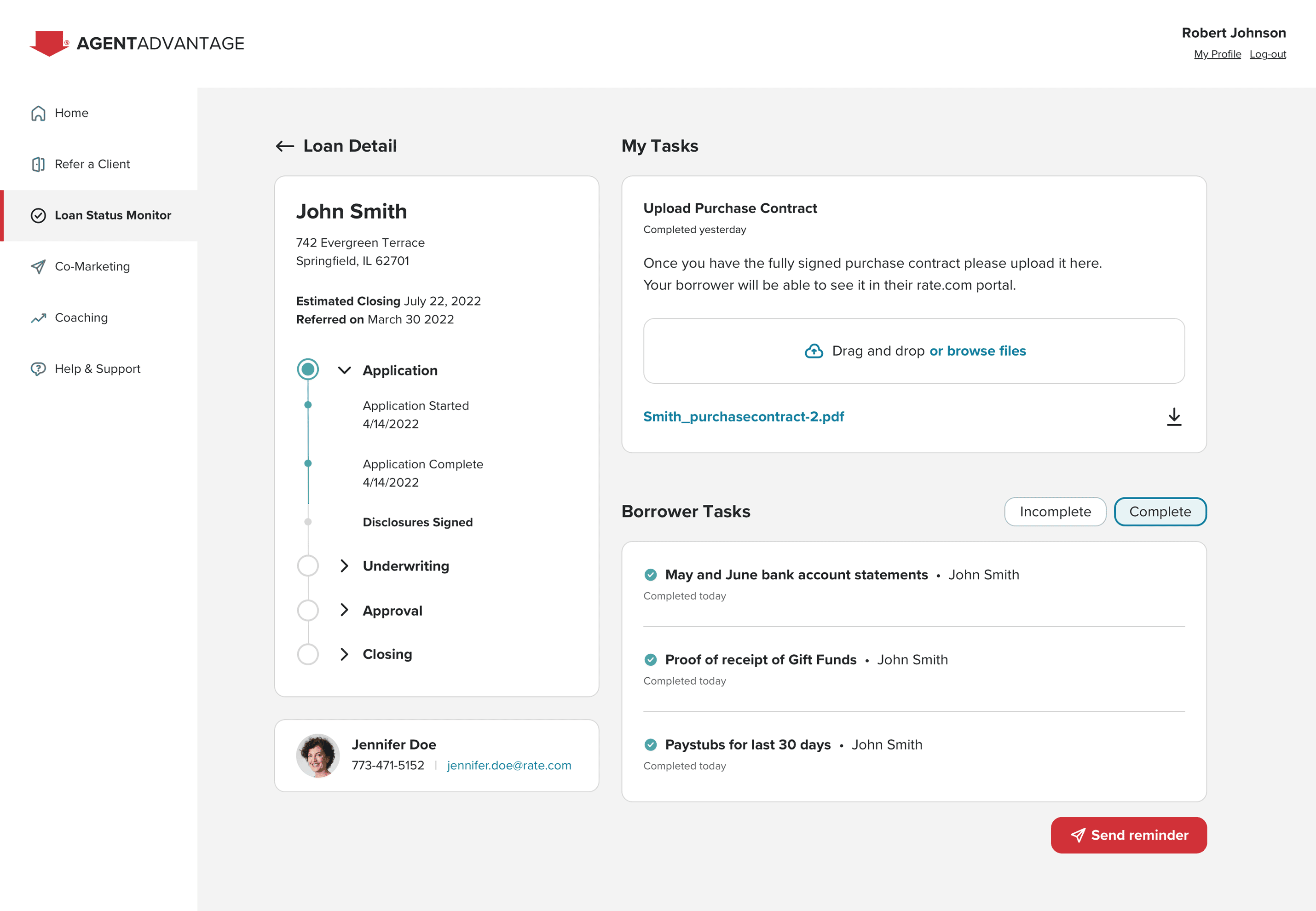
This was done by providing Agents the ability to track the loan status of any borrower they referred, delivering much needed transparency into how their client’s loan journey was progressing or if there were encountering any impediments along the way.

There was also a huge opportunity to accelerate loan processing time by providing the functionality to upload crucial documents like the purchase contract, which nearly always originates from the Agent’s office, anyhow. Doing so would save time by cutting down on unnecessary work and reducing the need for consistent calls and emails checking in for status updates.

Process:
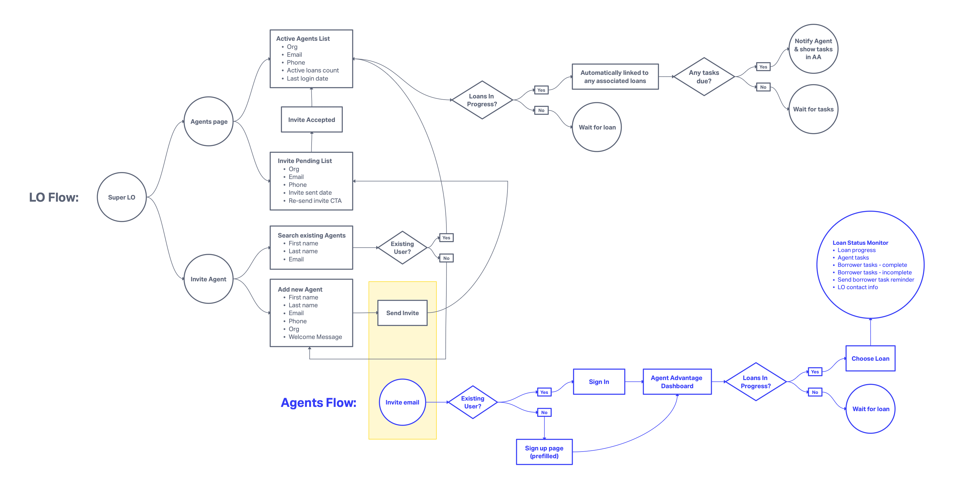
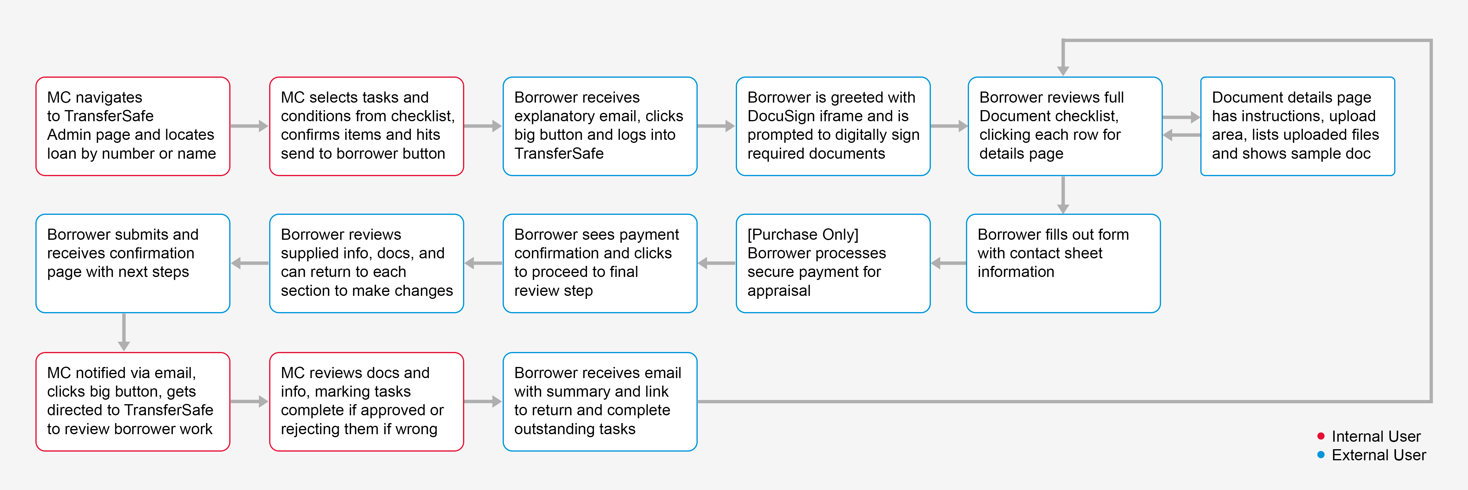
I paired closely with my lead product and engineering counterparts and to map out a set of features were within scope to deliver in just a handful of sprints. Once I had the feature list in hand I went to work on putting a flowchart together for both the LO and Agent experiences:

Once I got sign off from my team on the proposed flows I got banged out the new screens needed for each of the two apps while trying to utilize as much of the existing frameworks as possible.

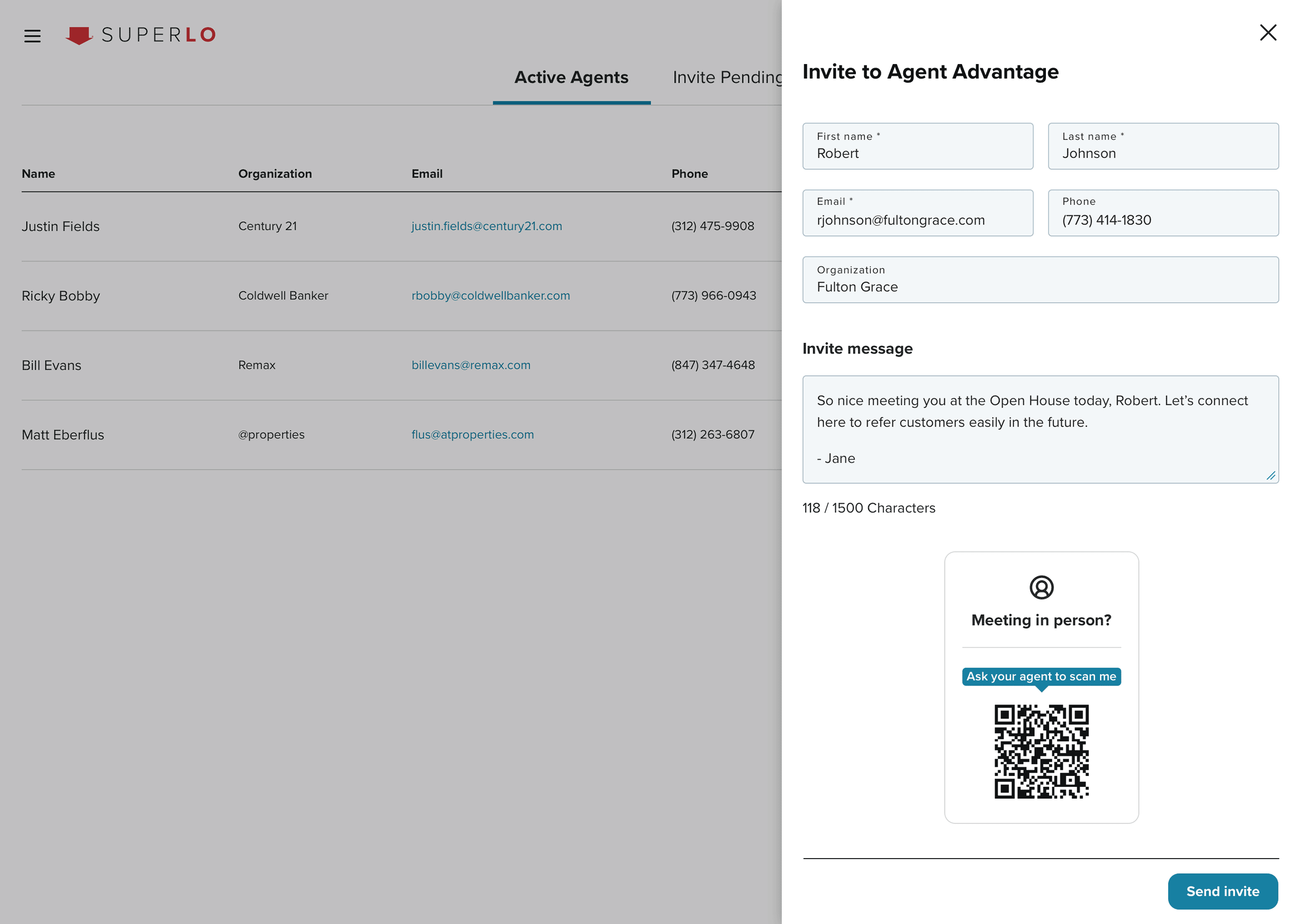
In talking with various LOs during discovery, it became clear that many of their relationships with Agents began at events like open houses and mixers, and that we could skip many of these invite and onboarding steps by having them scan a simple QR code with their phone. I confirmed the feasibility of this feature with my engineering lead and after getting the green light, I built it into the “Add New Agent” drawer.

Results:
By bridging these systems, we were able to add significant value for two essential personas with minimal lift. Loan Officers reported getting fewer emails and calls from their referral partners asking for status updates and our Agents were able to check loan progress for their clients any time they needed without having to reach out and ask for it.

Additionally, analytics showed that Agents were using two key features quite often: actively uploading the purchase contracts themselves rather than having their Borrowers perform that work and sending reminders to their Borrowers to stay on top of them if they weren’t completing their assigned tasks.

This push to connect Super LO and Agent Advantage helped GR chip away at its prime KPI of reducing the amount of days from pre-approval to closing and helped ensure that our referring Agents were more likely to receive their commissions, and in a more timely fashion.

TransferSafe

Sunday, June 11th, 2023

TransferSafe

Background:
Once a borrower applies for a mortgage and is pre-approved by a Loan Officer, the real work begins. Contracts have to be drafted, reviewed and signed. A barrage of documents must be requested then supplied. Homeowners insurance has to be acquired and proof provided. Appraisals need to be ordered, paid for and completed — and these are just for your run of the mill, vanilla purchase or refi.

The days between pre-approval and closing is one of Guaranteed Rate’s biggest KPIs and getting a loan up to and through Underwriting is often the most costly and time consuming part of the entire process. It consists of Mortgage Consultants and Underwriters reviewing and organizing countless documents that Borrowers supply to prove that they are truly qualified for the loan they want.

When I joined Guaranteed Rate, these tasks (and many others) were completed as if it were still 1997; with paper, faxes and email attachments. These methods weren’t only antiquated but resulted in significant security, efficiency, transparency and accountability concerns.

Objective:
To address these issues, I was tasked with designing TransferSafe, which we eventually rebranded as myAccount. It’s primary goal was to the bring the post-application phase of the loan approval process into the 21st century and tightly integrate these tasks with our in-house loan origination system and GR’s POD Model. To do so, we had to accelerate and bolster collaboration between the key personas in the loan manufacturing process; Borrowers, Mortgage Consultants and Underwriters.

We later set our sights on expanding the platform to include the automation of borrower tasks, reducing errors and speeding up the verification of income and assets by integrating with third party services like AccountChek and The Work Number and building out sticky content like mortgage payment processing, credit health monitoring, home valuation reporting and fast-tracked refinances.

The aim was not only to ensure speedy and seamless closings with as few hiccups as possible but to keep Guaranteed Rate top of mind for our borrowers once the initial transaction of closing the loan was complete. Generating new customers is a lot more costly than retaining existing ones and there was so much more we could offer our borrowers to keep them engaged with our umbrella of various services.

Guaranteed Rate’s product org was a brand new group at the outset of this project. We were handed a tight deadline, broad business requirements and had no shortage of eyes on us. Getting a successful MVP out quickly would be a massive win not only because of the impact it would have for borrowers, LOs and their support staffs, but also for earning the trust of our many key stakeholders while cementing the reputation of GR’s product org as both effective and reliable.

Process:
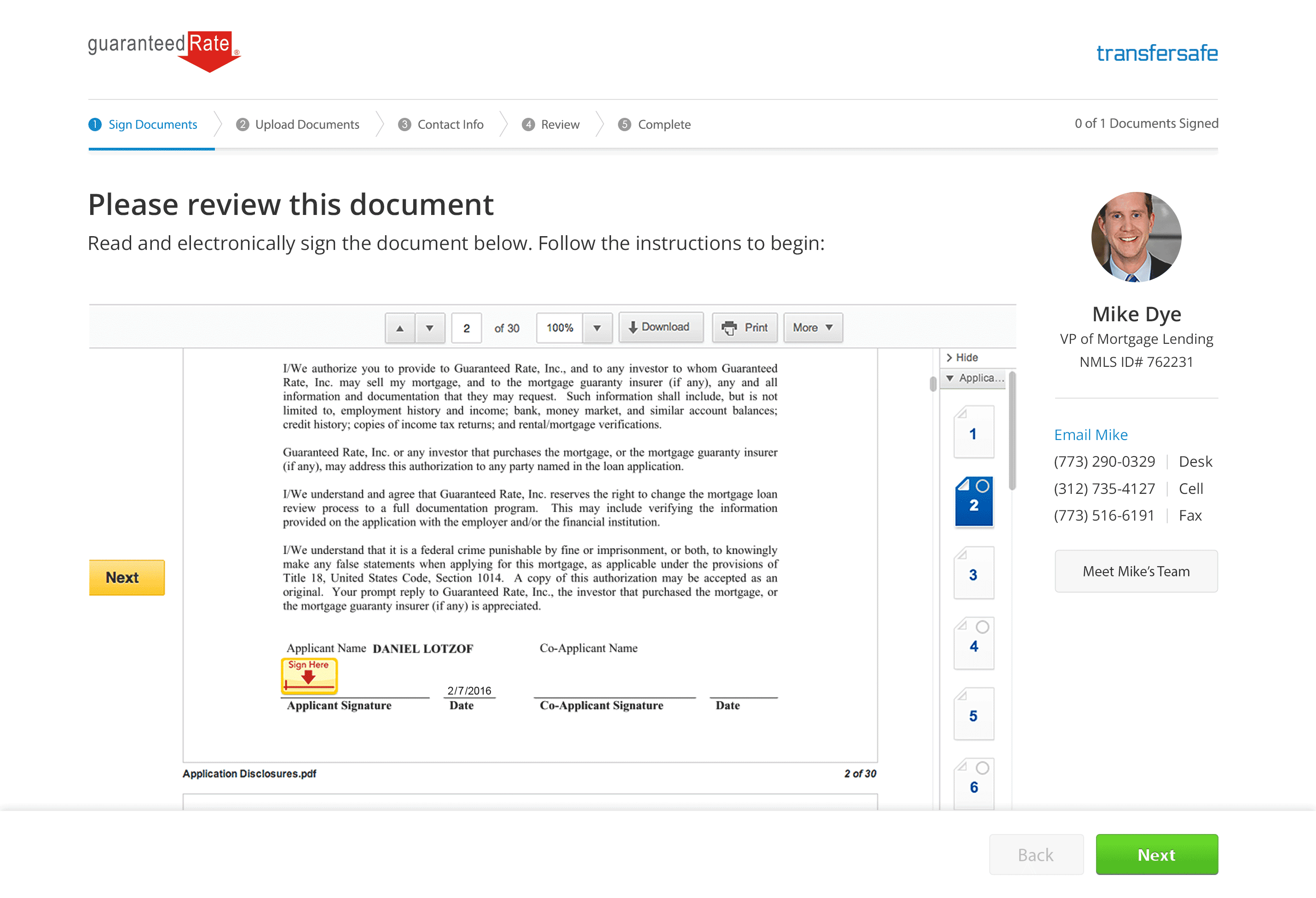
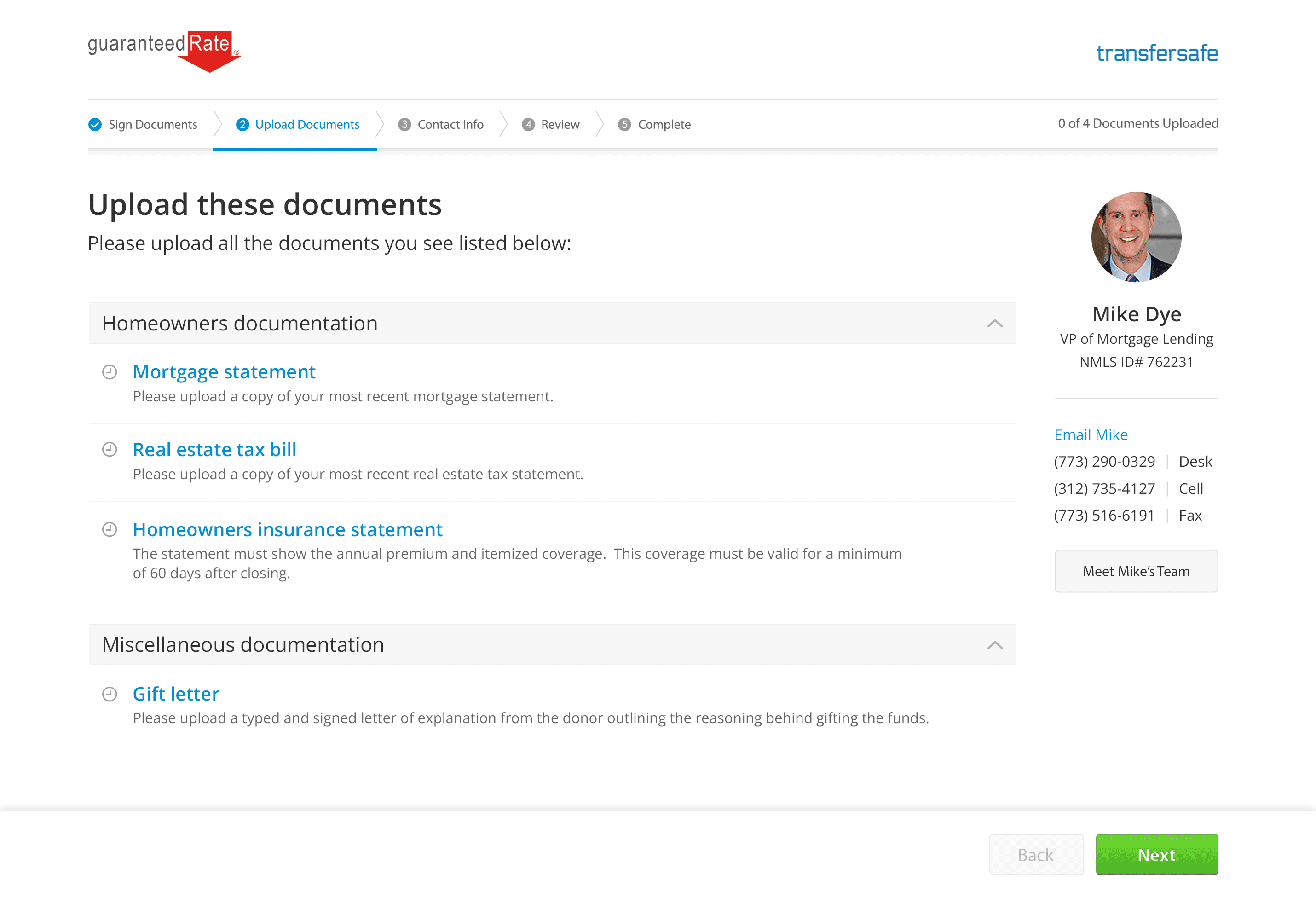
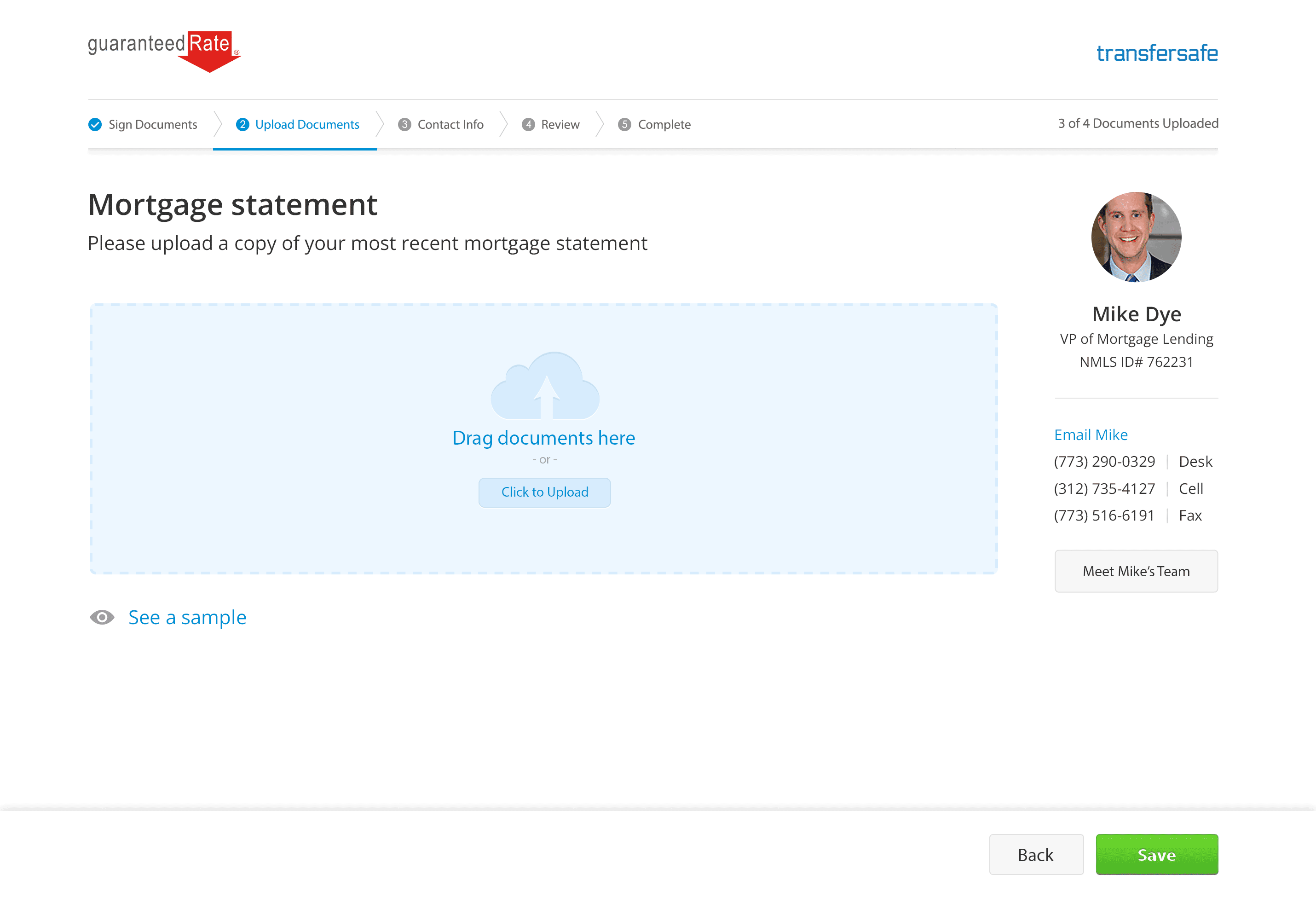
I had very little time to perform proper, initial discovery so I had to move fast and efficiently. I began with some contextual inquiry, shadowing a handful of high-performing LOs and their PODs. I joined them at their desks while they worked, observing and asking questions along the way. There was an astounding level of one-to-one hand holding with borrowers; lots of verbal explanation through phone calls, emails and all progress tracking was being done via Outlook folders, spreadsheets and hand-written, paper notes. These immediately jumped out to me as huge opportunities for inline borrower education, process streamlining and automation of repeated, menial tasks.

What shocked me most weren’t the massive inefficiencies inherent to this all, it was just how many documents with super sensitive PII like W2’s, paystubs and tax returns were being emailed back and forth only to be copied to someone’s Windows desktop before being organized and ‘printed to the eFolder‘ – a shared document repository for final Underwriter review. The security risks were worrisome, the process was convoluted and I knew we could solve for both while delivering a far better experience.

After completing enough research to feel like I had clear understanding of the problems, I mapped out a flowchart for what the team felt it could deliver promptly and got it in front of our stakeholders:

The flow proposal elicited positive feedback from the business, the PODs I shadowed and my team, so I began designing screens for each step.

We launched an MVP with guided, step-by-step pattern. I received a ton of initial user feedback and metrics, and upon review, there was good news and bad news.

The good news was that I’d nailed the design of Enterprise portion of the app. Our internal users loved its simplicity, how it kept the entire process on rails and that it saved so much time by drastically reducing data entry and having to track everything by hand.

The bad news was that arranging the app in a linear, wizard fashion did not accommodate true borrower behavior well. The borrower’s process was more of a back and forth, with them logging in multiple times, usually over the course of a week, to complete the tasks piecemeal rather than taking a single, straight shot toward the finish line on the first pass.

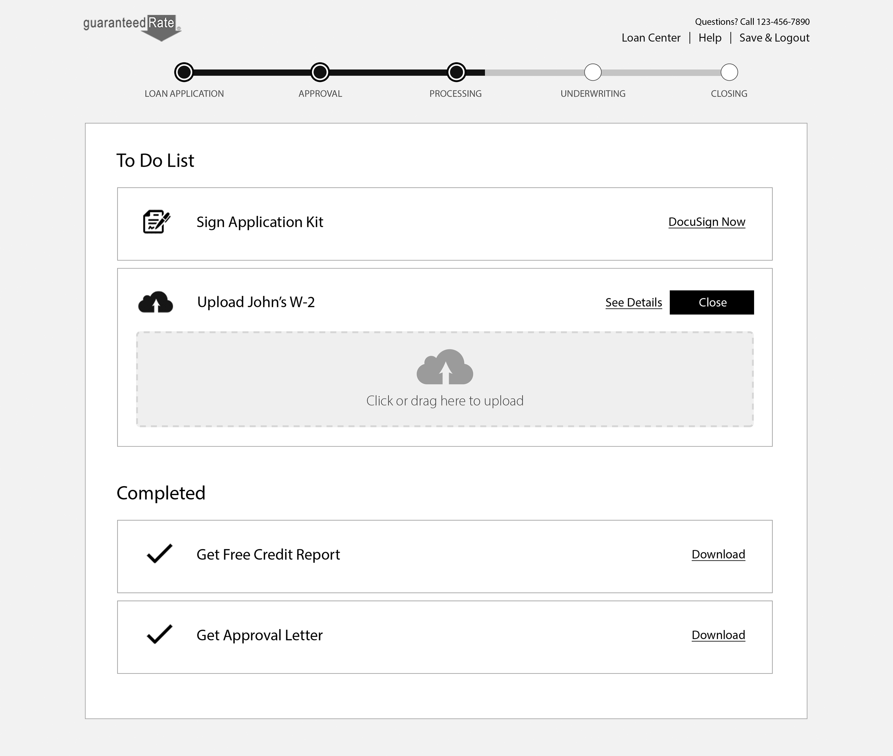
Armed with real-world user data, I went back to the drawing board to solve for this new revelation. I felt a hub and spoke navigational model would be better suited for how our borrowers were actually engaging with their tasks rather than the wizard model from the MVP.

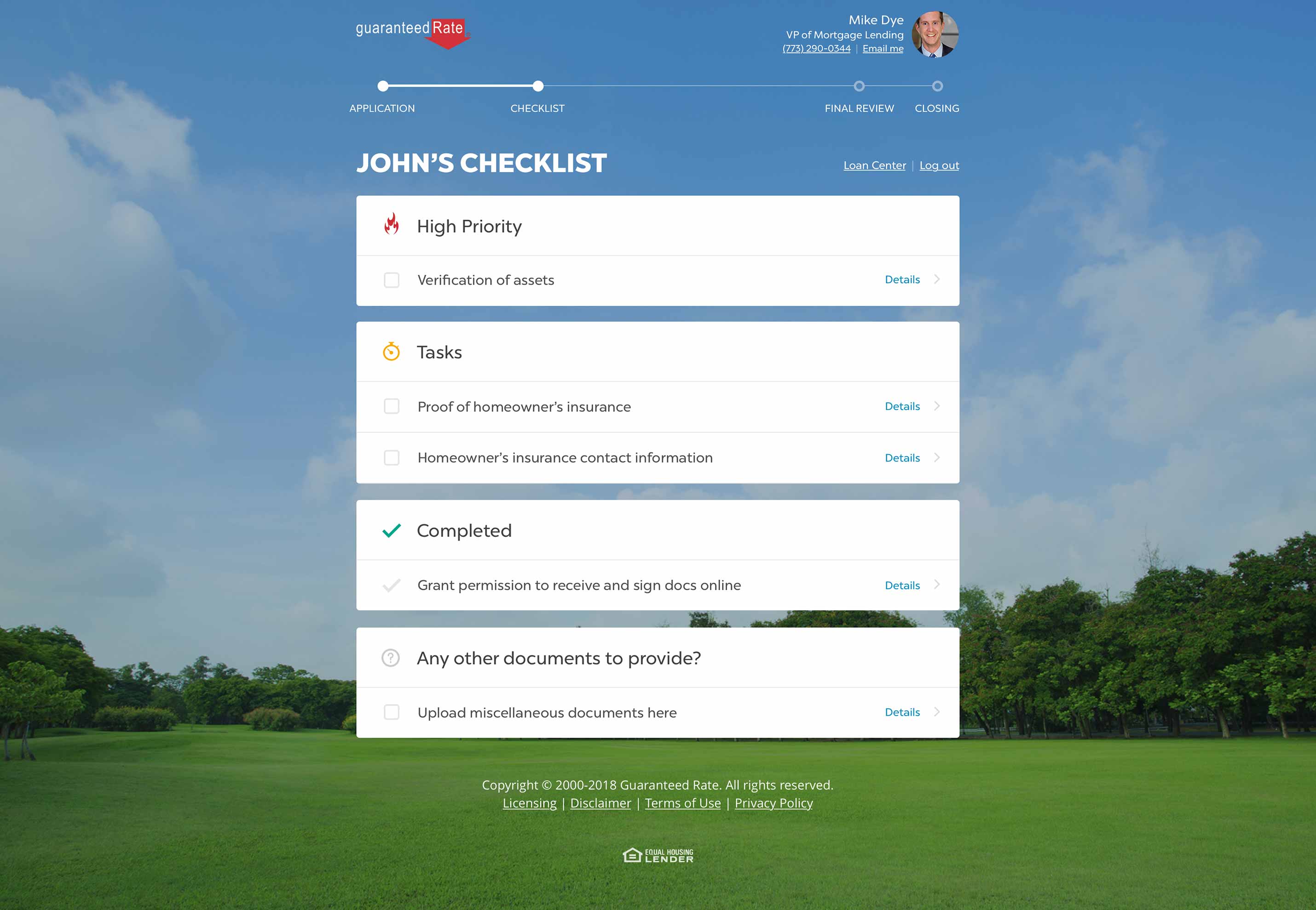
I reworked it as a to-do list with all borrower tasks organized into either incomplete or completed sections. When presenting this new concept to my stakeholders they stressed that all tasks weren’t equal and that certain ones should still be completed before others. I solved for that by adding a third, dynamic section for high priority items.

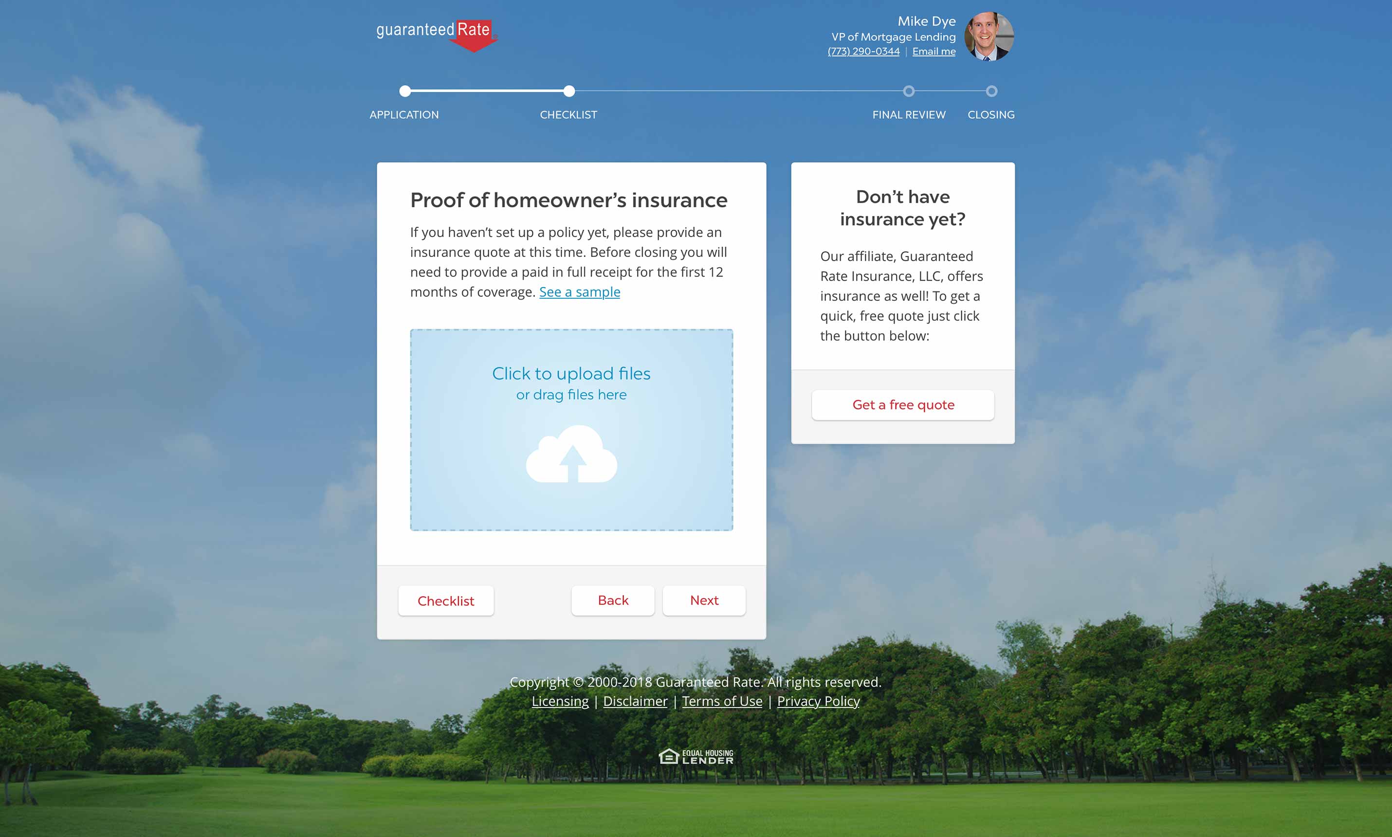
Another finding from the MVP user testing was that some borrowers simply weren’t willing to complete their tasks individually and instead were dumping all their files into a single task. This was problematic since the goal of organizing them into individual tasks saved our PODs from having to sift through the files and arrange them in the proper review order for our Underwriters. This resulted in more work for GR employees but one of our principal core values as a company was “putting the customer first” so I designed a deemphasized, catch-all bucket at the bottom of the page that would formally allow for this behavior without promoting it too heavily.

This was also an opportunity to update the UI to more closely match our Digital Mortgage and Loan Finder products to create a more cohesive feel across the entire borrower experience. It necessitated changing our wayfinding to a design that kept users keyed in on where they currently were in the larger mortgage process while providing insight as to how far they were from actually closing. My stakeholders bought in to all these proposed changes, so I got to work on the new design.

Results:
After shipping these updates, both user testing and analytics showed that the new framework made a marked improvement in getting Borrowers to complete all their tasks in fewer days and while reaching out to our Mortgage Consultants less.

The catch-all space for bulk-dropping documents also reduced the number of users that were skirting the system by uploading all their files into a single, unrelated task since they now had a dedicated place to do so. This resulted in less confusion and greater time savings for the POD members when reviewing, organizing and preparing the files for Underwriting.

Borrower adoption was also positive as we saw a significant drop in the amount of users sending their sensitive documents to us as email attachments, one of our topmost goals from the outset. Compliance was swooning, but the biggest takeaway was that our total number of days from pre-approval to close trend precipitously downward, ultimately falling from around 44 days to just below 29, a decrease of nearly 50% and a massive win not only for my team but for the entire company.

Loan Finder – Rate recommendation engine

Tuesday, May 30th, 2023

Loan Finder

Rate recommendation engine

Background:
The most common question a Loan Officer hears is “what rate can I get?” Providing an answer is never cut and dry because everyone’s financial situation is unique, there can be many right answers and LOs need a dozen or so datapoints before delivering a quality response.

Borrower access to product and rate information required the completion of a URLA 1003 loan application along with a hard credit pull; time consuming tasks that’d likely impact their credit. Our LOs would comb through this data and feed it into their existing, mobile-hostile tools.

I heard these experiences described with words like “clunky” and “slow” and it was hard to disagree with them. Despite that, they fought past these issues in order to craft various loan options to present to potential borrowers through a combination of email attachments, phone conversations and even in-person meetings. Yikes.

Objective:
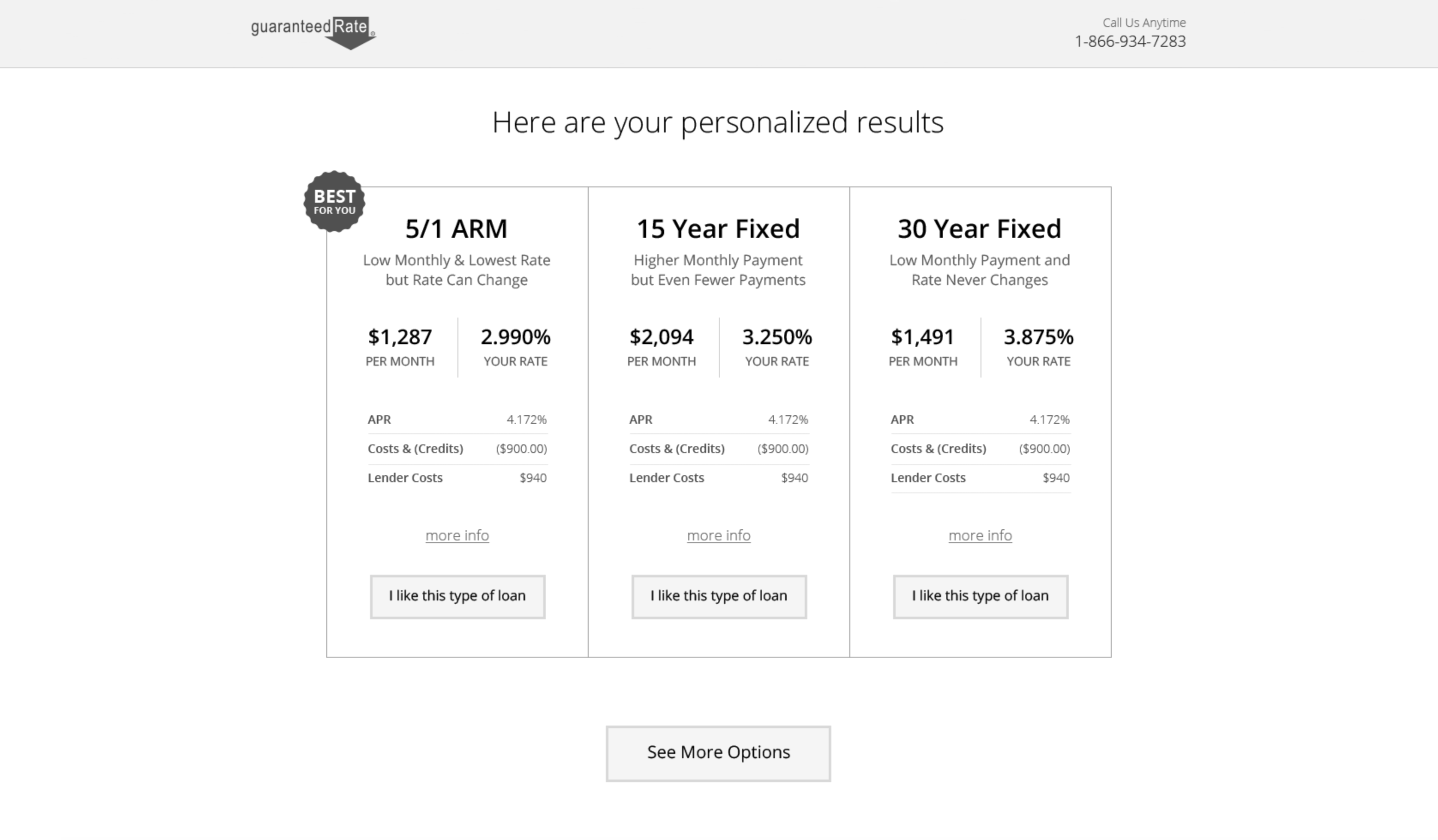
Guaranteed Rate’s Loan Finder was designed to quickly provide prospective borrowers with accurate answers to key questions around rates, products and pricing with the lowest barrier of entry possible.

Simultaneously, we wanted to deliver a vetted, high-quality lead to our LOs. A customer who already had “skin in the game” thanks to the work they did, the info they supplied and the answers they received thanks to GR’s willingness to be transparent and forthcoming with rate data.

Process:
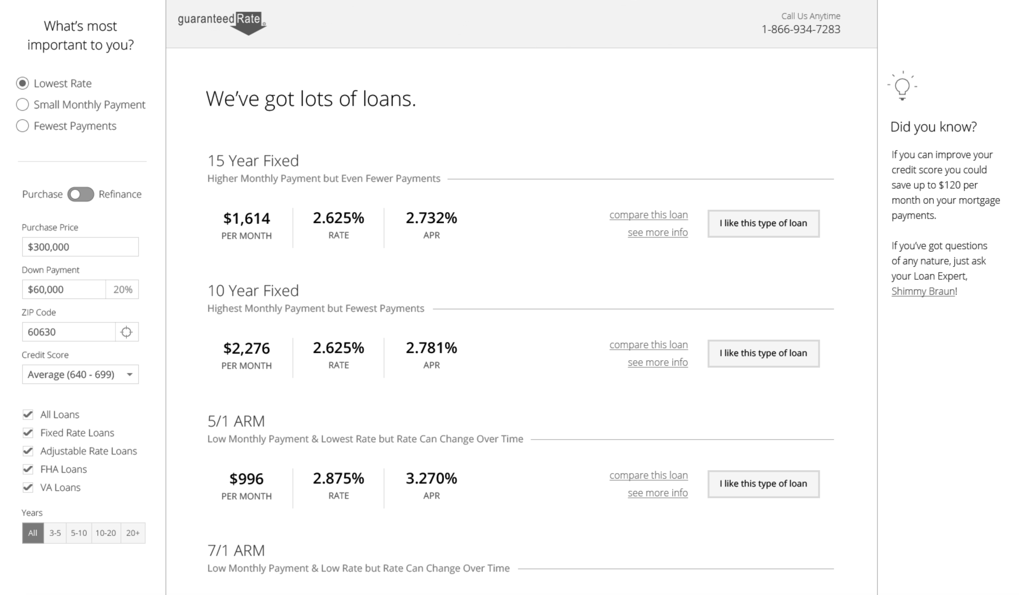
Loan Finder was born out of a Design Sprint I led with stakeholders including business leaders, Loan Officers and their support staffs. In our initial discussions, a repeated problem arose around how we priced loans, made product recommendations and quoted rates to borrowers.

After a few lightning demos to see what we could learn from pricing experiences outside of fintech (AirBNB and Expedia were two favorites) it became clear how flawed and dated the experience we provided our mortgage customers truly was.

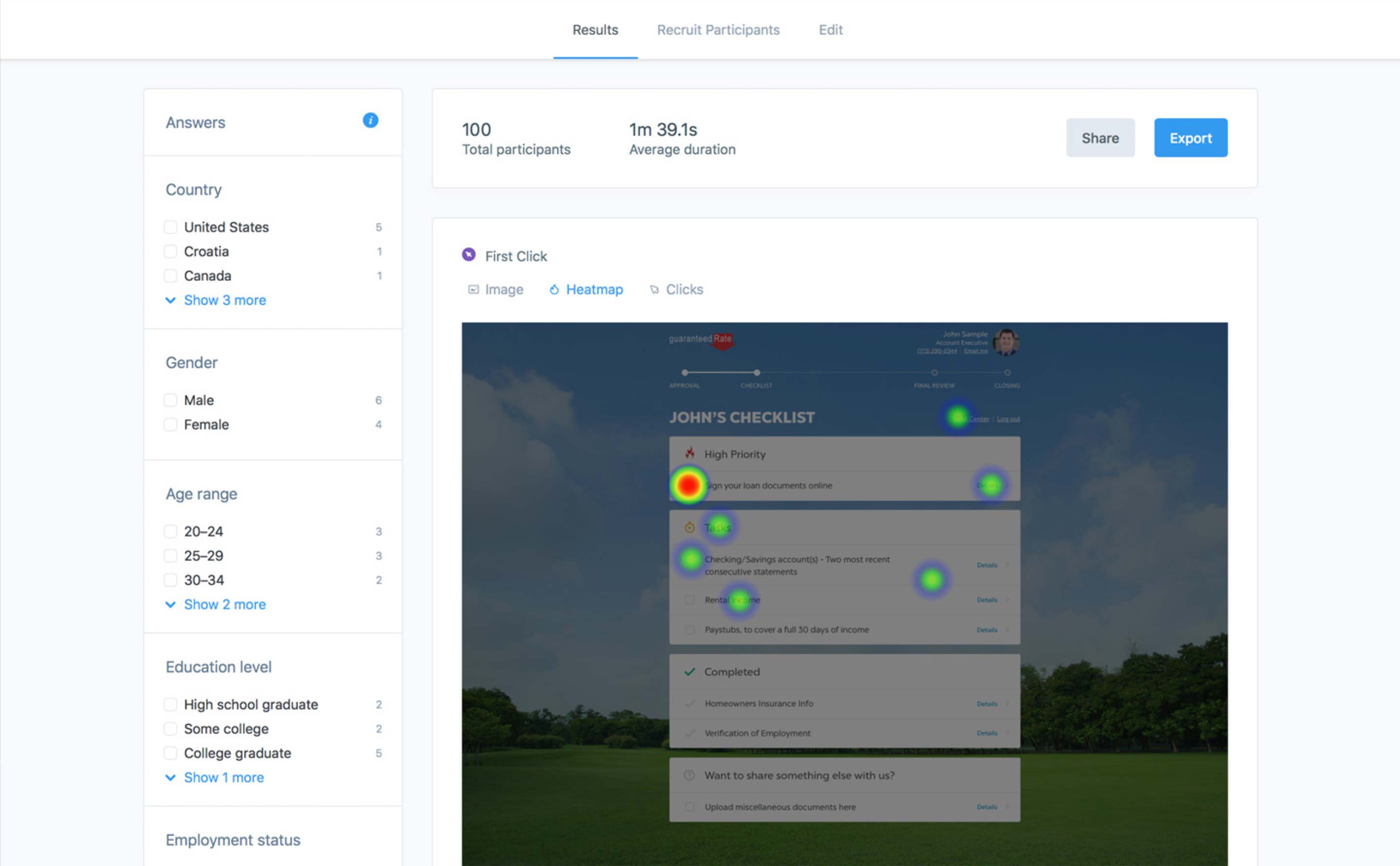
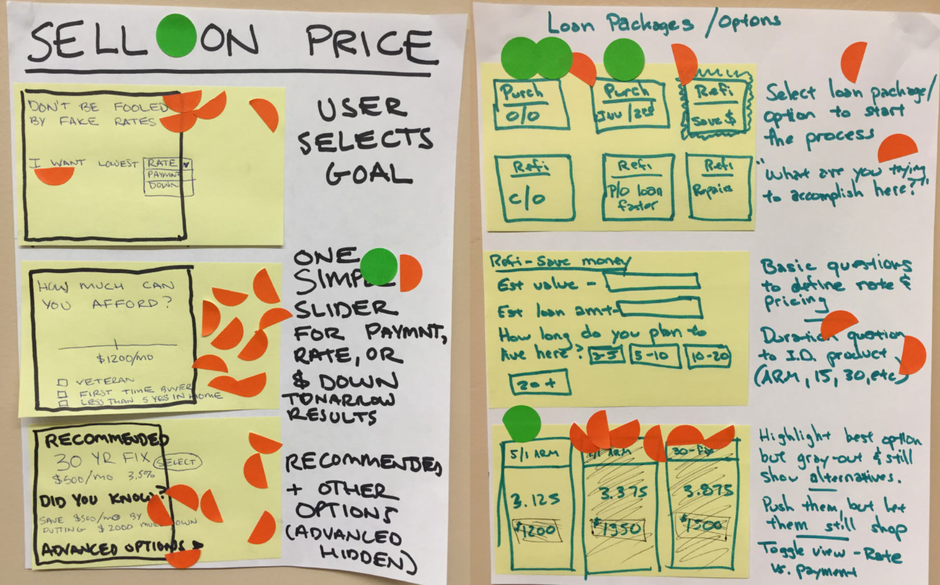
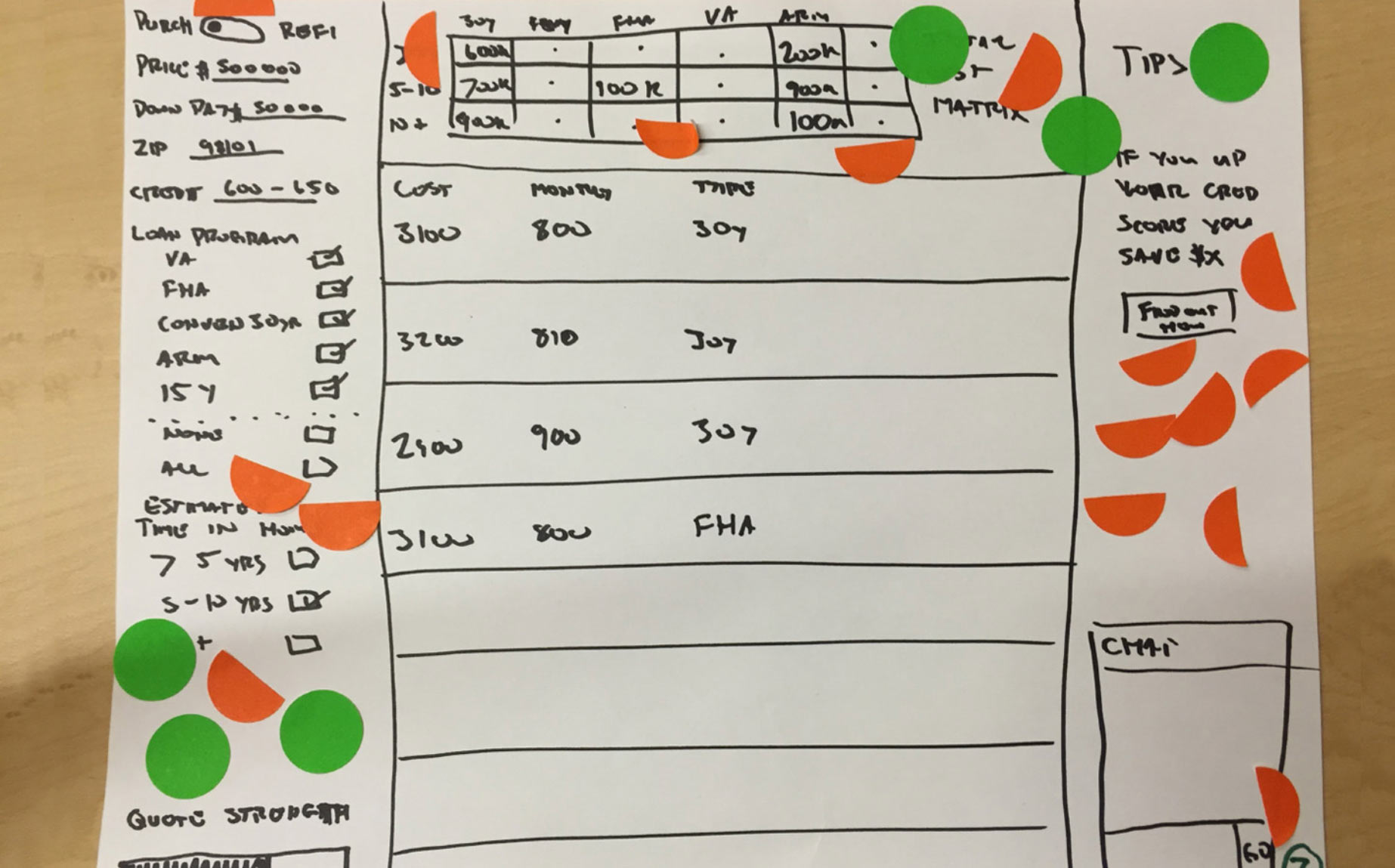
Next, I ran the group through a Crazy 8’s thumbnail session followed by more evolved sketching of the everyone’s best ideas that we then put up on the walls for quiet, individual review. Each member of the Design Sprint was given a limited number of full and half stickies to vote for the solutions, features and designs they liked best.

When we came back together, the most popular solutions were discussed in detail and we chose which path to pursue, eventually landing on the idea of a “Loan Pricing and Recommendation Engine” that would be available to both customers and LOs, alike.

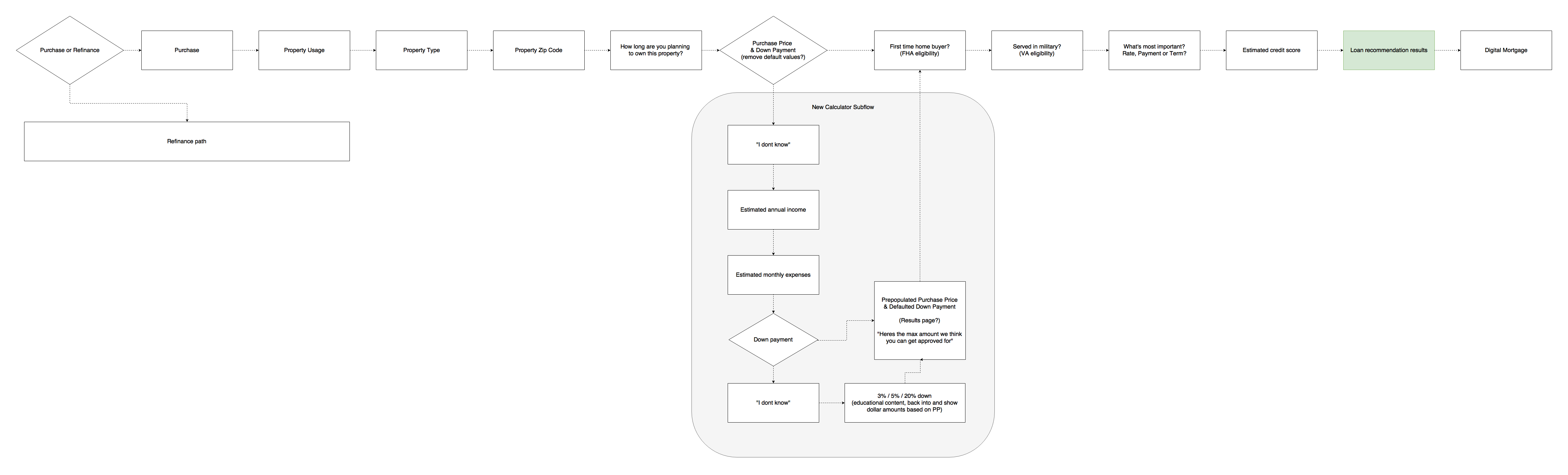
I worked with our stakeholders to build a quick flowchart based on the various steps LOs take to quote customers and used that to rapidly wireframe a clickable prototype of how we envisioned the experience as a group.

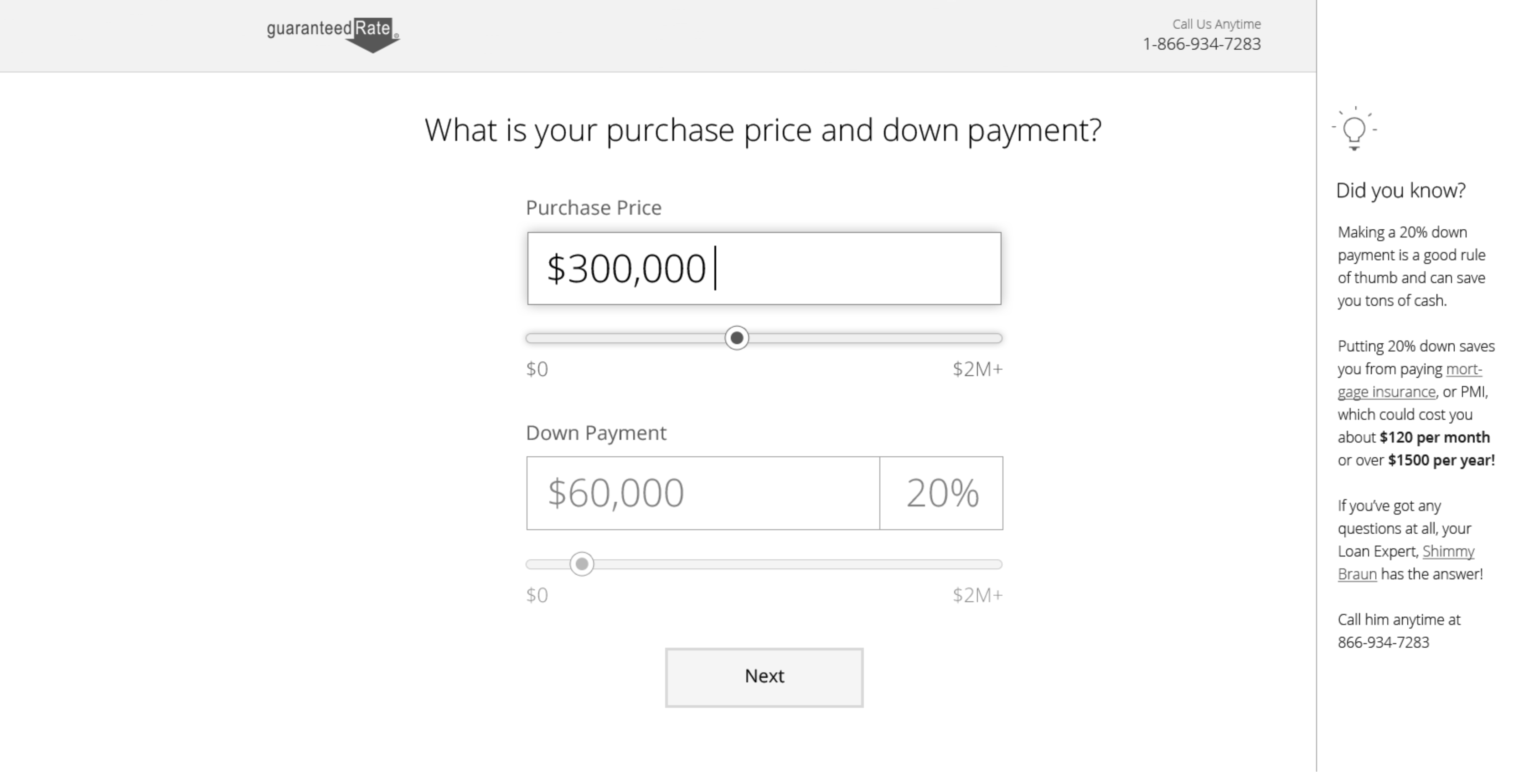
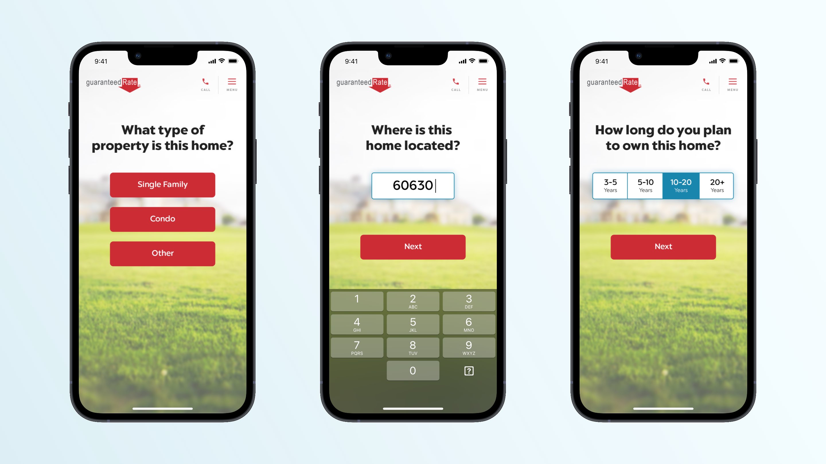
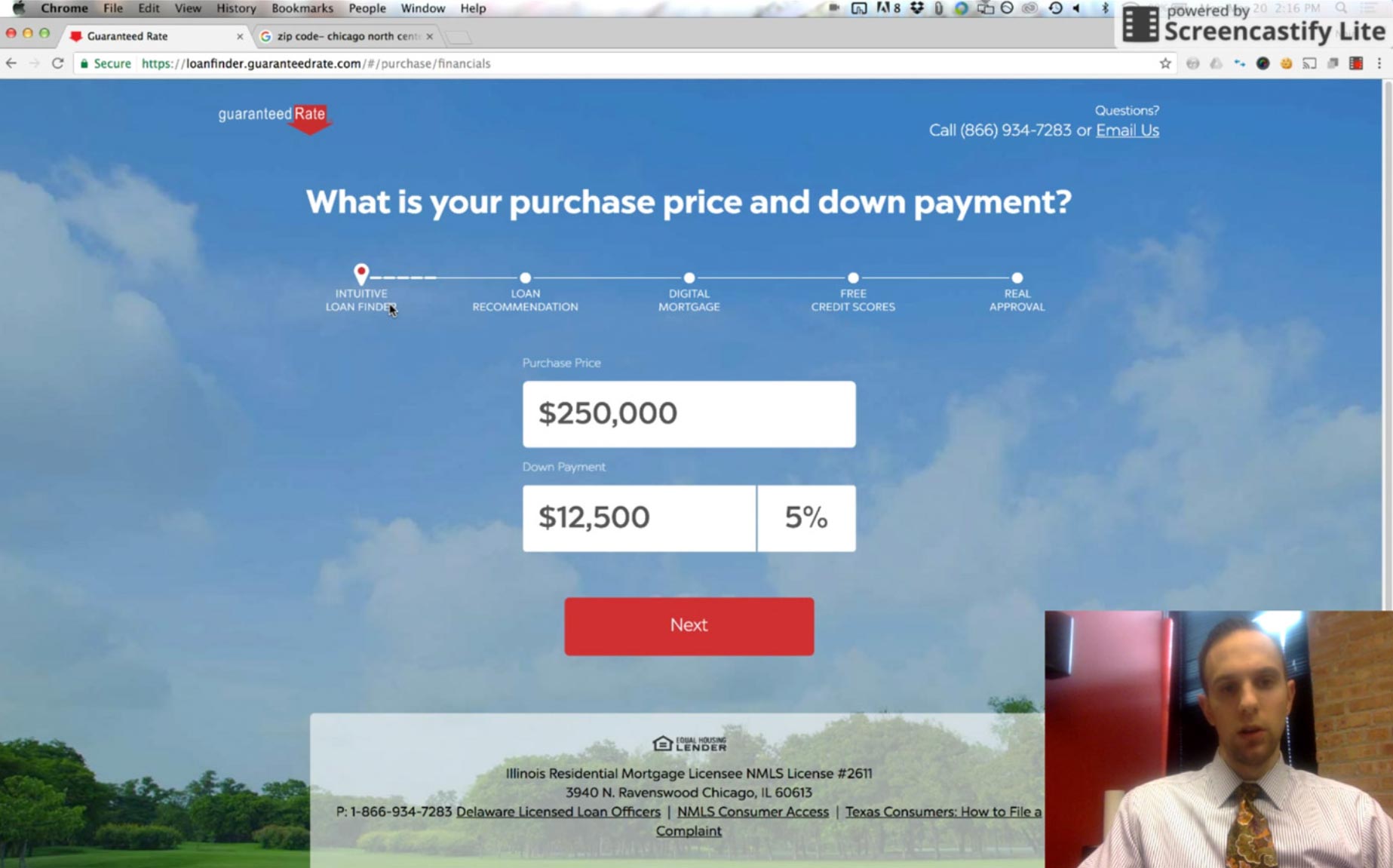
I was adamant about breaking each question, sourced from LOs who’d typically handle this process conversationally on the phone, into its own discrete step to promote focus, ease of use and a mobile-friendly pattern. I also felt this method would also lend itself well to optimizing the order of the questions via A/B tests once we’d gotten an MVP out.

We ran through the prototype as a group and it was well received. Everyone felt we had honed in on a legitimate problem and solved it with a fast and elegant solution. Our business leaders gave us the thumbs up to build it out for the web and get it in front of real borrowers and LOs to use on a daily basis.

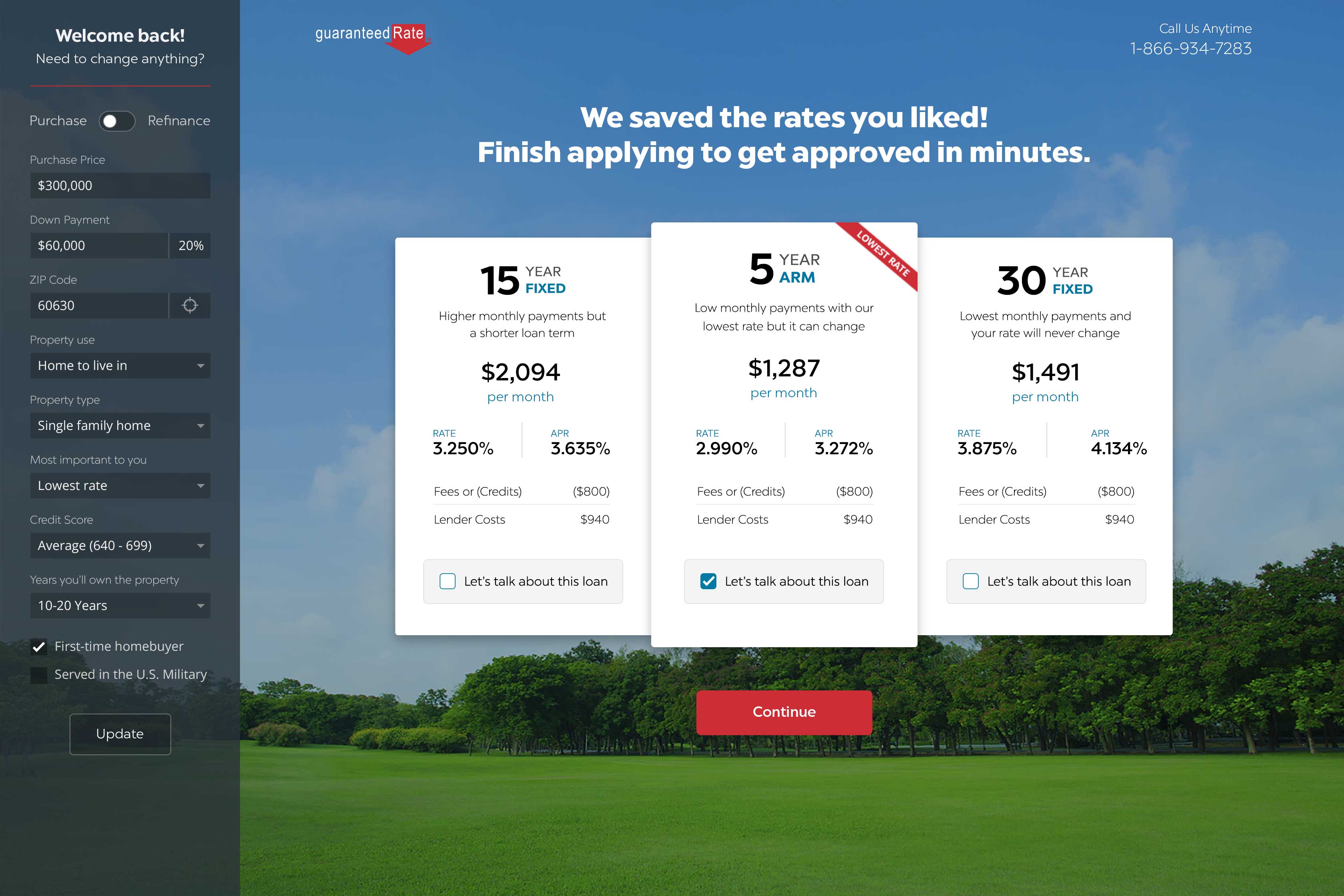
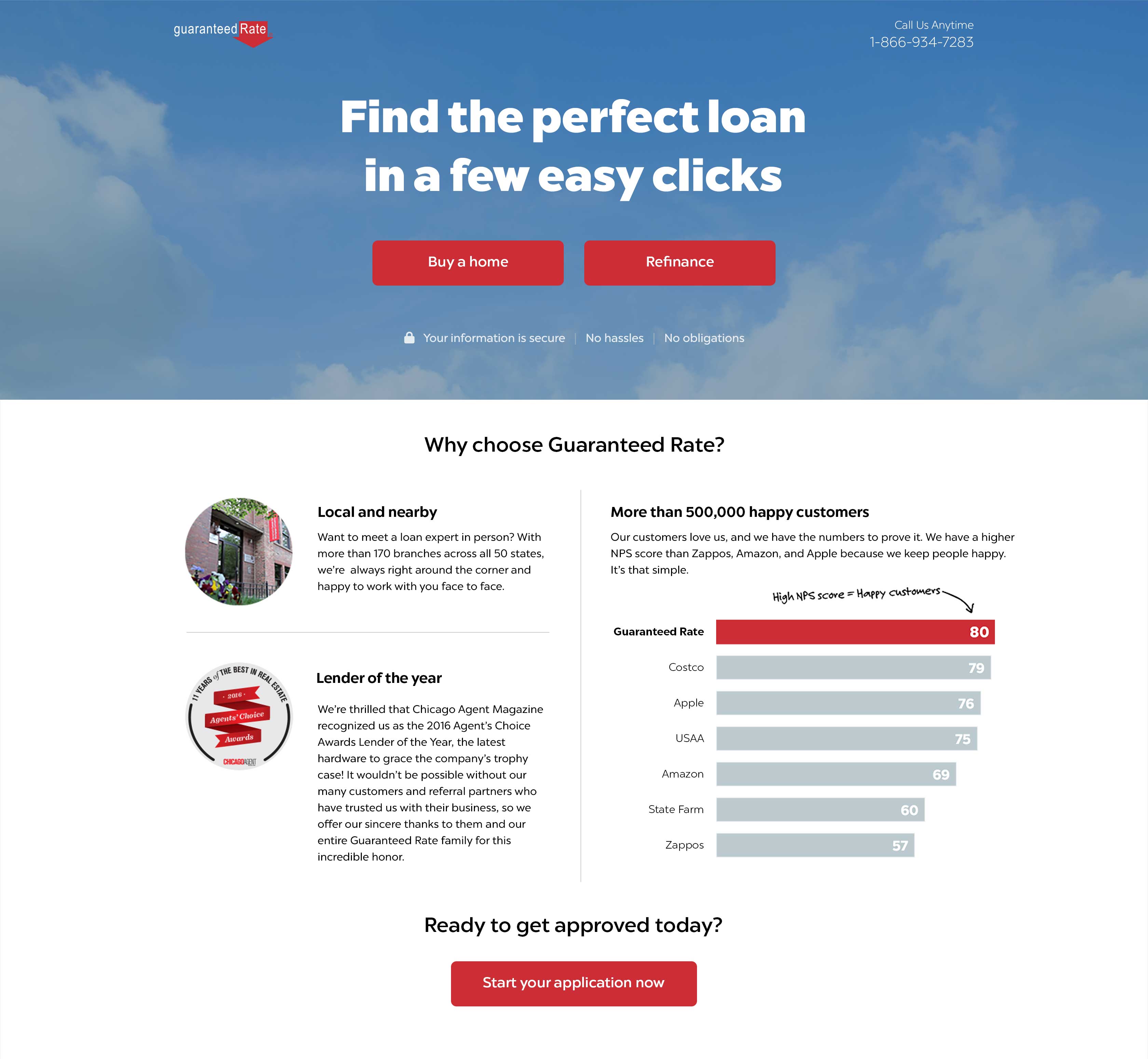
I then took some time to explore various UI treatments and delivered some different visual options to my stakeholders. The green grass and blue skies imagery was well-liked by the Design Sprint participants as it “didn’t look or feel like a traditional mortgage experience” but I made sure to get feedback on the visual theme when user testing the end-to-end product.

I proceeded to work closely with my product and engineering leads to get the first iteration coded, released and tested in a timely fashion.

Results:
Once in the wild, Loan Finder made a big difference. LOs were using it to quickly run scenarios for clients over the phone and were able to send with them a direct link to view their options and continue with their mortgage application if the deal was enticing enough.

More importantly, borrowers were now able to easily and anonymously provide information about their financial scenario, see results and tweak them in a “pricing sandbox” without ever having to speak to a salesperson or have their credit pulled.

As a result, borrowers who originated their user journeys in Loan Finder resulted in a lock rate of nearly 70%, well above the company-wide lock rate of around 30% for loans originated via other channels like word of mouth referrals and direct online applications.

Conclusions:
Our Design Sprint yielded a major win for the organization because it offloaded work from our highest paid employees and allowed them to put that time into generating more volume.

Loan Finder empowered our borrowers to shop rates and dip their toe into the mortgage process at their own from their desktop in the office or on their phone in bed, all with zero pressure to supply PII or pull their credit until they were completely comfortable wading further into the seemingly daunting loan application.

Breaking an elaborate, long-winded process down into individual steps proved to be so effective from a conversion rate standpoint and so impactful as a means for optimizing the order of the questions that we used it as a model for revamping our entire online application, the most important borrower-facing experience at Guaranteed Rate.

I am convinced this product was effective for a few different reasons. One, the method by which it was derived; a Design Sprint that garnered wide collaboration and input from many different SMEs. Two, the accessible and anonymous nature of the product resulted in a complete lack of pressure on the customer. They were free to approach GR and get an answer to their rate question in their own time and at their own pace. This resulted in the most committed and qualified potential borrowers essentially hooking themselves into our loan manufacturing ecosystem of their own accord.

Lastly, the saying “imitation is the greatest form of flattery” rang true as we saw countless other loan originators play copycat with our product in the ensuing months after release. Seeing our competitors follow suit definitely meant to me that this was an effective and useful product.”

Additional Artifacts:

Agent Advantage – OLD

Thursday, February 16th, 2023

Agent Advantage

I ❤️ Hackathons! So much freedom and fun. They’re great for people, products and teams and they’re one of best things about being a product designer.

I’m a firm believer in designers owning their product from end to end but that doesn’t mean we have eminent domain over them.

Just as it takes a village to raise a child it takes a whole team owning their product to truly make it something great. That’s why regular Hackathons are so important for a healthy product culture. We in product are people who love to build things and Hackathons let us get together and jam like jazz musicians. They let us improvise and use challenge our talents to bring the ideas we are most passionate about to reality.

That’s where this feature arose — in a five-person, cross-functional team on a two-day Hackathon in the spring of ’22.

In the retail mortgage sector, the relationship between Agents and Loan Officers is the engine that drives business. Most loans we originate come from Agent referrals who bring us more borrowers than all other intake channels combined.

Guaranteed Rate had built individual systems for both Agents and Loan Officers, but these two pillars of our loan manufacturing platform were completely siloed from one another despite the importance of the Agent / LO relationship.

This looks like a job for…

Hackerman!

Our goal was to design, build and deploy a workflow that let our LOs invite their referral partners to join Agent Advantage or connect with existing Agents already on the platform. Once there, Agents were given new tools to track the progress of any loan they refer and even speed things along by uploading key documents like the purchase agreement, which usually comes from their office anyhow.

The scope was ambitious but we had a feisty team and breaking down the wall between these two core systems was a no brainer. It utilized existing platforms and added a ton of value. Moreover, it wouldn’t likely have happened without the pure collaborative nature of Hackathons bringing together people and products who are usually separated most days simply because of how the org chart is structured.

We took home 2nd place but people took notice and we got it on the product roadmap anyways. Check out this quick walkthrough I recorded to get our LOs excited about the feature at the annual company-wide retreat.

Super LO – Point of sale experience

Tuesday, February 14th, 2023

Super LO

Point of sale experience

Context:
Mortgages are one of the most complex lending products in the world, and Loan Officers sit at the center of it all.

Their daily workflows were fragmented as they constantly jumped between systems, juggling internal coordination, client communications, and managing multiple deals all at once. Most of the tools they relied on were dated, slow, and not built for how they actually worked, especially on mobile.

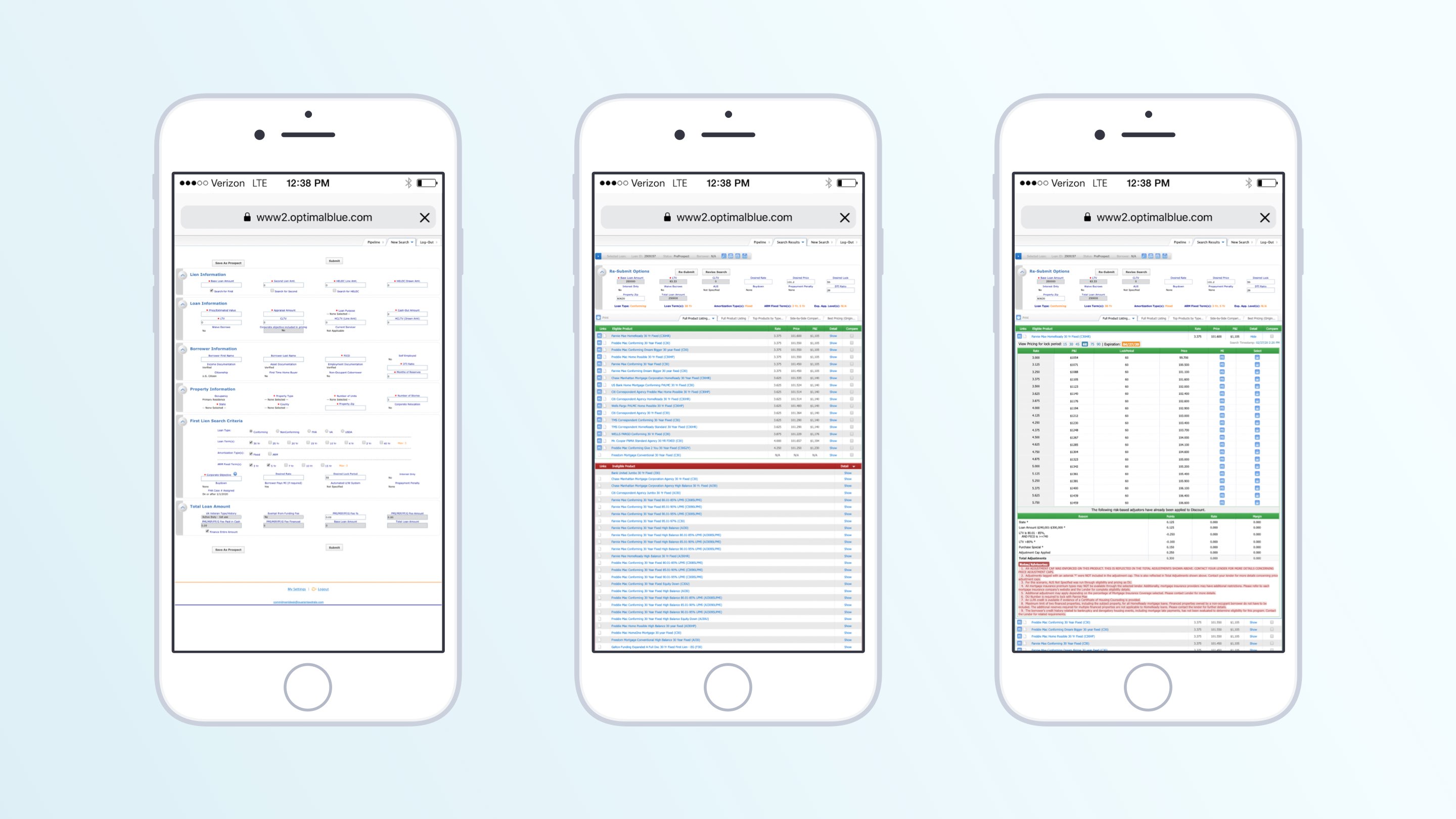
Encompass and Optimal Blue were antiquated, legacy tools that LOs relied on

There was no overarching system. No holistic thinking. Just a collection of tools that didn’t talk to each other, and that resulted in a reactive, scattered, and inefficient process for our most important users.

The Problem:
Loan Officers at Guaranteed Rate were relying on a patchwork of disconnected tools to manage their pipelines.

There was no single place where they could track deals, prioritize work, or easily move loans ahead to closing.

Anything they needed to do required context switching. Even basic tasks meant bouncing between systems, piecing together information, and reacting to whatever came next.

Objective:
Super LO was an effort to bring structure to all the chaos surrounding the core of the mortgage business: our Loan Officers.

The goal was to build a single, unified experience where LOs could manage their pipeline, prioritize work, and take action from anywhere without relying on multiple tools.

At the same time, it allowed us to move away from expensive third-party software and build something custom-tailored to how Guaranteed Rate actually operates.

Approach:
I worked closely with Loan Officers and their support teams to understand how they operate on a daily basis, how mortgage jobs flow across the different supporting roles, where things break down and what efficiency would actually look like in practice.

From there, I mapped out the key, high-value loan workflows and figured out where we could reduce friction, surface the right information, and help guide their decisionmaking.

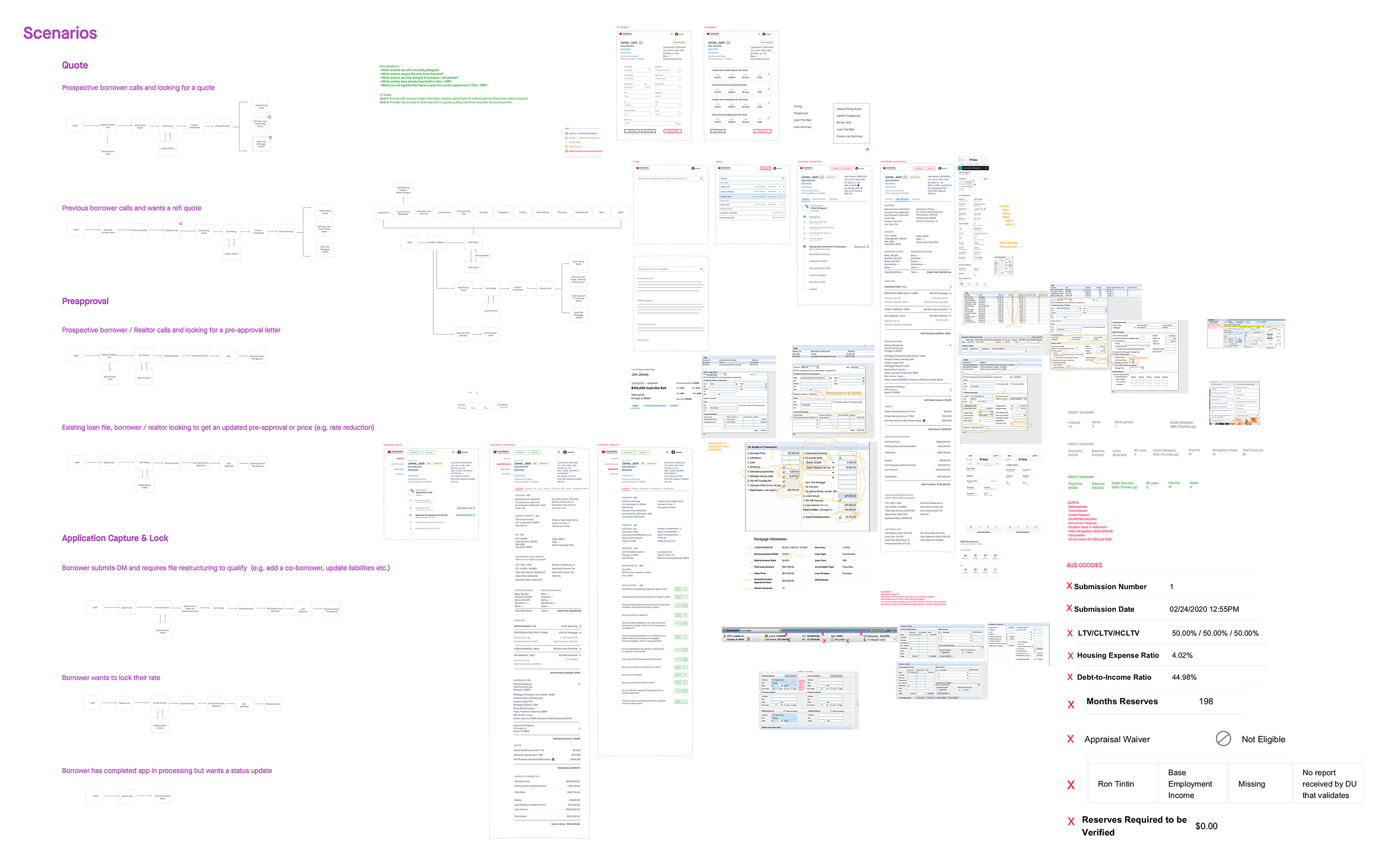
Mapping key loan scenarios across the full lifecycle

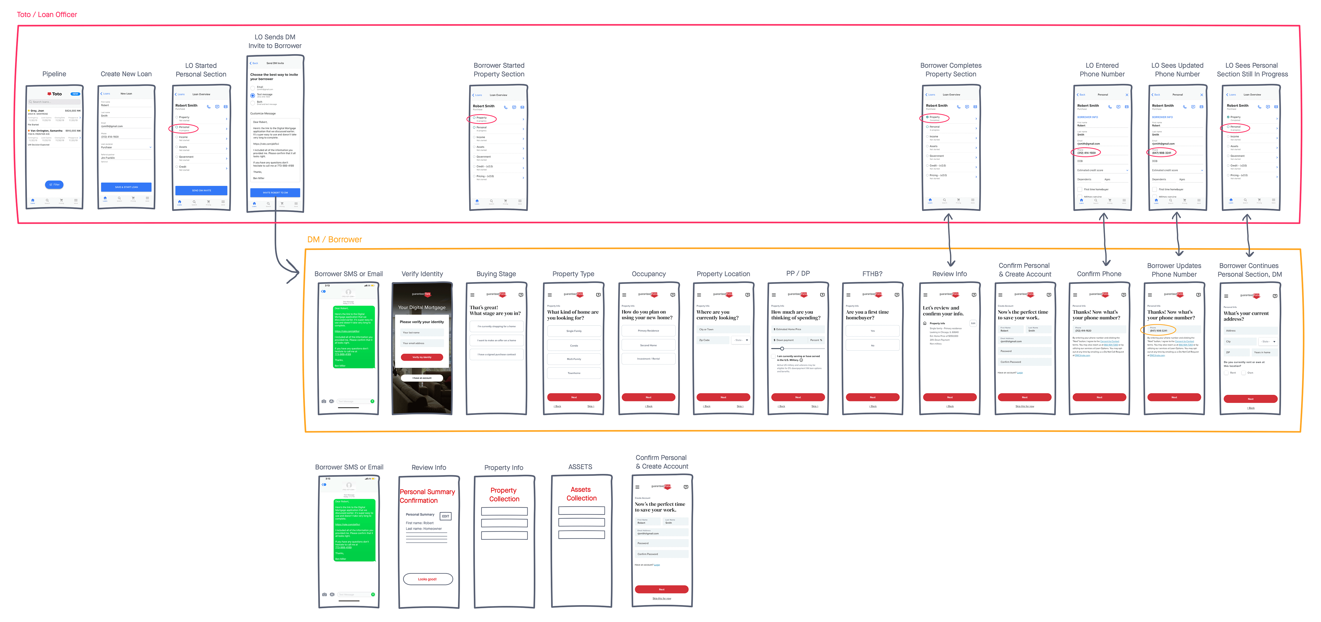
Early mapping of the handoff moments between LOs and Borrowers

Early journey maps and system diagrams became the foundation for the product, helping align our cross-functional triad around a shared vision before we started building.

Early system framework that shaped the larger interactive prototype

This simple framework later evolved into a much larger interactive prototype that documented Super LO’s core features, flows, functionality, and UI in enough detail for Product, Engineering, and stakeholders to stay aligned as the product came together.

Explore the full interactive framework.

System Design:
Solving all these various problems didn’t call for a series of features, it called for holistic thinking and an end-to-end system.

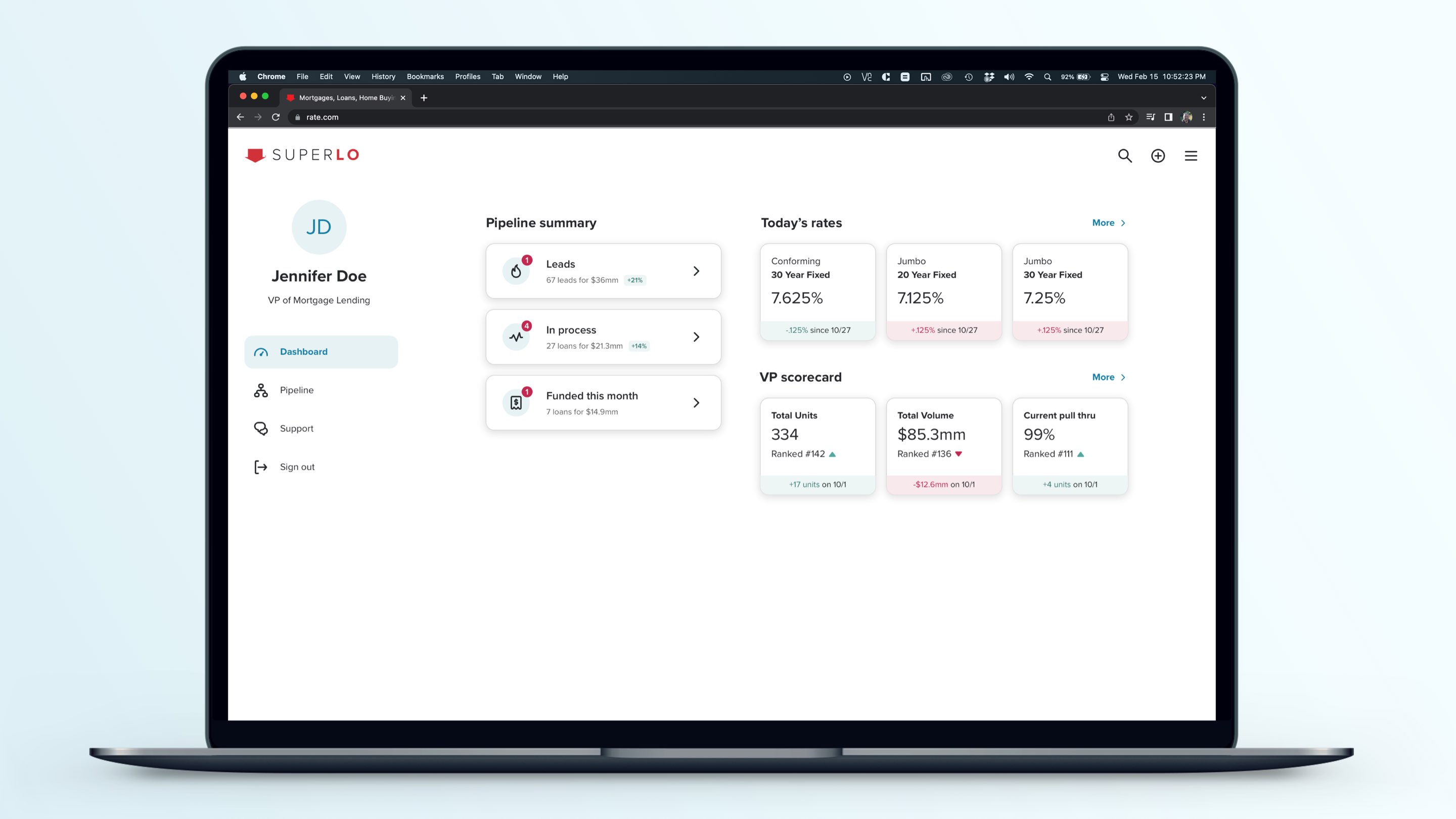
We brought pipeline management, communication, task prioritization, and loan-level actions all together into one cohesive experience.

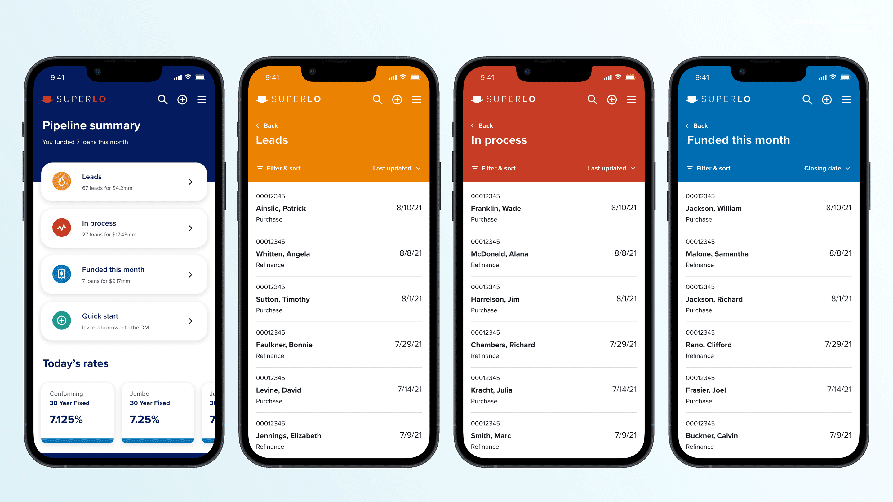
Pipeline views organized work by status and priority

Our goals were consistent: reduce context switching, surface what matters at just the right moments, and make it easy to quickly take action.

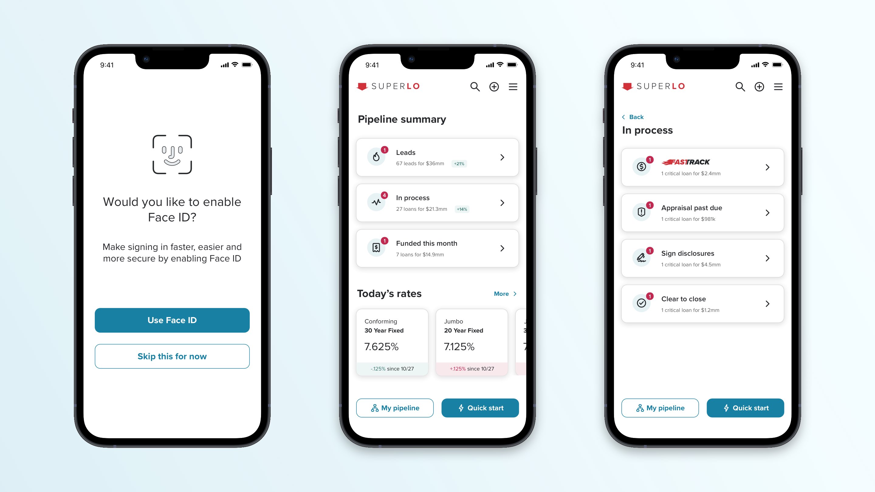
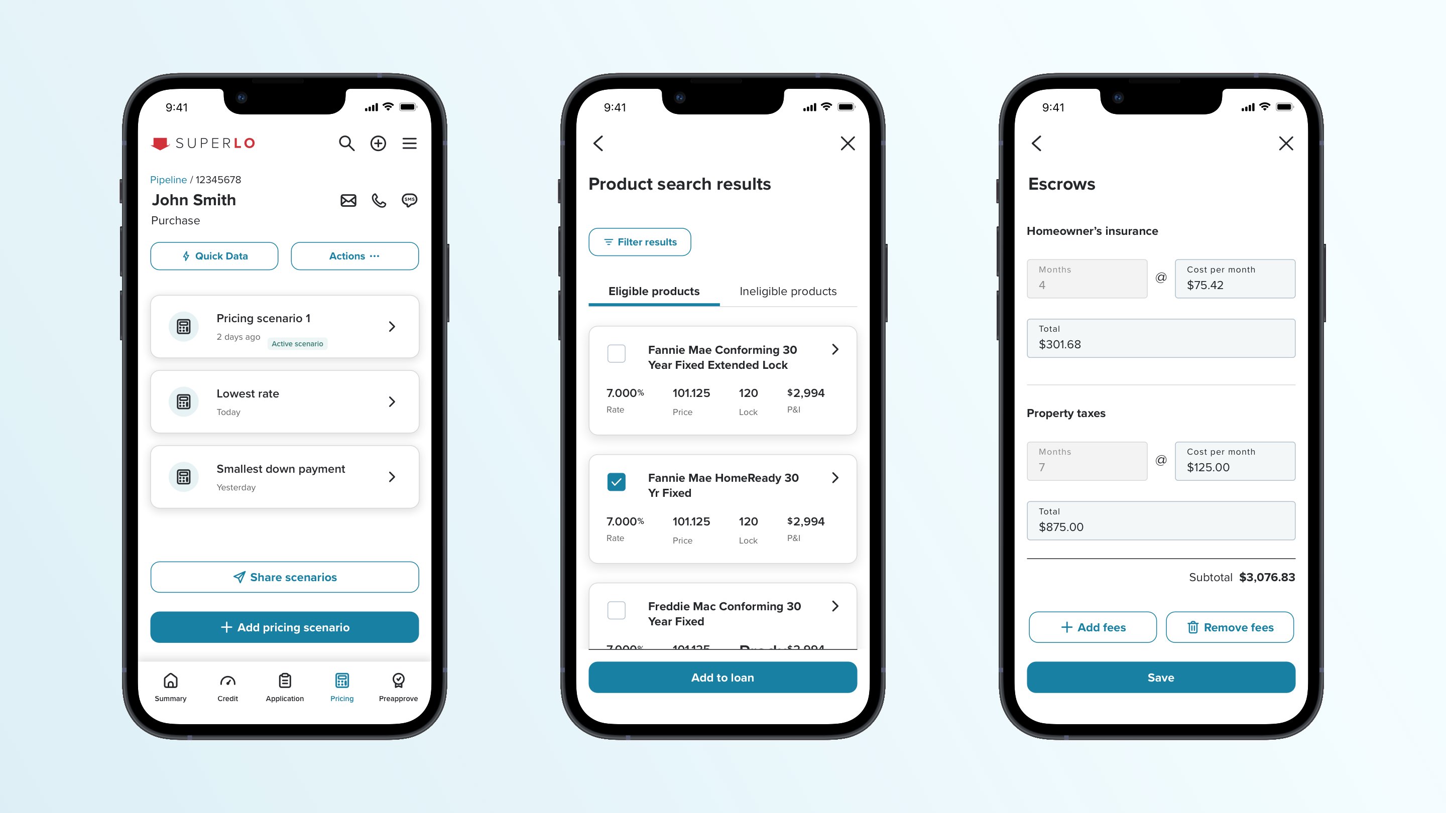
Everything is designed to work seamlessly across devices with full feature parity between desktop and mobile.

Challenges:
I faced a handful of key challenges on this project.

The first was full mobile parity. Executive Leadership mandated that we not deliver a stripped down mobile experience. Every feature needed to work across devices, which forced me to think deeply about layout, hierarchy, and interaction patterns at every step.

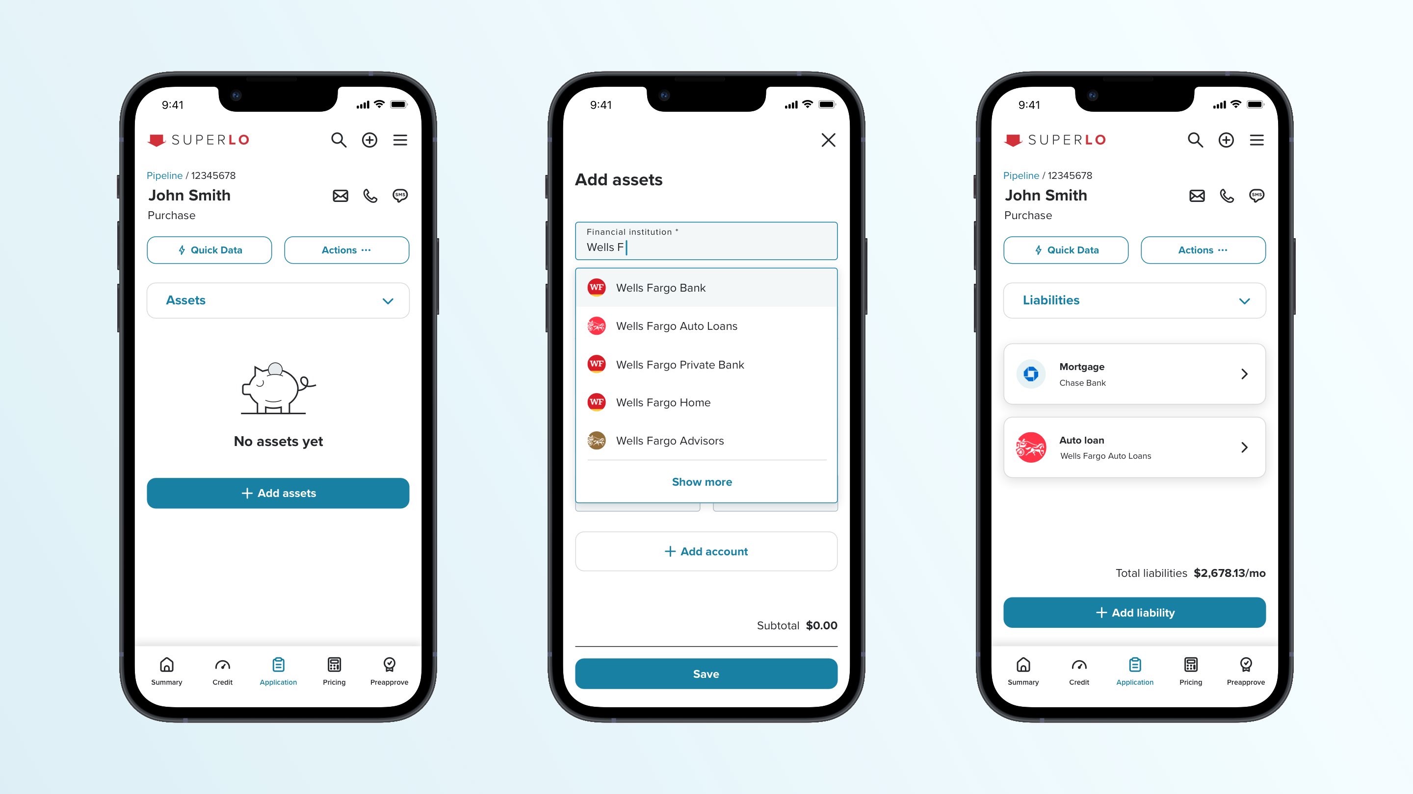
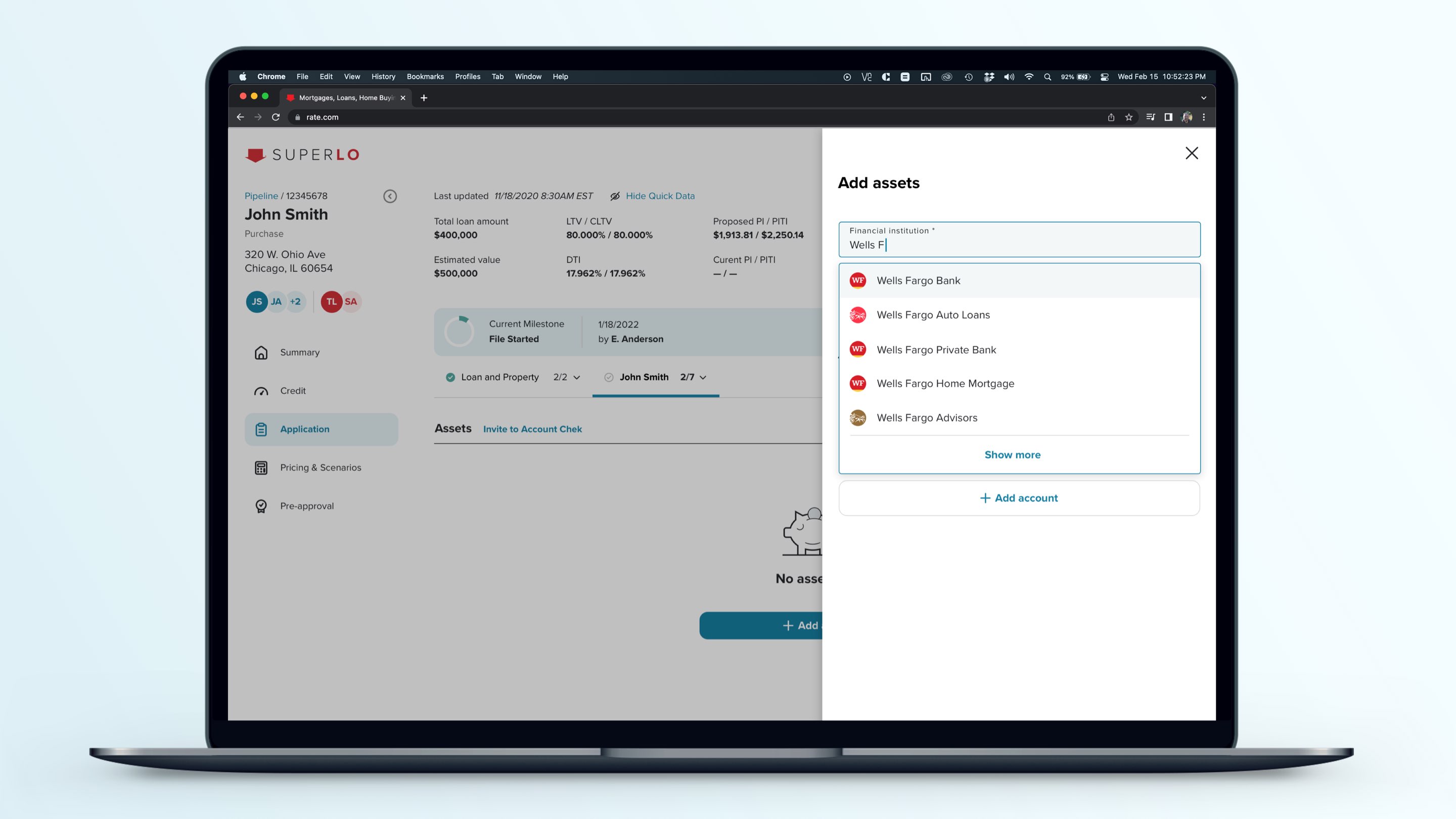
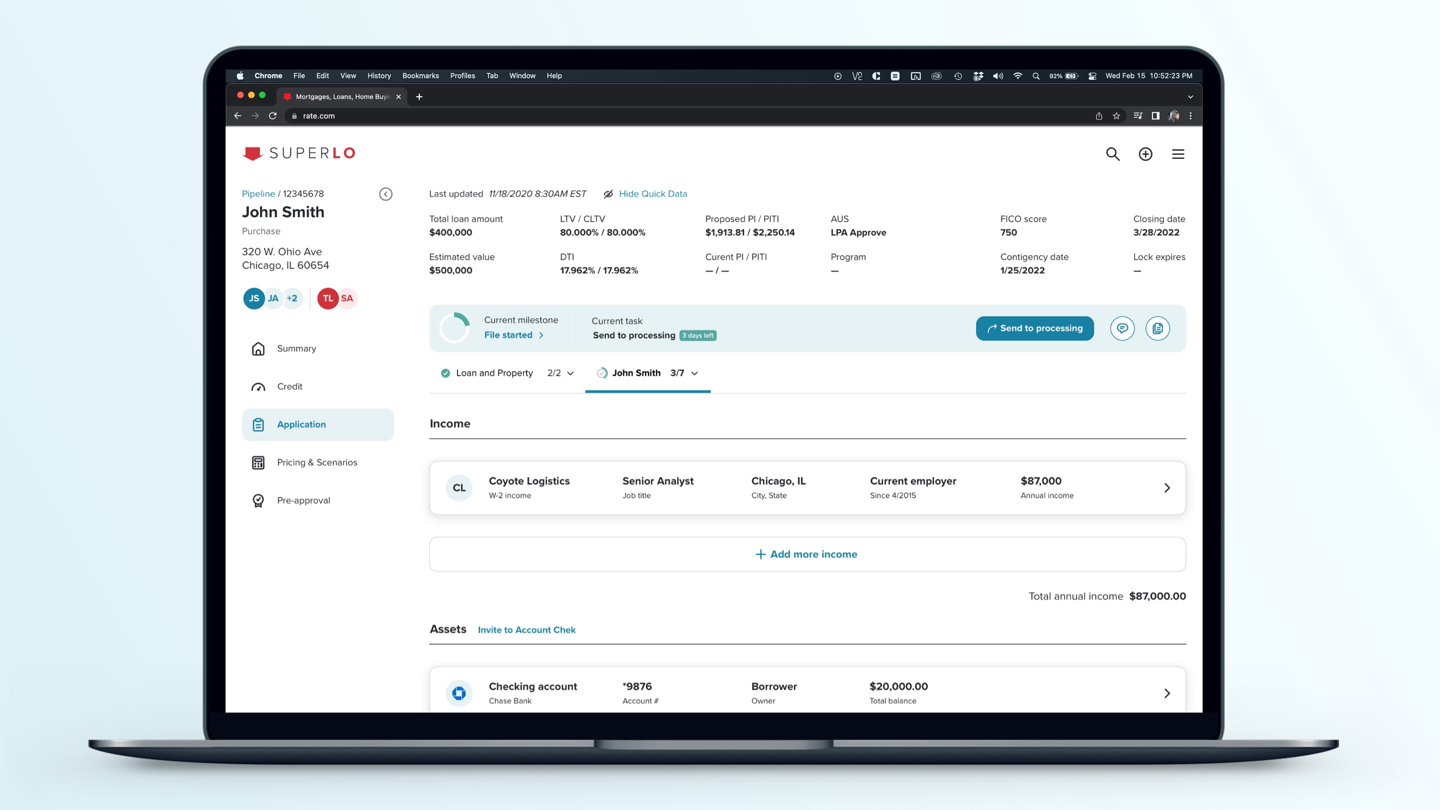
Unified desktop and mobile views for managing assets, liabilities and more

Next was dealing with legacy system constraints. We had to integrate with and build on top of several different existing tools and workflows that weren’t designed to work together, while still delivering what felt like a single, cohesive experience.

The last was balancing standardization with flexibility. Every Loan Officer works differently. The challenge was creating a system that delivered structure and prioritization based on business rules without feeling too restrictive.

Adoption:
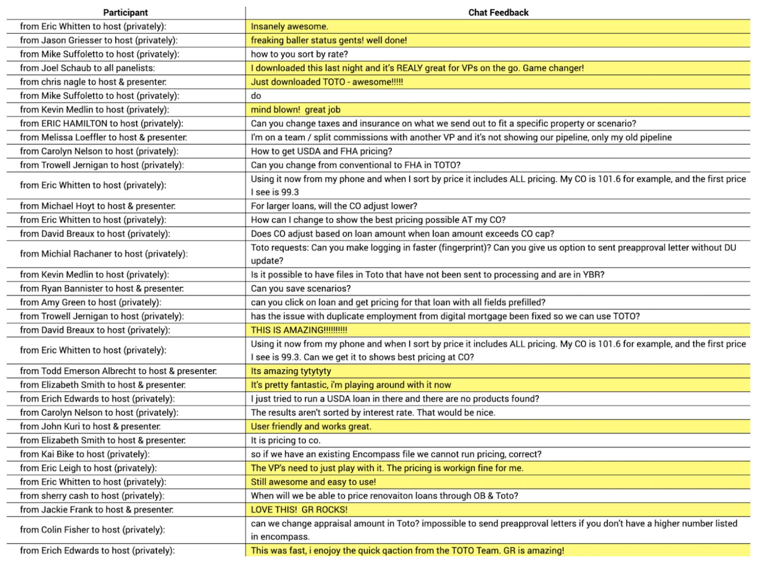
The response from our Loan Officers was immediate and overwhelmingly positive.

Early feedback from Loan Officers during our beta rollout

They finally had a single place to manage their pipeline and take action without jumping between systems.

The mobile experience changed how they worked day-to-day, making it possible to manage deals from anywhere without losing functionality.

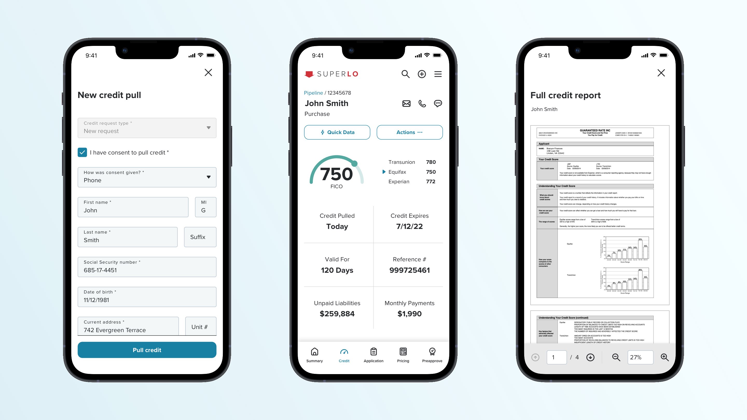
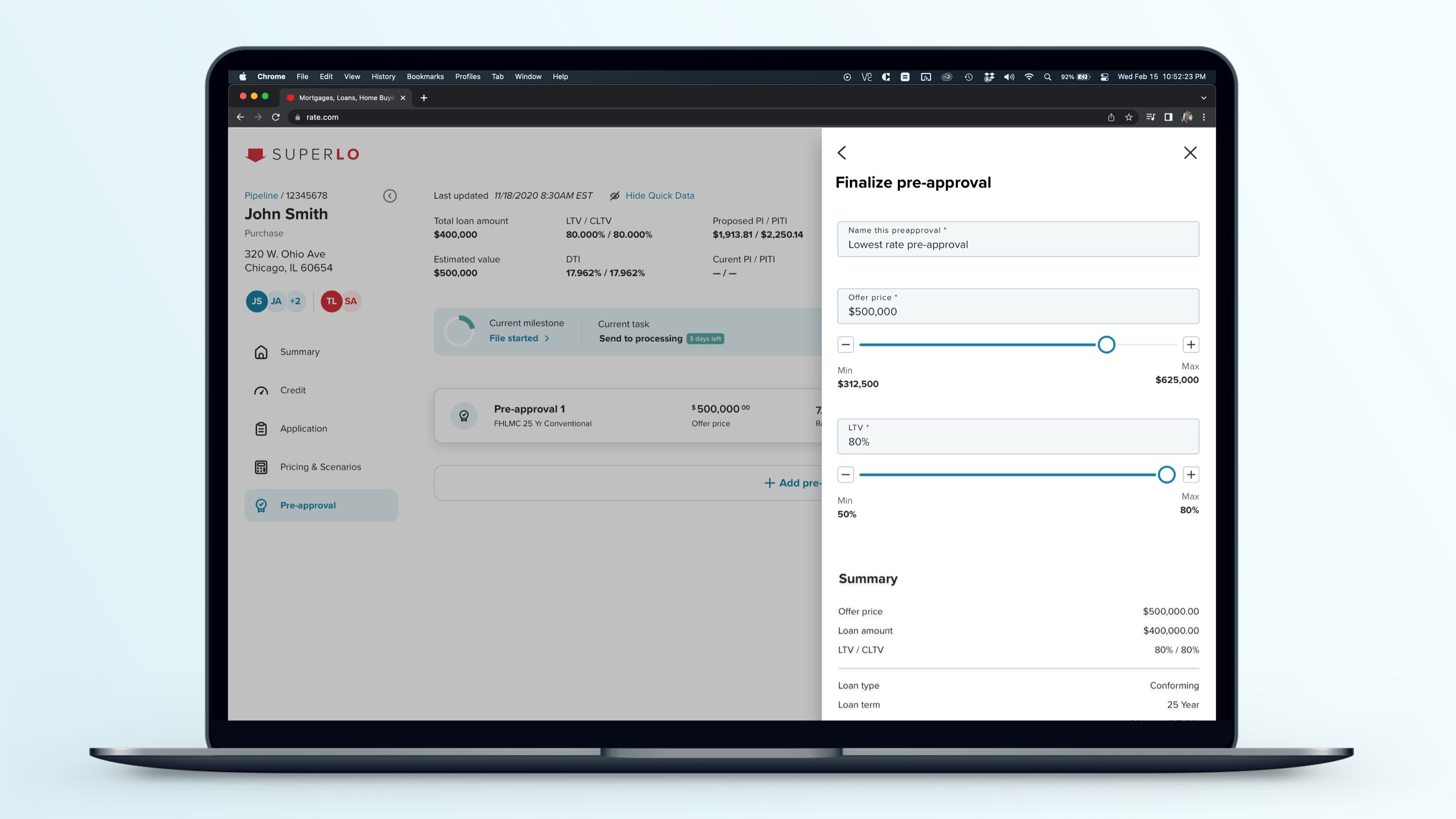
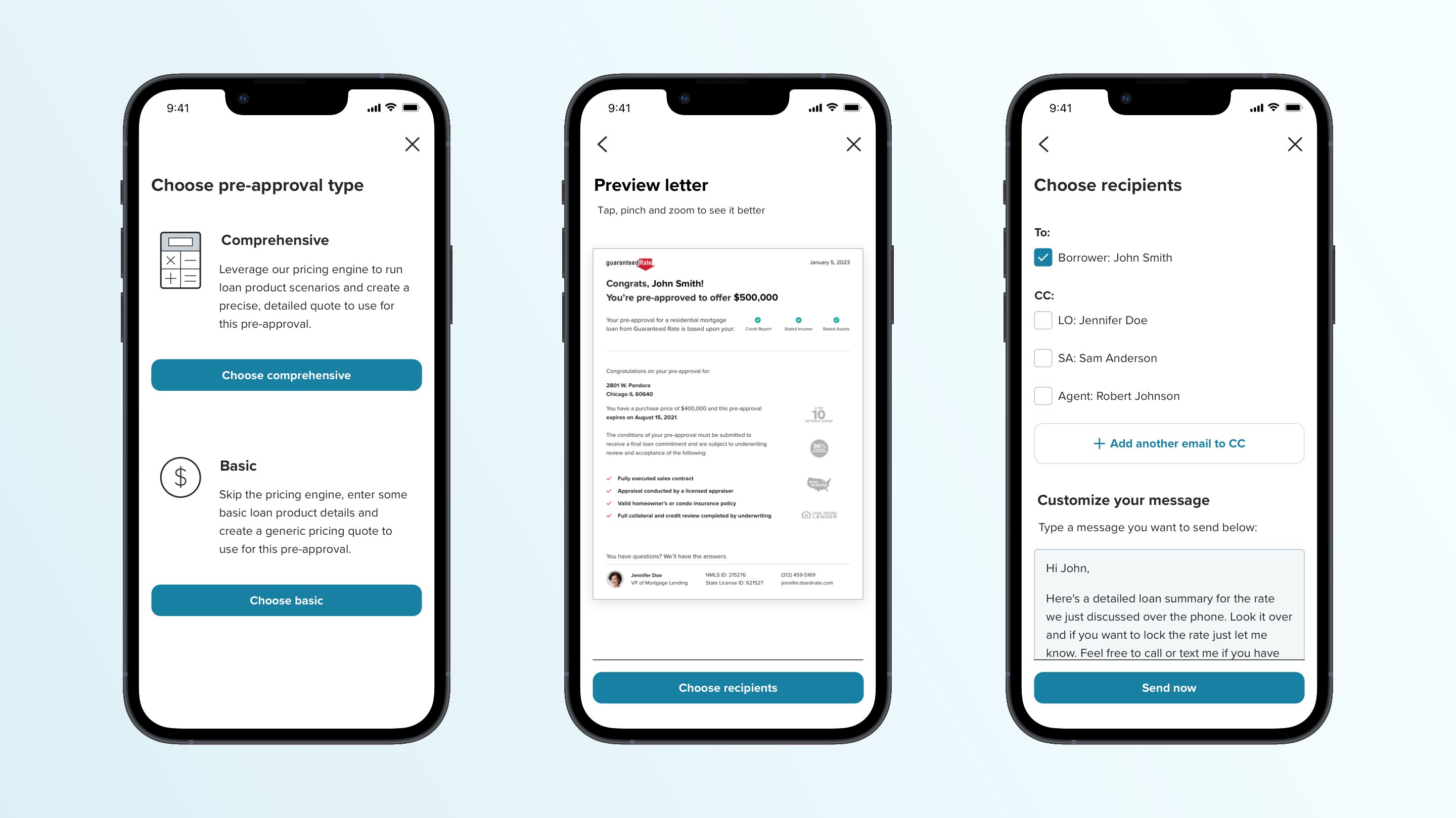
Credit could be pulled and Pre-approval letters could be shared from anywhere

We launched with a small beta group of about 50 LOs, which quickly grew to more than 700 active users as adoption spread organically. Our Loan Officers were largely free to leverage the toolsets of their choice, and they quickly chose to use Super LO.

Outcome:
Super LO successfully replaced a fragmented workflow with a unified system, effectively reducing reliance on disconnected third-party tools and centralizing loan origination workflows in a single suite that we actually owned.

This shift led to improved efficiency, visibility, and responsiveness across the pipeline, while positioning Guaranteed Rate to move away from our reliance on Ellie Mae Encompass – software our users genuinely hated that cost over $7M per year in licensing costs – all while delivering a faster, more flexible experience.